
Sig of the Week Superthread - Dormant
0
posted02/22/2014 02:21 PM (UTC)byWelcome to the new and improved Sig of the Week competition! Here are the rules:
1. Pay attention to the weekly schedule.
Monday: Theme announced
Monday-Friday: Entry period
Saturday: Voting
Sunday: Winner(s) announced
2. A different theme is to be used each week, and theme ideas are to be sent to either myself or legoslayer10 via PM.
3. Theme ideas will be used in the order they are recieved or as set by the contest creators. Every four weeks will be a Freestyle week, to promote greater creativity.
4. One and only one entry per person. To change your entry, edit the original post that the entry was in.
5. Animated and Flash sigs are not allowed.
6. If you are not entering, please do not spam the thread. Keep the conversation pertinent to the entries.
7. You must make your entry yourself, and your name must appear in the sig. There are absolutely no exceptions to this rule. If your name does not appear in the sig, it will not be entered into the voting phase.
8. To vote, you must post in order your top 3 favorites; 1st place votes are worth 3 points, 2nd place votes are worth 2 points, and 3rd place votes are worth 1 point. During voting, you may not vote for yourself.
9. The size limit is 400x150. You may make a smaller sig if you wish, but you may not exceed the limit.
10. You may not re-use sigs that have been entered in past weeks.
The above rules are subject to change at any time and without notice.
This week's theme: 90s CARTOONS
This week, your sig must feature elements of 1990s cartoon shows.

About Me
Shao Kahn did nothing wrong
0
Bumping this for everyone to see in case they didn't. I'll likely participate. I haven't made sigs in a while and I was never really good at it. I'll mess with my Photoshop tonight though and see what I get.


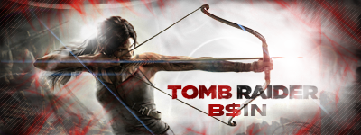
Well here is my entry this week. I just recently beat the new tomb raider and thoroughly enjoyed it, so I thought why not make a sig for it to enter. Good luck to anyone who enters! Please participate people, I would really love to see this thriving again.


About Me

Get that ass BANNED
0
Its been a while since I've made something. New laptop. Lost all my old tools and effects, brushes, texts. All that good stuff. Just slapped this together with the shit I had.


I will be entering. Thursday is coming up fast... I hope I make it on time!
I got it working. Here it is, hosted on Imgur.
*******UlcaTron's entry, not mine.*******

*******UlcaTron's entry, not mine.*******
m0s3pH Wrote:
Damn, I tried to fix your link, because it isn't displaying for me.
Damn, I tried to fix your link, because it isn't displaying for me.
I got it working. Here it is, hosted on Imgur.
About Me
Mortal Kombat Online - Community Manager

| Twitch | YouTube | Lawful Chaos |
Signature and avatar by ThePredator151
0
UlcaTron Wrote:

I know my name aint there but I made this real fast on my brothers laptop which had only brushes, no fonts.
=(
I know my name aint there but I made this real fast on my brothers laptop which had only brushes, no fonts.
=(
Couldn't you go here and download some fonts?
About Me

0
Come on guys! You've only got today to get in your entries, and we're still looking for themes for next week! Get crackin'!
m0s3pH Wrote:
Couldn't you go here and download some fonts?
Couldn't you go here and download some fonts?
I know where to download them Tim lol. It was just quickly scraped (lol resin) up on his laptop and it wasn't the fastest in the world. Is it cool for this week ONLY that I don't put my name on it? It seems so tedious to do all that work just to put "UT" on it...
EDIT: Decided to not be a pussy and add the font!


About Me

0

0
I missed doing this!

I started this one quite some time ago, and never completed/did anything with it. I just don't have time to make a new one this week between starting a new job, and all kinds of other boring stuff you don't want to hear about.
Here's my (technically incomplete) entry! I'll be in it to win it, pizza place spin it, step up and frown while I hardy-har grin it next week. Have fun, all!

Here's my (technically incomplete) entry! I'll be in it to win it, pizza place spin it, step up and frown while I hardy-har grin it next week. Have fun, all!
About Me
Mortal Kombat Online - Community Manager
| Twitch | YouTube | Lawful Chaos |
Signature and avatar by ThePredator151
0
xB$INx
Murcielago
UlcaTron
flameshang
Torchia's entry never got done, it seems. BlackErmac's entry is withheld unless a username is added.
Anyway, 4 eligible entries this week. Was hoping for more, but it can't be helped. Voting begins now. Pick your top 3.
Murcielago
UlcaTron
flameshang
Torchia's entry never got done, it seems. BlackErmac's entry is withheld unless a username is added.
Anyway, 4 eligible entries this week. Was hoping for more, but it can't be helped. Voting begins now. Pick your top 3.
0
Didn't properly read the rules I suppose, but here we go :P

About Me

0
Flameshang
B$IN
Murcie
B$IN
Murcie
Aw. I still meant for it to be entered, as half-assed as it was. :-/
Oh well.
1) flameshang
Simplistic, but elegant. Not cluttered or flashy. That's the way I like my signatures. Odd that something with Sub Zero in it is so damn hot.
2) Murcielago
Almost a little too crowded for my personal tastes, but it's still eye-buldgingly pretty.
3) UlcaTron
Again, I like simplicity, but this one was 3rd because of... Wait for it... The name! I know you had to go out of your way to add it in as an afterthought, and it kind of shows. It doesn't flow with the rest of the signature, and that makes me sad inside.
As for xB$INx, the reason I left yours off my top 3 is simply because it seems way too cluttered with the red around the borders. In addition, it has these strange blue/white lines randomly placed throughout the whole thing. I'm not picking on you, promise! Something about this particular entry of yours just doesn't sit right with me. It's by no means a bad signature, but compared to the competition, it just didn't quite make the cut.


Oh no harm done, torchia. I can respect other peoples opinion and am open to critique. The feedback is much appreciated. Just for a quick defense from the artist's perspective, the random blue and white lines are lighting streamlines that are often seen in digital and movie shots (such as on the cover of the movie "End of Watch.") They also act as leading lines for the eye through the sig. As far as the red around the border, I had made the sig all the way until the point of the text and felt that the red from the text needed a compliment so that the text did not stand out so much. The red I feel helps to make things flow better together in a more unison way.
Does BlackErmac's sig count now? If so, then my votes are as follows:
1. BlackErmac: Your sig is very well put together. The background is not complicated and does not take away from the main image. I feel like the lighting could have been a little brighter, but it works well with the white nonetheless.
2. Murcie: Bright and flashy with plenty for the eye to catch. Very nicely done.
3. flameshang: As a more simplistic sig, this is very nicely executed. I like sigs with a little more going on, but a simplistic sig every once and awhile is nice.
If BlackErmac's does not count:
1.Murcie
2.flameshang
3.Ulcatron: I like the background design of your sig and it fits well with the main image. The only thing is that I think is a different color may have been used just a little bit to break up the green, or at least a greater variety of shades of green (like flameshang's blues). Still a nice sig though.

About Me
Kung Lao/Smoke main. Maker of puns and bad jokes.
0
Ulcatron (Because I'm a fan of Green Arrow :P)
B$IN (Because Archery (see above))
BlackErmac (Because Infamous)
But if we aren't counting BlackErmac, then Murcielago has my third vote (I like the colors used)
B$IN (Because Archery (see above))
BlackErmac (Because Infamous)
But if we aren't counting BlackErmac, then Murcielago has my third vote (I like the colors used)
About Me
Get that ass BANNED
0
Flameshang
Da tronz
BSIN
Hopefully next time I can pull off a better sig. Been forever since I've done one. I've gotten super rusty.
Da tronz
BSIN
Hopefully next time I can pull off a better sig. Been forever since I've done one. I've gotten super rusty.
About Me
0
Murcie
BSIN
Ulcatron
Good entries
BSIN
Ulcatron
Good entries

About Me
Get that ass BANNED
0
(Erik) Wrote:Mercimiago
Spot on


© 1998-2025 Shadow Knight Media, LLC. All rights reserved. Mortal Kombat, the dragon logo and all character names are trademarks and copyright of Warner Bros. Entertainment Inc.