
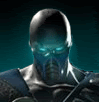
Scorpion Render
Scorpion Render
0
posted05/07/2008 11:57 PM (UTC)byMember Since
09/12/2004 09:59 AM (UTC)
Hey, latest polish magazine NEO+ has a article about Midway Gamers Day and of course MKvsDC. They included a new render of Scorpion i his MKvsDC look. If You didn't know, this magazine also had a first Motorstorm 2 pictures some while ago. Enjoy. I dont know haw to make image visible directly on the forum, so there is a link.

About Me
What do you like? Hit the Toasty thumbs up on articles and forum posts for a quick response!
0
Awful. After the Sub-Zero previews, not at all a surprising sight, but awful.
Next to the array of DC's icons - embarassing. It'd be wonderful to see the MK design team keep their heads out of their arses long enough to stay away from the palette swap look for more than one game.
Was there a fucking sale on shoulder pads in Outworld?!
I'm not about to condemn the whole game on the basis of one Polish magazine's screenshot, but the "ninja" suits, worn by many characters who aren't ninjas, are symbolism for MK's handicap. Move on, grow up.
No reason to doubt the legitimacy of that shot. Disappointing.
Like a lot of MK's faults, I think there's real promise in some of the details of the outfit, but come on. Individuality is more than a colour and ridiculous belt buckle.
0
I think it looks quite good. Maybe shoulder pads are little unnecessary , but overal look is ok. Especially his mask and head.
About Me
What do you like? Hit the Toasty thumbs up on articles and forum posts for a quick response!
0
Sarumanthewhite Wrote:
I think it looks quite good. Maybe shoulder pads are little unnecessary , but overal look is ok. Especially his mask and head.
I think it looks quite good. Maybe shoulder pads are little unnecessary , but overal look is ok. Especially his mask and head.
I could really go either way. Next to Sub-Zero, who had the past few games to really establish a sense of individuality, it's especially disappointing.
On the one hand, the character's back from Hell and probably deserves some sort of unique dressing. On the other hand, I was a big fan of MKDA's design that went lengths to not only emphasise a sense of individuality in Scorpion (and by proxy, Sub-Zero), but drew more upon some plausible reference points from Scorpion's history as a ninja.
There Scorpion looked less like the latest representative for a range of ninja sports wear, and more like a compromise between the practicality of a character who put himself together, and the bold yellow comic book design we know.
Could do without the HUGE moulded skulls in all respects.
Not real convince with the bug-shell movie style of the head and grossly missproportioned mask. Feels like another disappointing step backward, even though there's a lot of promise there.
0
It doesn't look too bad. Not that good, but it's still pretty early so we could see changes.


About Me
What do you like? Hit the Toasty thumbs up on articles and forum posts for a quick response!
0
JAX007 Wrote:
I think he looks good, much better character model and design compared to MKA.
I think he looks good, much better character model and design compared to MKA.
Couldn't disagree!
Even if any motivations for iconography are a total cop-out.
They'd be better served throwing their best at characters that have successfully been honed over sixty years, instead of something someone might remember seeing in a movie theatre ten years ago.
About Me

0
i actually like it, he doesnt look as buff as he used to in MKDA n MKD,
i think its pretty good, any info who else is going to be in??
i think its pretty good, any info who else is going to be in??
Actually know that I think about it I agree with Mick-Lucifer on the Sub-Zero
costume part. It is true like you said that Sub was starting
to get a sense of individuality, so yeah I think that the Sub costume they have
shown us so far should be an alt.
But I like this costume for Scorpion.... I think that its like a MKDA mixed
with MKD costume but with less accesories.
But I do think they should of made it more darker....like it looks
really bright...they should of made the yellow a tad darker, also
it really would of looked better if Scorpion showed some bone
and cuts, like in between the mask and head piece half of his face could be
ripped revealing his skull, you know stuff like that...because I guess
it does kinda look like a pimped out version of his MKSM costume.
But I still think it looks cool
0
looks badass looks like the classic scorp we all love!!!!!!!!!


0
Lose the shoulder pads, tone down that gargantuan belt buckle, those bulging knee pads, shin gaurds, and the foot-wear....take some of the emphasis off the definition of his head-wear and the mask, and we're all good.
It looks like they mixed Reptile and Scorpion together. Although, I like that they slimed the overall design down. The gold ain't bad....but it's supposed to be more yellow than that.
Nice update anyway.
EDIT:
MKSM Scorpion for those who'd like to compare...
The new one isn't bad....it's just not totally agreeable. "Perfectly fine" from my stand point. I'm usually impressed with Scorpions designs regardless though.
0
Bezou Wrote:
They're not gonna change the design, dude.
They're not gonna change the design, dude.
Just a critique. I'm not a Scorpion fan...so I really don't care either way. Just my first impression.
0
Bezou Wrote:
I cleaned it up a bit.
I cleaned it up a bit.
Yea, not a complete disaster. Granted it's not as impressive as usual, it's just....a Scorpion design.
If all they were shooting for was "recognition" then, they got it. They just didn't do anything "cool" with him. lol
0
First thanx for the image.
Second I like it from the belt and up.
From the lower part I don't like these sagionaras (boots) and this yellow thing that is hanging under the belt. I don't know the english word.
Second I like it from the belt and up.
From the lower part I don't like these sagionaras (boots) and this yellow thing that is hanging under the belt. I don't know the english word.
0
As a Scorpion fan I think that the costume could use a few touch ups, like that giant skull on the belt needs to be smaller. seriously, screw puncing someone just slam their face into the damn skull. and maybe no shoulder pads.
About Me
What do you like? Hit the Toasty thumbs up on articles and forum posts for a quick response!
0
ThePredator151 Wrote:
Lose the shoulder pads, tone down that gargantuan belt buckle, shin gaurds, and the foot-wear....take some of the emphasis off the definition of his head-wear and the mask, and we're all good.
It looks like they mixed Reptile and Scorpion together. Although, I like that they slimed the overall design down. The gold ain't bad....but it's supposed to be more yellow than that.
I actually like the shoes. They're a happy compromise between tabi boots and something stylized. I think I like that they're a bit less Nike than Sub-Zero's matching tracksuit.
Like you, I thought there was a hint of Reptile, particularly in the cowl, although I think that's probably more of a symptom of the organic, bug-shell look of the movie influence. Which, as much as I don't want it to, could probably make the most sense for the character from Hell... They've never really taken the license to make Scorpion as weird as he could be...
What I really wanted to mention was the bulk of his MKDA design , though.
The offensiveness of Deception's narrow and streamlined physique of all the characters aside; I thought MKDA was especially good for giving a sense of fabric and reality to the character. It needed some detail and design work (like the loss of those stupid huge skulls), but it was nice to be able to look at Scorpion and feel like this was more than a cheap comic design. It felt like a stylized ninja!
As debatable as precedent might be, anyone freaking out about the "spandex" superhero costumes needs to take a closer look at this stuff. I mean, are they competing to see which side can have the tightest pants beneath their fabric physics (capes, belts, sashes)?
"Meh".
That's a good design. Nothing that blows me away or impresses me, and a few minor quibbles. Besides his WWF wrestling belt buckle, the pointless shoulder pads (that aren't even on his shoulders), and some odd design choices around the feet, he looks decent. He doesn't really look like a ninja, but I sort of gave up on that around the MK:DA era. The details look good, and I believe that his spear is even visible around his leg.
Quite frankly, I would have prefered a darker color scheme, but the brighter gold color will help him visually match up with some DC characters..... not that I'm any happier about that.
0
The graphics look amazing! But the outfit is a 8/10. I cant wait to see some alts.

I kind of dig it!
While it is a bit of a regression in terms of individuality and spandexism, I think it's somewhat appropriate, given the nature of the game.
My first impressions were; how reminiscent it is to his MKSM look, how it has a more "comic" feel to it (which I like for this game), and... well, the shoulder pads. I don't hate them, but...
They wouldn't bug me as much if they weren't so pointy.
Overall- 4.4/5


© 1998-2025 Shadow Knight Media, LLC. All rights reserved. Mortal Kombat, the dragon logo and all character names are trademarks and copyright of Warner Bros. Entertainment Inc.