0
submitted 05/26/2003 08:16 AM (UTC)by
TomTaz Member Since
05/20/2003 02:47 AM (UTC)
Zentile •05/22/2003 05:20 PM (UTC) •0
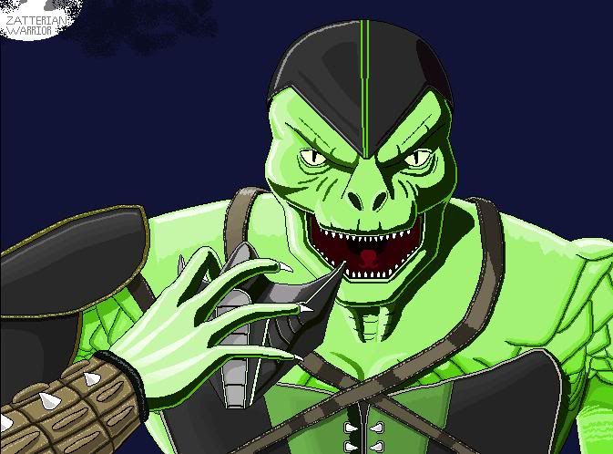
Ah! I love it. He kinda reminds me of Hannibal Lecter.
Though, I'de take those rings off of Baraka's blade.
hey I like it. very creative. just lose the rings like Z said.
Excellent as usual, good job.
Kool. I gave him 5 Dragons!
very good
i like the eye patch
just try to make it look less cartoony, you follow?
experiment with some shading and stick to darker colors!
RaMeir •05/23/2003 06:20 PM (UTC) •0
Good start I would say. I agree on the cartooniness. Not that that's a bad thing but I would progress from there to even better results.
Keep practicing
Wyatt
TomTaz •05/23/2003 11:53 PM (UTC) •0
Once again thanks for all of the comments. As I have stated before I kinda have a few problems with shading, It just never looks right when I do it so I end up going without it. I still have stuff to learn I guess. I have a picture of Sindel that I am going to post, it is the same, lacking shadow. Once I have experimented and found way to do it that I am happy with I will definitly include it. Thank you all again.
Its great!!It looks kinda like the MK4 version cause of those things on his head. As Zentile said lose the ring thingys.
I like it.
But as they say, get rid of the rings.
Great Design! The ring look fine. But without shading, the character look flat.
Zombie •05/26/2003 04:01 AM (UTC) •0
good start, loose the rings , if you want a more serious look, add more depth and shading, to give him more character.
i'm new how do i add a picture that i drew so everyone can look at it?
nice drawing, like others have said more shading and darker colors and the rings....lol still gave it 4.
© 1998-2026 Shadow Knight Media, LLC. All rights reserved. Mortal Kombat, the dragon logo and all character names are trademarks and copyright of Warner Bros. Entertainment Inc.