
DA Liu Kang type death
Fan Kreations
Pages: 1
Display Mature Content:
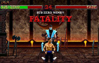
| Artist's Remarks: | |
|
Ok. A bit better than my first... i think. I forgot to dim the screen though.
|
| Full Scale | 393x250 | Category | Drawing (Pencil - B/W) | User Views | |
| User Likes | User Ratings | 7 | Score |
 1.5 1.5
|


Pages: 1


© 1998-2026 Shadow Knight Media, LLC. All rights reserved. Mortal Kombat, the dragon logo and all character names are trademarks and copyright of Warner Bros. Entertainment Inc.