
Drahmin and Scorp fake
Fan Kreations
Pages: 1
Drahmin and Scorp fake
0
posted06/29/2006 05:47 AM (UTC)byWell,this is my 2nd custom fake.Im preety happy with the result.I know its not perfect,but its a start.I hope.....=P 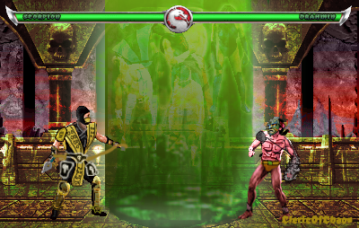

About Me

0
For a start it is good, but i think that scorp and Drahmin should have more detail.


0
Drahmin looks shitty, Scorpion has a black outline...should be a darker gold color, and the bg is blech 2.5/5

About Me

0
Not bad. The Drahmin sprite looks ok and Scorpion's clothing should be a darker color. The background is kinda meh. 3/5


0
Nice man! 4.9/5 dude!! Hey, cleric what's up dude?

About Me

0
the background looks like a gensis game, the characters look cartoonish, scorpion looks like he's holding a velvet rope, but overall, i like it. It has an odd charm

About Me
0
The whole fake seems weird, though it could be a whole lot better.
First off, the whole fake is boring. What is this, a starring contest? Add some action and some gore.
Scorpion sprite could use more shading. Is too much of the same color. Drahmin is too small. When your making sprites be sure to make them all with the same proportion.
The BG is ugly. Make a BG that is kickass and has that "MK Feel."
The text on the lifebars is good, but it's hard to see. Make the inside white. Don't make it blend with the color behind it.
Other than that, I see some potential. Nice effort, nonetheless.

About Me

0
-illusion- Wrote:
The whole fake seems weird, though it could be a whole lot better.
First off, the whole fake is boring. What is this, a starring contest? Add some action and some gore.
Scorpion sprite could use more shading. Is too much of the same color. Drahmin is too small. When your making sprites be sure to make them all with the same proportion.
The BG is ugly. Make a BG that is kickass and has that "MK Feel."
The text on the lifebars is good, but it's hard to see. Make the inside white. Don't make it blend with the color behind it.
Other than that, I see some potential. Nice effort, nonetheless.
I'm with stup... I mean Illusion


0
It looks like Drahmin is steping into the soulnado, it should cover him a little, 4/5
Cleric.....Is this THE Cleric from all the other sites I saw you at?
Cleric.....Is this THE Cleric from all the other sites I saw you at?
About Me
0
No, its his mom. :P
Yeah thats me.
Yeah thats me.


About Me

0
It's alright, but you could have made the sprites bigger by using MK2 or MK1 sprites.

About Me
<img src ="http://www.comixodez.com/Sets/mkosig2.png"
www.ComiXodeZ.com
0
I agree with illusion.
Pages: 1


© 1998-2025 Shadow Knight Media, LLC. All rights reserved. Mortal Kombat, the dragon logo and all character names are trademarks and copyright of Warner Bros. Entertainment Inc.