
Ermac: Telekinetic Maul
Fan Kreations
Pages: 1
Display Mature Content:
| Artist's Remarks: | |
|
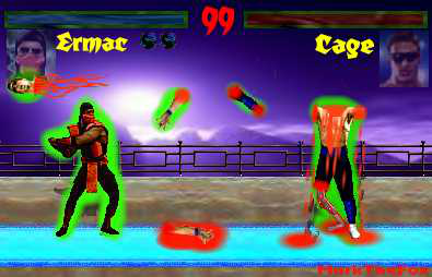
well this was made using 95% Ms paint and the rest was web studio's pic editor. Hope you guys like it. Comments? Suggestions? oh i made(actually edited)the bg myself hope you guys like that as well.
|
| Full Scale | 395x254 | Category | Fakes | User Views | |
| User Likes | User Ratings | 6 | Score |
 1.5 1.5
|
0


Pages: 1


© 1998-2026 Shadow Knight Media, LLC. All rights reserved. Mortal Kombat, the dragon logo and all character names are trademarks and copyright of Warner Bros. Entertainment Inc.