
first fake...not that good
Fan Kreations
Pages: 1
Display Mature Content:
| Artist's Remarks: | |
|
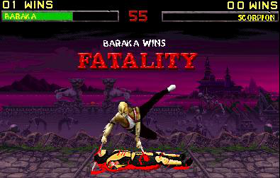
ok..i took a few suggestions on my old one and made this
|
| Full Scale | 395x252 | Category | Fakes | User Views | |
| User Likes | User Ratings | 3 | Score |
 3.0 3.0
|

Pages: 1


© 1998-2026 Shadow Knight Media, LLC. All rights reserved. Mortal Kombat, the dragon logo and all character names are trademarks and copyright of Warner Bros. Entertainment Inc.