
Hydro vs. Shirai Ryu FAKE
Fan Kreations
Pages: 1
Hydro vs. Shirai Ryu FAKE
0
posted03/07/2013 12:26 PM (UTC)by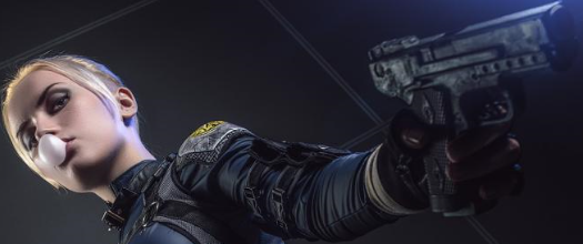
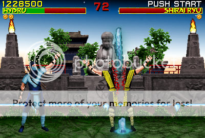
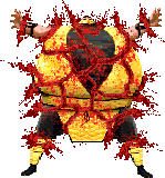
I didn't want to make yet another cheap cyborg pallet swap for Hydro like everyone else does. ...but then again i did make a generic shirai ryu ninja =/
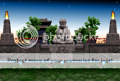
i finished my "buhdda garden" stage concept i made a while back. here it is without sprites
I based my sprite off of this comic pic of Hydro:
...well back to my FPK entry i guess =/

About Me

0
lol? This fake puts the suck in "sucks ass"
blacksaibot Wrote:
lol? This fake puts the suck in "sucks ass"
lol? This fake puts the suck in "sucks ass"
WOW?! Well u put the dick in "sucks dick" This is my most extensive sprite edit aside from my FPK. I practically took YOUR advice when making a custom sprite. sorry if my shading isnt perfect, but lets take a look at ur CARTOONY quan chi!
About Me
0
saiZero Wrote:
WOW?! Well u put the dick in "sucks dick" This is my most extensive sprite edit aside from my FPK. I practically took YOUR advice when making a custom sprite. sorry if my shading isnt perfect, but lets take a look at ur CARTOONY quan chi!
blacksaibot Wrote:
lol? This fake puts the suck in "sucks ass"
lol? This fake puts the suck in "sucks ass"
WOW?! Well u put the dick in "sucks dick" This is my most extensive sprite edit aside from my FPK. I practically took YOUR advice when making a custom sprite. sorry if my shading isnt perfect, but lets take a look at ur CARTOONY quan chi!
LMFAO that was cute, in a feeble-minded sorority girl kind of way...
Seeing as how your rebuttal described my Quan Chi as cartoony, (even though I made no mention of the cartoonish nature of your sprite), that lets me know you are admitting and acknowledging your own sprite editing faults.
Let us examine at what makes blacksaibot blacksaibot?
A. If your fake sucks, he'll let you know.
B. He get's angrier than a bull stuck in Eastern Washington University's football stadium when you don't apply yourself 100% and/or you ignore advice previously given to you
It seems to me as though you got frustrated with the cloth of Hydro and rushed this one out to the forums for the fuck of it.
Okay, fine it's not bad considering your experience with custom sprites, but it certainly isn't that great either. I know you can look at it yourself and say "boy those shin wraps sure look like used Smurf toilet paper"
I am just not a fan of this prop-infested stage that has yet another out-of-place MKMSZ element (Water God's water attack).
This fake should have been worked on AFTER your FPK entry. it had a lot of potential especially because you were willing to make the human version of Hydro.
I mean for fuck's sake it would have been better had you recolored the blood from this sprite into water and ripped off of Rain's fatality!
But noooo... MKMSZ sprites to saizero's rescue! Water magially cuts humans in half like a straight-edged blade, even though it's too thick and doesn't even look pressurized enough to do so.
I hope you didn't spend more than 15 minutes on this; and just for the sake of taking a break from the FPK.
saiZero Wrote:
...well back to my FPK entry i guess =/
...well back to my FPK entry i guess =/
So yeah, get your ass back to it.


0
saiZero Wrote:
Love the tranquility of the background, glad you completed this one. The amount of props used and their position in the stage are just right. It could use some darkening though to mask the segmentation in the horizon. This would look great set at night - maybe add the moon, some stars, glow bugs, etc.
The fake itself is Ok. Human hydro is something never seen before but he could use more texture detail and definition. As for the fatality, what's the premise? Did the water solidify into ice for the split?
About Me
FB: Trans4Materia Card Game I invented "Circling Vulture, Laughing Hyena"
True story, it happened to a friend of a friend of mine... EVERYBODY!
0
The texture could use some more shading. Hydro's raised arm looks too long, and awkward.
Nice attempt on the Fatality, they don't always make sense in the games either.
Ka-Tra
Nice attempt on the Fatality, they don't always make sense in the games either.
Ka-Tra

About Me
0
mwgrant0 Wrote:
4/5 although Hydro has moobs. I have sent several E-mails to NRS about Sub-Zero having the Hydro costume as an alt. Its pretty badass
4/5 although Hydro has moobs. I have sent several E-mails to NRS about Sub-Zero having the Hydro costume as an alt. Its pretty badass
Moobs? I know the sprite is bad but I don't even see man boobs on him.
blacksaibot Wrote:
Moobs? I know the sprite is bad but I don't even see man boobs on him.
mwgrant0 Wrote:
4/5 although Hydro has moobs. I have sent several E-mails to NRS about Sub-Zero having the Hydro costume as an alt. Its pretty badass
4/5 although Hydro has moobs. I have sent several E-mails to NRS about Sub-Zero having the Hydro costume as an alt. Its pretty badass
Moobs? I know the sprite is bad but I don't even see man boobs on him.
Nevermind its just his chest-piece

About Me
hey
0
I guess by now you'll be busy with your FPK picture, but I'm going to analyze this anyway.
Hydro looks sweet overall. My biggest suggestion would be to make the sleeves longer and a bit wider. In the comic they seem to go down to his elbows and they're very loose. Right now they seem more like regular t-shirt sleeves. Other than that, I think his outfit could use a bit more folds and ruffles so it doesn't look so smooth. By the way, I can't really say how to do any of this because I've never made custom sprites before. I bet BlackSaibot will help you with that, you two seem to get along well.
Not surprisingly, I'm not nearly as impressed with the Shirai Ryu warrior. I know he's just a throw-away character, but maybe he could be a little more than Scorpion with palette-swapped leg and mouth gear.
So, about the fatality, I kind of like it and kind of don't. I like the idea of the water splitting him in half, but like BlackSaibot said, there doesn't seem to be enough pressure for the water to cut through the Shirai Ryu. If you were to add on to this picture, one way you could fix it would be to simply make the water sprite more blade-like in shape, similar to Rain's MK9 fatality. Or maybe Hydro can actually control the water in his opponent's body and he focuses it all to the center and rips it out instead of summoning it from below (which I think is what that bit of water is below the Shirai Ryu warrior).
The stage is my favorite part of the fake. I love the overall peaceful vibe it has going for it. Ironic how there's a guy getting massacred right in the center though. However, I see the flames have a dark sort of edge around them. Were they cut out of a dark background or something? If you could somehow tweak them so they fit their new environment more I think they'd look a lot better.
I think that big pagoda building in the background might look cooler if it were centered behind the big Buddha statue, and maybe have another small pagoda placed to the left of it the large one. I'm not sure if I like the trees being in front of the buildings; they might look better behind them or to the side. Either way though, I think it's kind of weird that the tree on the left is identical to the one on the right. Maybe if you flipped one of them so they're facing each other it would give the impression that the monks cut them that way to act as a frame of sorts with the Buddha centered in front of them. In short, I think you should accentuate that Buddha is the main focal point of the stage.
I also think that a moon would go wonderfully with this stage. I'm thinking something like this (hopefully I get the HTML right):
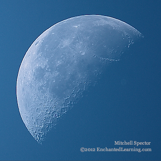
A night time version of the stage would be fantastic as well. I agree with what UltimateRyu said about adding glow bugs, lots of stars, and a bright moon, making it look really spiritual and cosmic.
So if you decide to come back to this fake, there's some advice. Maybe it's trivial, maybe you already know what to do, but there it is anyway. And a night stage is a good idea.
Hydro looks sweet overall. My biggest suggestion would be to make the sleeves longer and a bit wider. In the comic they seem to go down to his elbows and they're very loose. Right now they seem more like regular t-shirt sleeves. Other than that, I think his outfit could use a bit more folds and ruffles so it doesn't look so smooth. By the way, I can't really say how to do any of this because I've never made custom sprites before. I bet BlackSaibot will help you with that, you two seem to get along well.
Not surprisingly, I'm not nearly as impressed with the Shirai Ryu warrior. I know he's just a throw-away character, but maybe he could be a little more than Scorpion with palette-swapped leg and mouth gear.
So, about the fatality, I kind of like it and kind of don't. I like the idea of the water splitting him in half, but like BlackSaibot said, there doesn't seem to be enough pressure for the water to cut through the Shirai Ryu. If you were to add on to this picture, one way you could fix it would be to simply make the water sprite more blade-like in shape, similar to Rain's MK9 fatality. Or maybe Hydro can actually control the water in his opponent's body and he focuses it all to the center and rips it out instead of summoning it from below (which I think is what that bit of water is below the Shirai Ryu warrior).
The stage is my favorite part of the fake. I love the overall peaceful vibe it has going for it. Ironic how there's a guy getting massacred right in the center though. However, I see the flames have a dark sort of edge around them. Were they cut out of a dark background or something? If you could somehow tweak them so they fit their new environment more I think they'd look a lot better.
I think that big pagoda building in the background might look cooler if it were centered behind the big Buddha statue, and maybe have another small pagoda placed to the left of it the large one. I'm not sure if I like the trees being in front of the buildings; they might look better behind them or to the side. Either way though, I think it's kind of weird that the tree on the left is identical to the one on the right. Maybe if you flipped one of them so they're facing each other it would give the impression that the monks cut them that way to act as a frame of sorts with the Buddha centered in front of them. In short, I think you should accentuate that Buddha is the main focal point of the stage.
I also think that a moon would go wonderfully with this stage. I'm thinking something like this (hopefully I get the HTML right):
A night time version of the stage would be fantastic as well. I agree with what UltimateRyu said about adding glow bugs, lots of stars, and a bright moon, making it look really spiritual and cosmic.
So if you decide to come back to this fake, there's some advice. Maybe it's trivial, maybe you already know what to do, but there it is anyway. And a night stage is a good idea.
Pages: 1


© 1998-2026 Shadow Knight Media, LLC. All rights reserved. Mortal Kombat, the dragon logo and all character names are trademarks and copyright of Warner Bros. Entertainment Inc.