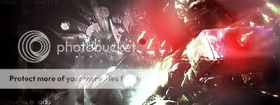
MK vs DC Smoke (using Scorpions render)
Fan Kreations
Pages: 1
MK vs DC Smoke (using Scorpions render)
Vash_15 Wrote:
Fucking sweet man. but the mask doesn't fit him well, 3/5
Fucking sweet man. but the mask doesn't fit him well, 3/5
Like do you think your Reptile is on the exact same level as this one? I definitely think this is better than your edit. Atleast everything is done right (except I guess the mask?) and he took the time to change it up and make it more of his own than what you produced.
(Erik) Wrote:
Like do you think your Reptile is on the exact same level as this one? I definitely think this is better than your edit. Atleast everything is done right (except I guess the mask?) and he took the time to change it up and make it more of his own than what you produced.
Vash_15 Wrote:
Fucking sweet man. but the mask doesn't fit him well, 3/5
Fucking sweet man. but the mask doesn't fit him well, 3/5
Like do you think your Reptile is on the exact same level as this one? I definitely think this is better than your edit. Atleast everything is done right (except I guess the mask?) and he took the time to change it up and make it more of his own than what you produced.
They have the same rank but for different reasons. Mine is 3/5 because it isn't that good. Smoke01's is 3/5 because the smoke round it is annoying, as in, having smoke is cool, but not only is there too much, it seems cheap and pixelated, sqaure-ish if you will, plus, the look doesn't seem to fit Smoke as I wouldn't see a character like him wearing it. So yes, it gets a 3/5 like mine, but for a different reason.
His mask is an attempt at making it look more like his MKSM outfit. I first designed it to look completely like the MKSM design, but he looked to much like Noob.
The smoke around him looked a lot better when I made it. I saved in in jpeg format, and doing that can often make things more noticable.
The smoke around him looked a lot better when I made it. I saved in in jpeg format, and doing that can often make things more noticable.
Bezou Wrote:
Of all the render edits I've seen, this is one of them.
Of all the render edits I've seen, this is one of them.
I bet it is!
You did a decent job with this, but why take Scorpion to make Smoke? The skulls and dead eyes have never been a part of Smoke's design. Sub-Zero would be much more apropriate.


0
Even though it's just a palette swap, you still did an awesome job. I love the smoke around him. It looks very realistic. Better than a lot of palette swaps that I have seen of this render.
Pages: 1
© 1998-2025 Shadow Knight Media, LLC. All rights reserved. Mortal Kombat, the dragon logo and all character names are trademarks and copyright of Warner Bros. Entertainment Inc.


