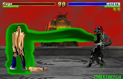
Well... I think you went a bit too heavy on the effects here. The idea is, well not that original, but usually this 'melting' idea isn't executed well as it could be. Personally, if you wanted to do such a fatality, I would recommend you showing the 'melted' opponent in a more melted state. That is if you are going to use this effect anyway, it really doesn't have a very 'melting' feel to it. It feels alot more like just a blur to me, which is what it is in reality of course.
Anyway, I don't like the background very much. The sky you used is sort of an off-pink color or something, a darker color, with perhaps some lighting or something to not make it look bland as it does currently. You used the same floor as in your last fake, so my previous comments about it still stand. Though, there is a small bit less vacant space as last time since you cut off the majority of the 'flipped' part of this. It makes it somewhat better I suppose. The prop you did place seems sort of lonely, its just too large a space behind the fighting platform, it needs to be filled with something. You have all the basics, lifebars, timer, correct amount of tokens. But I don't really care for the font you used, Cage's name doesn't look the same to me as MTF8T8's. The 'C' in his name should be touching the bottom of the lifebar, as it looks lower-cased as is. The shadow for MTF8T8 is there, and it looks nice, since you have a program that does it besides Paint it had that nice transparent look.
Okay, well like I said I think you overused the effects a bit. This causes massive quality damage, the floor quality is blurred pretty bad. Not your fault of course, but you have to be careful or the jpg will do that to you. The effects are greater if you use effects like this. Anyway, if you look you can see the 'beam' of energy from MTF8T8's chest is not contained properly. It shouldn't be on the outside of the 'flaps' that open. For the effect itself, I am happy to see you at least did you some various colors, which blend quite nicely actually. But the effect as a whole is too think, it gives it a very odd 'blob' feeling. Since you have this program that can make things transparent, use it here, this will look much better semi-transparent than it does as a whole.
Cage could have been done a bit better, this sprite isn't so pleasant looking. I'm not sure why the arm is off, and if it is why hasn't it melted into a puddle? Also, the way it lays on top of the effect surrounding Cage is sort of odd. Which is another reason why I say the effect should be semi-transparent in appearance. As for the rest of Cage's body, there are white pixels around the edges where they shouldn't be. Not a real problem though, just simply go into Paint and get rid of things like that. In some places, the 'melting' effect looks very solid in color, almost like pixel stretching. On his right arm is one place, and also coming down from what would be either his nose or mouth. That color is too dark, it doesn't look at all like the color of skin so I'm not sure what it is supposed to be. The 'melting' on the legs is alot better though, its pretty decent. Also, the two sprites are not lined up, and since they are in the game, they should be here.
The best part of this fake is no doubt your custom sprite. He has a simple name, but I like it actually. Makes it sound alot more like a souless killing machine, not even having a name because it had no need for one. Its not a total palette swap, so that's a plus. I like the way the yellow/orange/black colors look together. The chest may be a bit too black though, but other than that I like the sprite. Not your best, or worse. It could be better with a bit more time spent on it, don't rush yourself.