Next Fake
Fan Kreations
Pages: 1
Next Fake
0
posted05/14/2008 06:47 AM (UTC)by
0
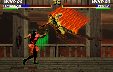
Ugh... i think you need to just trash that stupid Scorpion sprite... seriously. I mean, it has nice effects, but you're using it for the wrong thing. It doesn't really resemble motion blur too well. It's as if he's melting... SURE the fire is on him but since when does clothing melt? It burns... is he wearing a Halloween costume? NO. And the flames look quite cartoony. It doesn't fit the digitized graphics at all and they look redundant (as in: the same exact filter/picture tube was pasted on Scorpion over and over again. Flames are a natural thing, nature is hardly symmetrical - that might not be the right word to use but I hope you get the point).
I'm not sure why Ermac has all those green dots around him, it doesn't really add much to the fake. I don't like the shit coming off his arms either. It's like you're adding effects to your fake to distract the viewer from seeing how boring this all is.
I like how you edited the background to make it look like a destructive battle took place between the two... but please realize wood breaks off in chips and splinters, not perfect smooth slices like it would with butter... WTF would have caused that in the first place? Must have been some pretty big swords................. So yeah, I would go back and resemble those physical properties of broken wood where need be in your stage.
I think the background looks great and doesn't take the attention off the sprites. Too bad what's going in isn't all that spectacular.
I admire you taking the time to edit things, with more practice, you'll get better. Oh... and you don't have shadows, but that never really bothers me (but I went ahead and said it anyway because I know many people here are anal about that).
0
I just wanted to point out that I agree with what XTREEMIST had written, but I want to add that the way you have the wooden pillars cut has them look like they are floating and not held by anything else, which makes it unusual. That is the first thing I noticed when I was looking at the background, and is definitely something that should be fixed up, otherwise it looks like your wall is floating in mid-air.

0
Jerrod Wrote:
I just wanted to point out that I agree with what XTREEMIST had written, but I want to add that the way you have the wooden pillars cut has them look like they are floating and not held by anything else, which makes it unusual. That is the first thing I noticed when I was looking at the background, and is definitely something that should be fixed up, otherwise it looks like your wall is floating in mid-air.
I just wanted to point out that I agree with what XTREEMIST had written, but I want to add that the way you have the wooden pillars cut has them look like they are floating and not held by anything else, which makes it unusual. That is the first thing I noticed when I was looking at the background, and is definitely something that should be fixed up, otherwise it looks like your wall is floating in mid-air.
Well i considered that but the pillars would be supported from above as seen there is a lot of structure above. The pillars would not simply just collapse.
0
ok, here's what I think:
i think where the pillars are cut, u should remove the top, b/c the mountains and sky look really nice and it'd be better if you showed it off... otherwise its too similar to belltower, and kind of distracting.
also, I think the scorpion would look better w/o the fire.
i think where the pillars are cut, u should remove the top, b/c the mountains and sky look really nice and it'd be better if you showed it off... otherwise its too similar to belltower, and kind of distracting.
also, I think the scorpion would look better w/o the fire.
0
hey at least randy likes to recycle!but,honestly you could do way better the ermac effects are just horrible and you did the same exact thing with scorpion but all this is,is just copy and paste at it's most mediocre. so yeah  just no.

0
One thing that I've been noticing, is how everyone uses that brown tone Ermac sprite. I think it looks ugly and another sprite should be pallet swapped. =/
0
illu§ion Wrote:
One thing that I've been noticing, is how everyone uses that brown tone Ermac sprite. I think it looks ugly and another sprite should be pallet swapped. =/
what brown tone? do you mean his skin? anyway the worst is the messed up mist that looks like vomit.One thing that I've been noticing, is how everyone uses that brown tone Ermac sprite. I think it looks ugly and another sprite should be pallet swapped. =/

0
Yeah his skin tone. I just don't really think it looks good on someone like Ermac.
About Me

Gold You have golden eyes. You tend to be quite
distant, and may come off as depressed. In
truth, you are, but once people get to know
you, a smile or a laugh breaks through your
emotion barrier every now and then
What Color Are Your Anime Eyes?
brought to you by Quizilla
0
i agree with these guys, the effects look to easy to do try some new ones of ermac since hes my favorite character :D more magical and sprite edit the sprites for more better detail then it will be good so ill say
2/5
2/5
Pages: 1
© 1998-2025 Shadow Knight Media, LLC. All rights reserved. Mortal Kombat, the dragon logo and all character names are trademarks and copyright of Warner Bros. Entertainment Inc.


