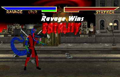
Ravage wins
0
07/16/2003 06:39 PM (UTC)by
Avatar
MarktheFox
Avatar
About Me

Member Since
06/20/2003 01:46 PM (UTC)
Avatar
MaRcElunbeatable
07/14/2003 06:48 PM (UTC)
0
If you think its crappy why do you even bother to post it? anyways the fake pic is horrible, the lifebars are not even lined up, im getting tired of people always using MK2 text and putting it on the bottom of the lifebars when the stage its not even Mk2. The text RAVAGe its not the actual text from Mk3-MKT, I can't even tell you got "eaten" your sprite is very very cheesy I mean you can tell you use MS paint and started covering on the previous colors.

I think you should get a better program or put some time on your work this is not a race, neither is some1 going to punch you on the face tongue.

(Im good w/ lyrics grin)
Hmmmm, I .... don't know, lol.
Anyhow:

- Lots of mixing here. MK3 background, edited MK2 sprite with reversed MK4 lifebars with MK2 and MK3 texts.
- Those lifebars are SO not level, lol. The right one should be moved up one pixel (or the left one down one).
- Where exactly is the timer?
- A few shadows would be nice.
- The sprite edit, is odd, lol. I mean, the colours clash, red, blue, green, all in one.
- Screen has not gone dark for the fatality.
- If Stryker is dead, then why is his run meter depleted?
- The fatality idea isn't very original, it's just an eating fatality.

Good things:
+ Well, the sprite edit, is, so so, as I said, it's just kinda boring and clashy with the colours, but I guess it isn't that bad.
+ Nice to see you trying something new.

Just try not to mix stuff up, and make sure to include everything above.

Check out ]ombat's thread, which is a sticky at the top of this forum, read everything, and just include and take not of it all.
That thread can be found here.
Avatar
~Crow~
07/15/2003 12:18 AM (UTC)
0
Ok, well, its nothing special, just an edited 'eat' fatality. Fairly simple, though the sprite isn't... too bad I guess. The colors were done nicely by themselves, but as a whole they really clash pretty badly. Outfit is too simple also, looks just like Ermac's suit to me.

You did alot of mixing as it was pointed out, its not difficult to keep everything from the same game, the warehouse has all of that sort of stuff from each game. Again, the quality is bad, look at Ravage's lifebar, its very blurry looking to me. Also, as you know, the lifebars are FAR out of line.

I see no blood at all here, ot at least some sort of saliva from Ravage would have a nice addition. Shadows would be nice, as would the dimming effect. And in my opinion, the fatality isn't complete yet so the texts are needed. Just follow the link above, all of our ideas are collected there for east access.
Avatar
Zentile
07/16/2003 06:39 PM (UTC)
0
I like the combination of colors on the sprite, though it could use work smile
I like how you reversed the lifebars. It makes them look...kinda cooler.
The Fatality is Ok, it's not very original, but you pulled it off nicely.
keep up the good work, and try to improve, you can do much better than this smile
Pages: 1
Download on the App StoreGet it on Google Play
© 1998-2024 Shadow Knight Media, LLC. All rights reserved. Read our Privacy Policy.
Mortal Kombat, the dragon logo and all character names are trademarks and copyright of Warner Bros. Entertainment Inc.