
Sub-Zero And Frost
Fan Kreations
Pages: 1
Sub-Zero And Frost
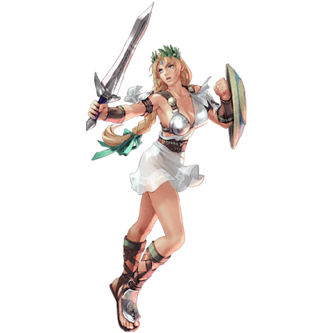
Thought this forum should have something new to look at. This is a character sketch of Frost and Sub-Zero (Kuai Liang) in what they look like for a story I have in mind that's supposed to show the events AFTER Mortal Kombat 2011.
I felt that Frost should be a student at the Lin Kuei that escaped after her friend helped her out with the cyborgs that were hunting down the surviving Lin Kuei. (Of course, her friend wouldn't make it out). She stumbles upon Raiden, Cage, and Sonya and helps join them.
Along the way, (And I'm still working on how this would work) Sub-Zero would become alive again and become human by taking his cyborg suit off. I felt that the suit should be infused with his body, such as how Raiden is in Metal Gear Solid 4, so parts of his suit would remain intact while most of it would come off.
This is, of course, a work in progress that's slowly getting done. (With school and working with Flash, I'm kinda doing a heck of a lot of things at once, this is just a side-story for when I really have nothing else to do for the moment)
Enjoy.

About Me

0
I think frost looks very cool except the strap across her chest.
Sub-Zero's face makes him look mentally retarded. I'm not a fan of his ninja turtle-esque toes. His heal looks weird. The teal color worked for frost but not Sub-Zero.
Though your (one of) your designs I am not a fan of, that is not to say you can't draw well. Much better than I could ever dream of.


Taking your discriminatory/selective reading into consideration, I'll try to make this as concise as possible seeing as how you probably won't read it in the first place.
I'm finding it increasingly difficult to believe that you're an art major given the shoddy workmanship involved in each and every one of your pieces. You claim that these are works-in-progress, yet, even in their current state, they look eerily similar to some of your previous finished products.
The anatomy is elementary at best, particularly in regards to the cheap Metal Gear Solid Raiden knockoff that you're calling Sub-Zero. By the way, Sub-Zero didn't have that scar before being transformed to a cybernetic ninja. He bore that only after fleeing from the Lin Kuei in an effort to avoid being transformed into a cyborg. Moving on, the scrawny neck on his shoulders should definitely be quite a bit thicker given the size of his bulbous noggin. The muscle tone on his arms and thighs is passable, but everything else could definitely use some touching up in terms of shading/highlighting to avoid looking so flat.
Frost looks quite a bit more appealing than her male companion. The position of her right hand looks goofy, like her wrist has been replaced by a thick rubber hose. The pose isn't the least bit realistic. No one could stand comfortably with their legs in that position while twisting their torso in a completely different direction. As I mentioned with Sub-Zero, everything appears a bit too flat and I know that you're claiming that this is a work-in-progress, but I've recognized that an almost complete lack of shading has been a staple of your previous work, so, as an established artist, I suggest that you focus on perfecting proper shading techniques.
Final verdict: 4/10. Overall, this piece isn't the worst that I've seen, but I wouldn't say that it's above-average, either. Ignore my critique if you must. Just remember that I'm here to help you recognize your faults and hope that you're open-minded enough to accept and take into consideration my honest and constructive criticism. In the end, whatever you decide to do affects only you. That is all.
blacksaibot Wrote:
I think frost looks very cool except the strap across her chest.
I think frost looks very cool except the strap across her chest.
I can always get rid of it if it needs to be. Of course, I can also fix it to make it look better. It's not a definite this could be her outfit that I had in mind (I did have one where she was in a one-piece wearing a trench coat).
blacksaibot Wrote:
Sub-Zero's face makes him look mentally retarded. I'm not a fan of his ninja turtle-esque toes. His heal looks weird. The teal color worked for frost but not Sub-Zero.
Sub-Zero's face makes him look mentally retarded. I'm not a fan of his ninja turtle-esque toes. His heal looks weird. The teal color worked for frost but not Sub-Zero.
Yeah, I didn't like the way his face turned out either. That too can always get fixed. He did have somewhat of that kind of concept for his feet, but I chose to make it stand out a little bit more than what it did in the game.
Also, I'm aware that I didn't go for the same color in the game, however, like I said. That can always be changed.
blacksaibot Wrote:
Though your (one of) your designs I am not a fan of, that is not to say you can't draw well. Much better than I could ever dream of.
Though your (one of) your designs I am not a fan of, that is not to say you can't draw well. Much better than I could ever dream of.
Meh, it's okay, you're not always gonna like everything and I don't expect everyone too.
VenoMark Wrote:
Taking your discriminatory/selective reading into consideration, I'll try to make this as concise as possible seeing as how you probably won't read it in the first place.
Taking your discriminatory/selective reading into consideration, I'll try to make this as concise as possible seeing as how you probably won't read it in the first place.
Given that you think I'm not going to take you seriously since I normally don't, when it comes to art I make an exception... That is if it's nothing but insults...
VenoMark Wrote:
TI'm finding it increasingly difficult to believe that you're an art major given the shoddy workmanship involved in each and every one of your pieces. You claim that these are works-in-progress, yet, even in their current state, they look eerily similar to some of your previous finished products.
TI'm finding it increasingly difficult to believe that you're an art major given the shoddy workmanship involved in each and every one of your pieces. You claim that these are works-in-progress, yet, even in their current state, they look eerily similar to some of your previous finished products.
... This is something I'm going to take personally as an insult because I find it that you're mocking my abilities just because I haven't been able to "please" you, although I'm finding it oh-so-easy to realize that it'll never happen. I'm still a student, learning to get better and better day by day, I'm not going to be as perfect as Aculeus or Jax007 in a heart beat. I haven't taken a Photoshop class or any kind of class like that, so coloring isn't my strongest and I'm fully, FULLY aware of that.
I'm even redoing my entire art site because I've improved since last year, and majority of my original characters have been drawn a year ago.
Let me give you a little explanation of what this thread really is... It's feedback thread, whenever I post works of art in these kinds of threads, it's to get feedback so I can go back and work on whatever isn't working with those who have seen this and given their two cents. I'm not going to submit works onto this site unless I truly feel that I did my best. I know I didn't do my best with this work because it's not done, it's an idea, an idea that I'd like to get feed back on.
Lastly, all of those works in my profile on this site were created long ago, and I've improved a lot since then, even if you don't think I have.
VenoMark Wrote:
TThe anatomy is elementary at best, particularly in regards to the cheap Metal Gear Solid Raiden knockoff that you're calling Sub-Zero. By the way, Sub-Zero didn't have that scar before being transformed to a cybernetic ninja. He bore that only after fleeing from the Lin Kuei in an effort to avoid being transformed into a cyborg. Moving on, the scrawny neck on his shoulders should definitely be quite a bit thicker given the size of his bulbous noggin. The muscle tone on his arms and thighs is passable, but everything else could definitely use some touching up in terms of shading/highlighting to avoid looking so flat.
TThe anatomy is elementary at best, particularly in regards to the cheap Metal Gear Solid Raiden knockoff that you're calling Sub-Zero. By the way, Sub-Zero didn't have that scar before being transformed to a cybernetic ninja. He bore that only after fleeing from the Lin Kuei in an effort to avoid being transformed into a cyborg. Moving on, the scrawny neck on his shoulders should definitely be quite a bit thicker given the size of his bulbous noggin. The muscle tone on his arms and thighs is passable, but everything else could definitely use some touching up in terms of shading/highlighting to avoid looking so flat.
Not sure what is so elementary about the anatomy, sure Sub-Zero's torso might look a bit small, but that can always be fixed.
The scar was more so to represent a piece of his suit that was taken off.
I gave him a long neck that can also be fixed.
I can always go back and shade parts that needs to be shaded.
VenoMark Wrote:
TFrost looks quite a bit more appealing than her male companion. The position of her right hand looks goofy, like her wrist has been replaced by a thick rubber hose. The pose isn't the least bit realistic. No one could stand comfortably with their legs in that position while twisting their torso in a completely different direction. As I mentioned with Sub-Zero, everything appears a bit too flat and I know that you're claiming that this is a work-in-progress, but I've recognized that an almost complete lack of shading has been a staple of your previous work, so, as an established artist, I suggest that you focus on perfecting proper shading techniques.
TFrost looks quite a bit more appealing than her male companion. The position of her right hand looks goofy, like her wrist has been replaced by a thick rubber hose. The pose isn't the least bit realistic. No one could stand comfortably with their legs in that position while twisting their torso in a completely different direction. As I mentioned with Sub-Zero, everything appears a bit too flat and I know that you're claiming that this is a work-in-progress, but I've recognized that an almost complete lack of shading has been a staple of your previous work, so, as an established artist, I suggest that you focus on perfecting proper shading techniques.
Frost's hands are supposed to have ice surround them, and since this isn't a finished project, I will go back to it and make her look what I intended on having.
I also drew Frost's pose by looking as myself in the mirror. I myself gave her a pose that I did in front of a mirror. It's not that uncomfortable.
And as I said earlier, I will go back and give them shade.
VenoMark Wrote:
TFinal verdict: 4/10. Overall, this piece isn't the worst that I've seen, but I wouldn't say that it's above-average, either. Ignore my critique if you must. Just remember that I'm here to help you recognize your faults and hope that you're open-minded enough to accept and take into consideration my honest and constructive criticism. In the end, whatever you decide to do affects only you. That is all.
TFinal verdict: 4/10. Overall, this piece isn't the worst that I've seen, but I wouldn't say that it's above-average, either. Ignore my critique if you must. Just remember that I'm here to help you recognize your faults and hope that you're open-minded enough to accept and take into consideration my honest and constructive criticism. In the end, whatever you decide to do affects only you. That is all.
See, now that's something I'm not liking. Just becuase you and I don't really agree on pretty much everything, it's not like I'm going to ignore you when it comes to critiquing my work. However, depending on the attitude and the way you write the critique is something I'll take or ignore,. Insult me and I'll just forget you, actually give help is something I'll take. Either way, a critique is a critique and it's much appreciated, whether or not you think I've appreciated it.
I'll admit that the derogatory comment aimed at your level of artistic education was unnecessary.
At any rate, if you're going to go through the trouble of adding scars to Sub-Zero's face, at least go a more sensible route and give him a few more while also making them appear less distinct. Not only would it add a bit realism in terms of how much physical damage he suffered during the mask removal procedure, but it would allow for more definitive diversity between post-cyborg Sub-Zero and MK3 Sub-Zero. The fact that his scar looks exactly as it did and is in exactly the same place as it was in MK3 led to the related criticism.
The comment regarding Sub-Zero's anatomy was more in regards to his jaw (or seemingly a lack thereof), neck, the length of his thighs in comparison to his shins (they should be of the same length), the unrealistic curvature given to his left foot and the fact that his right foot is undersized, a complete lack of knuckle structure on each hand, and the overall position and appearance of both hands and their attached fingers.
Now that I realize that you're completely capable of waiving any and all pre-conceived notions, at least when it comes to my assessment of your artwork, I'll make a more diligent effort to avoid making derisive remarks. I just hope that you're as willing to make an attempt to disregard our past disputes both inside and outside the FanSub forum.


0
After months and months of anticipation, this was Veno's expression after seeing IceBaby's fresh new thread in the MKO fan art forum:

So he got behind his crusty keyboard and put his drooling face up to the monitor. He sat like that for a whole minute, just staring at the thread title, mouth watering and eyes rolling up ever so slightly in excitement. Even before clicking the post open he knew what he was going to say to IceBaby. His response, already formulated in his head before seeing the art. This was his chance to shine.
So he got behind his crusty keyboard and put his drooling face up to the monitor. He sat like that for a whole minute, just staring at the thread title, mouth watering and eyes rolling up ever so slightly in excitement. Even before clicking the post open he knew what he was going to say to IceBaby. His response, already formulated in his head before seeing the art. This was his chance to shine.
UltimateRyu Wrote:
After months and months of anticipation, this was Veno's expression after seeing IceBaby's fresh new thread in the MKO fan art forum:
So he got behind his crusty keyboard and put his drooling face up to the monitor. He sat like that for a whole minute, just staring at the thread title, mouth watering and eyes rolling up ever so slightly in excitement. Even before clicking the post open he knew what he was going to say to IceBaby. His response, already formulated in his head before seeing the art. This was his chance to shine.
This coming from a guy who meticulously inspects each and every thread in this area of the site, eagerly anticipating my involvement so that he can gratify some disturbing desire. Your lone role at this site is to play the part of the insignificant, envious hater--troll, if you must. I get that. You possess no respectable talents, so you figure that harassing me is going to earn you some diminutive level of respect, no matter how childish and insecure you prove to be.
At least I'm contributing advice and constructive criticism in spite of how harsh it may be at times. My stance has been steadfast since I first registered at this site, and that is to be a respected, supportive, and effective artist and critic in a number of art forms. Seeing as how I've practiced nearly all existing art forms, I'm confident that my opinion is going to be beneficial to whomever appears to require an experienced artist's judgment. What I possess is healthy self-confidence. Though, I wouldn't expect you to know what that feels like.
Keep digging that hole deeper. You'll bury yourself eventually.
Hey, whatever kind of hatefest you guys got going on between you two, keep it out of my thread. If you have anything to contribute to my work, contribute, otherwise, don't post anything in here that's unrelated to the topic.
It really wasn't at all.
I've changed his scar to a tan color, I was deciding on what color I wanted to give him in the first place, but after realizing that it doesn't look right at all, I changed it to a tan color.
I've made adjustments to his face after noticing Blacksaibot's remark, and I did agree with him that it just looks plain weird. I do know that the feet are also discombobblelated so, it too will also be fixed.
My thing is, if I'm being harassed/insulted, I become defensive, doesn't matter if you're nice to me in other threads or not. That's just who I am. I am willing to move past and let bygones be bygones, I'm a forgiving person. When it comes to criticism in art forums, I take anything as constructive criticism, but not when I can tell it's just downright insultive. I don't go back and call names, I'd like to keep a certain level of maturity when it comes to art, since I do take it very, very seriously... That is if people tend to believe that I do.
So, that's pretty much it. Thanks again for the feedback.
VenoMark Wrote:
I'll admit that the derogatory comment aimed at your level of artistic education was unnecessary.
I'll admit that the derogatory comment aimed at your level of artistic education was unnecessary.
It really wasn't at all.
VenoMark Wrote:
At any rate, if you're going to go through the trouble of adding scars to Sub-Zero's face, at least go a more sensible route and give him a few more while also making them appear less distinct. Not only would it add a bit realism in terms of how much physical damage he suffered during the mask removal procedure, but it would allow for more definitive diversity between post-cyborg Sub-Zero and MK3 Sub-Zero. The fact that his scar looks exactly as it did and is in exactly the same place as it was in MK3 led to the related criticism.
At any rate, if you're going to go through the trouble of adding scars to Sub-Zero's face, at least go a more sensible route and give him a few more while also making them appear less distinct. Not only would it add a bit realism in terms of how much physical damage he suffered during the mask removal procedure, but it would allow for more definitive diversity between post-cyborg Sub-Zero and MK3 Sub-Zero. The fact that his scar looks exactly as it did and is in exactly the same place as it was in MK3 led to the related criticism.
I've changed his scar to a tan color, I was deciding on what color I wanted to give him in the first place, but after realizing that it doesn't look right at all, I changed it to a tan color.
VenoMark Wrote:
The comment regarding Sub-Zero's anatomy was more in regards to his jaw (or seemingly a lack thereof), neck, the length of his thighs in comparison to his shins (they should be of the same length), the unrealistic curvature given to his left foot and the fact that his right foot is undersized, a complete lack of knuckle structure on each hand, and the overall position and appearance of both hands and their attached fingers.
The comment regarding Sub-Zero's anatomy was more in regards to his jaw (or seemingly a lack thereof), neck, the length of his thighs in comparison to his shins (they should be of the same length), the unrealistic curvature given to his left foot and the fact that his right foot is undersized, a complete lack of knuckle structure on each hand, and the overall position and appearance of both hands and their attached fingers.
I've made adjustments to his face after noticing Blacksaibot's remark, and I did agree with him that it just looks plain weird. I do know that the feet are also discombobblelated so, it too will also be fixed.
VenoMark Wrote:
Now that I realize that you're completely capable of waiving any and all pre-conceived notions, at least when it comes to my assessment of your artwork, I'll make a more diligent effort to avoid making derisive remarks. I just hope that you're as willing to make an attempt to disregard our past disputes both inside and outside the FanSub forum.
Now that I realize that you're completely capable of waiving any and all pre-conceived notions, at least when it comes to my assessment of your artwork, I'll make a more diligent effort to avoid making derisive remarks. I just hope that you're as willing to make an attempt to disregard our past disputes both inside and outside the FanSub forum.
My thing is, if I'm being harassed/insulted, I become defensive, doesn't matter if you're nice to me in other threads or not. That's just who I am. I am willing to move past and let bygones be bygones, I'm a forgiving person. When it comes to criticism in art forums, I take anything as constructive criticism, but not when I can tell it's just downright insultive. I don't go back and call names, I'd like to keep a certain level of maturity when it comes to art, since I do take it very, very seriously... That is if people tend to believe that I do.
So, that's pretty much it. Thanks again for the feedback.


About Me
hey
0
I don't really get why we need to act like professional art critics on this forum. Really, isn't this just a place for fans of the series to submit their work that they made just because they love Mortal Kombat? I guess I can see how people would criticize absolute garbage that took no time or effort to create. But this is not garbage; clearly it did take time and effort. I don't think it's wrong to give constructive criticism, but most of what I've seen is just plain insulting. How do you people expect someone to take your advice when you're mean about it? God, it's like you people get offended when someone puts up something that you wouldn't see hanging in a museum.
I like these sketches. Sure, they're not masterpieces, but they are interesting. I think it's cool how Frost kind of looks like one of the female ninjas in Ultimate Mortal Kombat 3, yet still unique (being unmasked and having the blue strap, leggings, and of course the frozen hair). I think the bandaged leg is a nice touch as well. I'm guessing that suggesting that she was wounded while escaping the cyborgs? I think it's cool that you decided to make the primary color white instead of blue; that really differentiates it from Kitana's MK3 costume, and it fits the character too.
I guess I'll offer a little bit of criticism too, even though I don't really know what you're already took into consideration (not to mention that this is apparently a work in progress). The only real problem I have with Frost's costume is that it might be a little too light in color. Don't get me wrong, I do like the white as the primary color as I said before. I just think it would be neat if there was just a touch of darker blue on her somewhere (i.e replacing the gray areas with darker blue, or just adding a dark blue trim somewhere).
My main points to make are with the anatomy, which is pretty good, but there is still room for improvement. I noticed that Frost, compared to Sub-Zero is pretty short. Now I know that she's obviously going to be a little bit shorter naturally, but right now she's kind of being dwarfed by him. In addition, her head seems sort of large in proportion to her body. Maybe if you kept her head the same size but made her body a little bigger it would fit together nicely. Lastly, I'm looking at her right hand. It seems a little dainty (as if she's just letting it hang towards the ground). I think all you need to do to make it look better is tilt it up a little bit.
Looking at Sub-zero, he seems like a little more of a mixed bag. I like the fact that you returned his scar. So maybe it doesn't have an explanation yet, but it is a staple for his character. I think your idea of having it as a result from the cybernetics being removed is good enough. I think it's an interesting idea to keep some cybernetics on him.
My criticisms on Sub-Zero actually lie more in the costume. I think the lighter color scheme worked for Frost, but I don't think it works so well with Sub-Zero. I'm just used to seeing some black and darker blue on him; his color scheme was much more a part of his character. I also much prefer seeing him with black hair (although it did start turning white around Deadly Alliance). Lastly, there's that mouth thing. I'm sorry, but I can't really tell what that is (seriously, no offence intended); a gray beard? A remnant of his Cyber suit? Regardless, I think he'd look better if you could see his mouth (like in MK3 or Deadly Alliance, primary). In short, if you darkened the outfit, added more deep shades of blue, changed his hair black, and got rid of the mouth thing, he'd look pretty great imo.
Now I will say that the anatomy isn't perfect on Sub-Zero either, but I think it's just a few trivial things. Someone already mentioned that his torso looks a bit short. That is true, but it shouldn't be too hard to fix; just make it longer. The only other thing that bothers me is his feet. It kind of looks like his right heel is separate from the rest of his foot, as if he was wearing high heels or something. All in all, the anatomy is solid and just needs a few tweaks here and there.
I know it seems like I criticized your sketches a lot, but I really do like them, I'm just sort of nit-picky. Your work is definitely improving, and it's always nice to see new original takes on characters, especially characters like Frost who only appeared in a few games (and only had one good costume, her primary, imo). Honestly, I'd rather see more original takes on characters, even if they're not quite perfect, then tons of depictions that look exactly like they did in one of the games, even if they're expertly drawn. Keep it up, and I fully believe you'll become as good as Jax007 or those other awesome MK artists.
About Me
FB: Trans4Materia Card Game I invented "Circling Vulture, Laughing Hyena"
True story, it happened to a friend of a friend of mine... EVERYBODY!
0
Her hair seems dull, maybe it should match her neon lips. The eyeliner is too thick. Her right leg is positioned unnaturally, it wouldn't look so weird if her foot was turned out. I like the ribbon/straps across her torso.
Other than that, Frost is hot.
I can see influence from Smoke on the Sub-Zero. He looks a bit mangled.
I like the metal plate on his lower jaw.
Ka-Tra
Other than that, Frost is hot.
I can see influence from Smoke on the Sub-Zero. He looks a bit mangled.
I like the metal plate on his lower jaw.
Ka-Tra
johnny1up Wrote:
I don't really get why we need to act like professional art critics on this forum. Really, isn't this just a place for fans of the series to submit their work that they made just because they love Mortal Kombat? I guess I can see how people would criticize absolute garbage that took no time or effort to create. But this is not garbage; clearly it did take time and effort. I don't think it's wrong to give constructive criticism, but most of what I've seen is just plain insulting. How do you people expect someone to take your advice when you're mean about it? God, it's like you people get offended when someone puts up something that you wouldn't see hanging in a museum.
I don't really get why we need to act like professional art critics on this forum. Really, isn't this just a place for fans of the series to submit their work that they made just because they love Mortal Kombat? I guess I can see how people would criticize absolute garbage that took no time or effort to create. But this is not garbage; clearly it did take time and effort. I don't think it's wrong to give constructive criticism, but most of what I've seen is just plain insulting. How do you people expect someone to take your advice when you're mean about it? God, it's like you people get offended when someone puts up something that you wouldn't see hanging in a museum.
What I don't get is why people like you need to blatantly ignore certain segments of conversation to suit your senseless rambling. What's more is people like you also have a propensity to contradict yourself. I admitted my wrong, maintained that I will make an effort to be less disparaging, and, by the looks of it, Icebaby and I have set aside our differences. You shouldn't make blind and unfounded accusations based on what your selective reading chooses to grasp. Learn to read everything before you criticize someone and, in the end, you'll come out looking a lot less obtuse and your entire outlook won't appear so biased and unnecessary. That is all.
mwgrant0 Wrote:
I REALLY like it, Frost isn't a cheap female ninja knock-off and Sub-Zero needs a wardrobe change. Oh a mask, crotch flap, jumpsuit thing how creative Sub-Zero
I REALLY like it, Frost isn't a cheap female ninja knock-off and Sub-Zero needs a wardrobe change. Oh a mask, crotch flap, jumpsuit thing how creative Sub-Zero
I refuse to accept people to say that Frost is a clone to Sub-Zero, that's why I didn't want to draw her anywhere near a clone. Sub-Zero needed a new look, yeap, I don't want to constantly have him look like the same old same old, despite that I do like some of his outfits. I just thought that since i was such a huge fan of the cyber part of him, I thought that maybe he could still have those kinds of parts while still being the Sub-Zero that we all know and love.
johnny1up Wrote:
I don't really get why we need to act like professional art critics on this forum. Really, isn't this just a place for fans of the series to submit their work that they made just because they love Mortal Kombat? I guess I can see how people would criticize absolute garbage that took no time or effort to create. But this is not garbage; clearly it did take time and effort. I don't think it's wrong to give constructive criticism, but most of what I've seen is just plain insulting. How do you people expect someone to take your advice when you're mean about it? God, it's like you people get offended when someone puts up something that you wouldn't see hanging in a museum.
I don't really get why we need to act like professional art critics on this forum. Really, isn't this just a place for fans of the series to submit their work that they made just because they love Mortal Kombat? I guess I can see how people would criticize absolute garbage that took no time or effort to create. But this is not garbage; clearly it did take time and effort. I don't think it's wrong to give constructive criticism, but most of what I've seen is just plain insulting. How do you people expect someone to take your advice when you're mean about it? God, it's like you people get offended when someone puts up something that you wouldn't see hanging in a museum.
I really agree with this. I mean I really do. There comes a time where professional remarks are needed when other times, they're not. As I stated before, this thread is mainly for feedback on ways to improve so that when I actually DO submit the real thing, it shows that I take the time to work in all of the critiques as well as show that I'm not that kind of artist that just wants the feedback and not do a single thing with them and be cocky with it.
Also, despite that I make a mentioning about it later on in this post, I did go on about how a particular critique felt very insulting. I don't tolerate ANY kind of criticism that requires the person to make an insulting comment whether or not it's because they like the person. That's rude, because it gives me a chance to feel like if I can sit here and post my work, and you have the audacity to mock me, put up or shut up. And I don't feel like I should have to say something like that because A.) I don't like causing fights when it comes to art and B.) The person could obviously put me up.
I refuse to take any kind of advice that's being said or look like it's being used in a negative manner. I just say "Kay thanks for the input," because it's not worth any of my time to deal with immaturity or rude remarks...
johnny1up Wrote:
I like these sketches. Sure, they're not masterpieces, but they are interesting. I think it's cool how Frost kind of looks like one of the female ninjas in Ultimate Mortal Kombat 3, yet still unique (being unmasked and having the blue strap, leggings, and of course the frozen hair). I think the bandaged leg is a nice touch as well. I'm guessing that suggesting that she was wounded while escaping the cyborgs? I think it's cool that you decided to make the primary color white instead of blue; that really differentiates it from Kitana's MK3 costume, and it fits the character too.
I like these sketches. Sure, they're not masterpieces, but they are interesting. I think it's cool how Frost kind of looks like one of the female ninjas in Ultimate Mortal Kombat 3, yet still unique (being unmasked and having the blue strap, leggings, and of course the frozen hair). I think the bandaged leg is a nice touch as well. I'm guessing that suggesting that she was wounded while escaping the cyborgs? I think it's cool that you decided to make the primary color white instead of blue; that really differentiates it from Kitana's MK3 costume, and it fits the character too.
The story goes with Frost's bandages was both the story I had in mind, as well as that blue strap that she had in Deadly Alliance. Kinda kept some features from her previous look in this costume to actually give the audience a chance to realize that it is, indeed, Frost.
The bandages are supposed to represent her escape from the cyborgs. There's supposed to be a tie up between her and another frozen-like cyborg that she faces and gets wounded in the fight, and of course she is saved by her friend (who of course, loses his life while saving her)
I was trying more to change her outfit from what I drawn previously. I had her in a one-piece suit with a trench coat, but I decided to give her a few changes to it becuase basically it was her secondary costume from Deadly Alliance without the loin cloth hanging between her legs. I also thought that she didn't need to be blue to represent that she uses the powers of ice. Ice doesn't really have a particular color, it's mainly clear... White was the blandest color that would fit perfectly with her so I gave her that, with a little bit of blue here and there.
johnny1up Wrote:
I guess I'll offer a little bit of criticism too, even though I don't really know what you're already took into consideration (not to mention that this is apparently a work in progress). The only real problem I have with Frost's costume is that it might be a little too light in color. Don't get me wrong, I do like the white as the primary color as I said before. I just think it would be neat if there was just a touch of darker blue on her somewhere (i.e replacing the gray areas with darker blue, or just adding a dark blue trim somewhere).
I guess I'll offer a little bit of criticism too, even though I don't really know what you're already took into consideration (not to mention that this is apparently a work in progress). The only real problem I have with Frost's costume is that it might be a little too light in color. Don't get me wrong, I do like the white as the primary color as I said before. I just think it would be neat if there was just a touch of darker blue on her somewhere (i.e replacing the gray areas with darker blue, or just adding a dark blue trim somewhere).
I could see where lightness is a problem, I mean the only costume in 2011 was actually Mileena's and it suited fine. I don't think we had an all-white costume for a character, so maybe it's a bit strange to see lightness come into play. I can always toy around with the colors if I need to (depending if I really do like the lightness or not) to see what happens. But I don't think it would hurt to darken her up a bit.
johnny1up Wrote:
My main points to make are with the anatomy, which is pretty good, but there is still room for improvement. I noticed that Frost, compared to Sub-Zero is pretty short. Now I know that she's obviously going to be a little bit shorter naturally, but right now she's kind of being dwarfed by him. In addition, her head seems sort of large in proportion to her body. Maybe if you kept her head the same size but made her body a little bigger it would fit together nicely. Lastly, I'm looking at her right hand. It seems a little dainty (as if she's just letting it hang towards the ground). I think all you need to do to make it look better is tilt it up a little bit.
My main points to make are with the anatomy, which is pretty good, but there is still room for improvement. I noticed that Frost, compared to Sub-Zero is pretty short. Now I know that she's obviously going to be a little bit shorter naturally, but right now she's kind of being dwarfed by him. In addition, her head seems sort of large in proportion to her body. Maybe if you kept her head the same size but made her body a little bigger it would fit together nicely. Lastly, I'm looking at her right hand. It seems a little dainty (as if she's just letting it hang towards the ground). I think all you need to do to make it look better is tilt it up a little bit.
To be honest, in the strategy guide book for Deadly Alliance, it has her listed as 5'4 (I believe, I lost obviously) but she was the shortest character in the entire game. I was aiming more towards that. I am working on how to make shorter characters appear better rather than looking like a dwarf. I mean I have another comic in the making that has the male character towering over the female character, and every time I draw them, I somehow make her look really small, even her face compared to his looks really tiny and I have no idea why this is a problem with me.
With her hands, I did mention that she was supposed to do something with her powers, I haven't gotten there yet, but I'll see what it looks like when I put in her moves. If it still looks like the same, I'll go back and change it.
johnny1up Wrote:
Looking at Sub-zero, he seems like a little more of a mixed bag. I like the fact that you returned his scar. So maybe it doesn't have an explanation yet, but it is a staple for his character. I think your idea of having it as a result from the cybernetics being removed is good enough. I think it's an interesting idea to keep some cybernetics on him.
Looking at Sub-zero, he seems like a little more of a mixed bag. I like the fact that you returned his scar. So maybe it doesn't have an explanation yet, but it is a staple for his character. I think your idea of having it as a result from the cybernetics being removed is good enough. I think it's an interesting idea to keep some cybernetics on him.
I thought that giving him his scar would represent the metal parts of his mask coming off and leaving a trail behind. Although I retouched the color becuase it looked too out there compared to the rest of his outfit. I mean the red scar is a signature of his, but the way I designed it, it just seemed too out of place. I decided to make it look like a healed scar in a way, so it's a bit tanned.
johnny1up Wrote:
My criticisms on Sub-Zero actually lie more in the costume. I think the lighter color scheme worked for Frost, but I don't think it works so well with Sub-Zero. I'm just used to seeing some black and darker blue on him; his color scheme was much more a part of his character. I also much prefer seeing him with black hair (although it did start turning white around Deadly Alliance). Lastly, there's that mouth thing. I'm sorry, but I can't really tell what that is (seriously, no offence intended); a gray beard? A remnant of his Cyber suit? Regardless, I think he'd look better if you could see his mouth (like in MK3 or Deadly Alliance, primary). In short, if you darkened the outfit, added more deep shades of blue, changed his hair black, and got rid of the mouth thing, he'd look pretty great imo.
My criticisms on Sub-Zero actually lie more in the costume. I think the lighter color scheme worked for Frost, but I don't think it works so well with Sub-Zero. I'm just used to seeing some black and darker blue on him; his color scheme was much more a part of his character. I also much prefer seeing him with black hair (although it did start turning white around Deadly Alliance). Lastly, there's that mouth thing. I'm sorry, but I can't really tell what that is (seriously, no offence intended); a gray beard? A remnant of his Cyber suit? Regardless, I think he'd look better if you could see his mouth (like in MK3 or Deadly Alliance, primary). In short, if you darkened the outfit, added more deep shades of blue, changed his hair black, and got rid of the mouth thing, he'd look pretty great imo.
I gave him more of his Cyborg color and lightened it up by the process of him becoming human again, like his colors had faded some how. I wanted to show off kind of a faded look towards him, although I did went back to darken the blue colors.
I wasn't sure what Kuai Liang's hair looks like underneath. I gave him more of a white-hair look because I figured whenever something is undead they have white/gray hair. I mean I know that he wouldn't be undead for that long, but, again, something I'm toying around with.
With his mouth, I was trying to do the Raiden look, on how his lips looked more like it was a skull-like feature that was on his face. Of course since the face is too tiny to actually show it better, it probably does look a bit weird, as well as looking kind of really shitty. I can get rid of it after the finish touchings if it's really not being liked that much.
johnny1up Wrote:
Now I will say that the anatomy isn't perfect on Sub-Zero either, but I think it's just a few trivial things. Someone already mentioned that his torso looks a bit short. That is true, but it shouldn't be too hard to fix; just make it longer. The only other thing that bothers me is his feet. It kind of looks like his right heel is separate from the rest of his foot, as if he was wearing high heels or something. All in all, the anatomy is solid and just needs a few tweaks here and there.
Now I will say that the anatomy isn't perfect on Sub-Zero either, but I think it's just a few trivial things. Someone already mentioned that his torso looks a bit short. That is true, but it shouldn't be too hard to fix; just make it longer. The only other thing that bothers me is his feet. It kind of looks like his right heel is separate from the rest of his foot, as if he was wearing high heels or something. All in all, the anatomy is solid and just needs a few tweaks here and there.
I did, I thought that I made his pects a bit short, and yes, feet are sometimes tricky for me when it comes to actually drawing feet rather than shoes, but that can always be fixed as well and it shouldn't be that hard.
johnny1up Wrote:
know it seems like I criticized your sketches a lot, but I really do like them, I'm just sort of nit-picky. Your work is definitely improving, and it's always nice to see new original takes on characters, especially characters like Frost who only appeared in a few games (and only had one good costume, her primary, imo). Honestly, I'd rather see more original takes on characters, even if they're not quite perfect, then tons of depictions that look exactly like they did in one of the games, even if they're expertly drawn. Keep it up, and I fully believe you'll become as good as Jax007 or those other awesome MK artists.
know it seems like I criticized your sketches a lot, but I really do like them, I'm just sort of nit-picky. Your work is definitely improving, and it's always nice to see new original takes on characters, especially characters like Frost who only appeared in a few games (and only had one good costume, her primary, imo). Honestly, I'd rather see more original takes on characters, even if they're not quite perfect, then tons of depictions that look exactly like they did in one of the games, even if they're expertly drawn. Keep it up, and I fully believe you'll become as good as Jax007 or those other awesome MK artists.
Don't worry, I appreciate a lot of nit-pickings because those are the kinds of critiques I like to read more than actually saying, "your work is great." I've seen a lot of improvements from the last time I've submitted stuff here to what I can do now. It's tough to really bring out a lot of what I can really do to something that isn't mine and of course it's going to take time to perfect everything that I draw, however, it's still no excuse to submit great work. I just have to continue working on the flaws that people see and get better with them rather than just take it and ignore it. That's certainly not how I work.
So yes, I'll eventually become really awesome with what I do, it's just I'm the kind of artist that takes her time rather than rush everything to perfection. Just like how I am at school.
Tetra_Vega Wrote:
Her hair seems dull, maybe it should match her neon lips. The eyeliner is too thick. Her right leg is positioned unnaturally, it wouldn't look so weird if her foot was turned out. I like the ribbon/straps across her torso.
Other than that, Frost is hot.
I can see influence from Smoke on the Sub-Zero. He looks a bit mangled.
I like the metal plate on his lower jaw.
Ka-Tra
I've redrawn her leg to make it more realistic since this is more than once this flaw is being said.
I tried not to give Frost her exact hair from Deadly Alliance, I tried something else. I was more messing around with spikey hair while also not making it completely spikey. I really didn't like how it looked in the game at times. But thanks for letting me know she's hot!
I've also added more metal to Sub-Zero's face to NOT make it look like a cheap knock off towards Raiden. I mean that's literally Raiden's mouth that I made.
VenoMark Wrote:
What I don't get is why people like you need to blatantly ignore certain segments of conversation to suit your senseless rambling. What's more is people like you also have a propensity to contradict yourself. I admitted my wrong, maintained that I will make an effort to be less disparaging, and, by the looks of it, Icebaby and I have set aside our differences. You shouldn't make blind and unfounded accusations based on what your selective reading chooses to grasp. Learn to read everything before you criticize someone and, in the end, you'll come out looking a lot less obtuse and your entire outlook won't appear so biased and unnecessary. That is all.
johnny1up Wrote:
I don't really get why we need to act like professional art critics on this forum. Really, isn't this just a place for fans of the series to submit their work that they made just because they love Mortal Kombat? I guess I can see how people would criticize absolute garbage that took no time or effort to create. But this is not garbage; clearly it did take time and effort. I don't think it's wrong to give constructive criticism, but most of what I've seen is just plain insulting. How do you people expect someone to take your advice when you're mean about it? God, it's like you people get offended when someone puts up something that you wouldn't see hanging in a museum.
I don't really get why we need to act like professional art critics on this forum. Really, isn't this just a place for fans of the series to submit their work that they made just because they love Mortal Kombat? I guess I can see how people would criticize absolute garbage that took no time or effort to create. But this is not garbage; clearly it did take time and effort. I don't think it's wrong to give constructive criticism, but most of what I've seen is just plain insulting. How do you people expect someone to take your advice when you're mean about it? God, it's like you people get offended when someone puts up something that you wouldn't see hanging in a museum.
What I don't get is why people like you need to blatantly ignore certain segments of conversation to suit your senseless rambling. What's more is people like you also have a propensity to contradict yourself. I admitted my wrong, maintained that I will make an effort to be less disparaging, and, by the looks of it, Icebaby and I have set aside our differences. You shouldn't make blind and unfounded accusations based on what your selective reading chooses to grasp. Learn to read everything before you criticize someone and, in the end, you'll come out looking a lot less obtuse and your entire outlook won't appear so biased and unnecessary. That is all.
But you know, Johnny has a point. After all, this is supposed to be fan art, it's not like this is going to be hung in a museum or whatever. If the guy didn't read all of the comments, so what. He's got the right to make a statement, even if it's directly pointed about what's in here, it's still good to take it underneath a wing for future critiques. There's no need to jump down people's throats.
Icebaby Wrote:
But you know, Johnny has a point. After all, this is supposed to be fan art, it's not like this is going to be hung in a museum or whatever. If the guy didn't read all of the comments, so what. He's got the right to make a statement, even if it's directly pointed about what's in here, it's still good to take it underneath a wing for future critiques. There's no need to jump down people's throats.
But you know, Johnny has a point. After all, this is supposed to be fan art, it's not like this is going to be hung in a museum or whatever. If the guy didn't read all of the comments, so what. He's got the right to make a statement, even if it's directly pointed about what's in here, it's still good to take it underneath a wing for future critiques. There's no need to jump down people's throats.
What the users who weren't around five-plus years ago don't realize is that harsh criticism was a staple in this area of the site and actually persuaded a great majority of artists to better themselves. Admittedly, it did tend to weed out the mentally delicate types, but the ratio of the insecure to the determined types leaned decisively toward the latter.
johnny1up doesn't need to act as a savior of sorts, because everyone is entirely capable of defending themselves. As everyone is capable of defending themselves, I am completely capable of altering the way that I review artwork to suit the current state of this forum while not losing sight of my individuality.
I understand that this is fan art, but there have been a handful of artists who've made a living as a result of perfecting their individual skill sets, and I'd like to think that honest criticism, no matter how harsh, has had a helping hand in that. As such, fan art should not be relegated for any reason. I'm not saying that I'm personally responsible for jump-starting any artist's career, but I'll be bold and say that I played a major role in reforming the way that users assessed artwork. There is, of course, some negativity involved with that, but as with everything else in life, you take the good with the bad.
This is merely speculation, but I don't believe that anyone submits artwork with the exclusive intent to receive praise. Moreover, I believe that artists submit their work to receive advice and criticism. In the same light, one should be prepared to receive the occasional harsh assessment. It's the prerogative of the artist to sift through the off-putting remarks and take note of the substance, the constructive material. That is all.
0
VenoMark Wrote:
That is all.
That is all.
Aren't you the least bit excited that a new entry in the Legacy of Kain series is in development for next gen platforms?
VenoMark Wrote:
What the users who weren't around five-plus years ago don't realize is that harsh criticism was a staple in this area of the site and actually persuaded a great majority of artists to better themselves. Admittedly, it did tend to weed out the mentally delicate types, but the ratio of the insecure to the determined types leaned decisively toward the latter.
What the users who weren't around five-plus years ago don't realize is that harsh criticism was a staple in this area of the site and actually persuaded a great majority of artists to better themselves. Admittedly, it did tend to weed out the mentally delicate types, but the ratio of the insecure to the determined types leaned decisively toward the latter.
I'm not going to try to make this sound like a vent, but I find that kind of rude to be honest. I understand that as an artist, you accept what you get back because if you can't accept the harsh criticism, then you shouldn't be an artist, period. I mean, I follow that and I follow it deeply. But the criticism shouldn't leave people to start wondering away from their work because one person happened to dislike it by telling them in a harsh manner their reasons why. I feel that's a bit selfish because who knows what could happen. They could forever stop drawing, and I don't know what my life would be like if I took a critique so badly that it made me stop drawing. Like I can't go for a single day without drawing something.
I get that there's harsh critiques, and I'm not going to stop people from doing that, but it shouldn't be harsh to a point where it literally stops someone from drawing. That's just downright mean.
VenoMark Wrote:
johnny1up doesn't need to act as a savior of sorts, because everyone is entirely capable of defending themselves. As everyone is capable of defending themselves, I am completely capable of altering the way that I review artwork to suit the current state of this forum while not losing sight of my individuality.
johnny1up doesn't need to act as a savior of sorts, because everyone is entirely capable of defending themselves. As everyone is capable of defending themselves, I am completely capable of altering the way that I review artwork to suit the current state of this forum while not losing sight of my individuality.
I would assume that Johnny was referring to your comments, however, he didn't necessarily called you out. But sometimes what people sees get to them and they need to make a stand, which in my books, I didn't see as a problem. You two might have a problem with how you stand in critiquing, I however, just see it has two guys who have different views on how they want to give feedback. And whether or not your critique was said in a way where you thought that I was going to lash out at you, still... It's not going to make a difference to me how people critique my work, they can be as selfish or as kind as they want and I have no problem with that becuase it IS criticism.
However, if you guys have a problem with how people critique work, I would appreciate it if it's not the main focus of this thread, thank you.
VenoMark Wrote:
I understand that this is fan art, but there have been a handful of artists who've made a living as a result of perfecting their individual skill sets, and I'd like to think that honest criticism, no matter how harsh, has had a helping hand in that. As such, fan art should not be relegated for any reason. I'm not saying that I'm personally responsible for jump-starting any artist's career, but I'll be bold and say that I played a major role in reforming the way that users assessed artwork. There is, of course, some negativity involved with that, but as with everything else in life, you take the good with the bad.
I understand that this is fan art, but there have been a handful of artists who've made a living as a result of perfecting their individual skill sets, and I'd like to think that honest criticism, no matter how harsh, has had a helping hand in that. As such, fan art should not be relegated for any reason. I'm not saying that I'm personally responsible for jump-starting any artist's career, but I'll be bold and say that I played a major role in reforming the way that users assessed artwork. There is, of course, some negativity involved with that, but as with everything else in life, you take the good with the bad.
I'm not saying that fan art should be thrown out the door for anything important, but it's not original work. The only thing original about this entire piece is that of their clothing, that's really it. These two aren't my characters that I made up, sure their stories would differ, but they didn't come from my hands. And for a person who's dream job is to work for Disney, I read something that stated that they don't want to see how great of a job I can create Mickey Mouse, they don't want to see that I can draw stuff that they draw on a regular basis. They want to see something original.
And I hear that a lot from other people who are in the art industry. They don't want to see people creating their works with their own touch to it, they want to see something that came out of their hands that they can claim. And I'm not trying to say that people shouldn't take fan submission seriously, but it's just that you guys, to me, are ordinary strangers who has a thing for art. I don't know if you guys are art teachers or work at a company that has you drawing things, I don't know. If you guys were actual employees of a company that has a thing for hiring artists, I'd be more acceptable to take this more on a serious side rather than just something to show off on what I got in the making.
VenoMark Wrote:
This is merely speculation, but I don't believe that anyone submits artwork with the exclusive intent to receive praise. Moreover, I believe that artists submit their work to receive advice and criticism. In the same light, one should be prepared to receive the occasional harsh assessment. It's the prerogative of the artist to sift through the off-putting remarks and take note of the substance, the constructive material. That is all.
This is merely speculation, but I don't believe that anyone submits artwork with the exclusive intent to receive praise. Moreover, I believe that artists submit their work to receive advice and criticism. In the same light, one should be prepared to receive the occasional harsh assessment. It's the prerogative of the artist to sift through the off-putting remarks and take note of the substance, the constructive material. That is all.
I submit stuff for feedback if they're in threads like this. Threads that I actually submit work in (to where you can actually vote) is something to show off that's finalized. Sure, majority of the work that I have actually submitted in that kind of way, hasn't been my best work. In fact, I can't really stand looking at that because I refuse to say that came out of me. But, it is what it is and I have to accept that back then, I stunk. However, a lot has improved, and that's because I've taken a lot more time to submit unfinished work to people just to see what they have to say so I can go back and work out the kinks and flaws of the picture.
I get that people take criticism to a level that some people might not like, and that's fine. Harsh criticism is fine for me, it's just when it comes down to an insulting level is where I draw the line. Because no one should insult the artist, even if they have a bad rep between each other. There's nothing that says that a critique has to be a certain way, as long as it helps the artist improve on their work is what matters to me. Whether or not people will accept the way on how I handle things, still, it's how I work.
UltimateRyu Wrote:
Aren't you the least bit excited that a new entry in the Legacy of Kain series is in development for next gen platforms?
VenoMark Wrote:
That is all.
That is all.
Aren't you the least bit excited that a new entry in the Legacy of Kain series is in development for next gen platforms?
Either give critique, or stop coming in here to post something that seems like an instigating bullshitting flame.
About Me
hey
0
I did read all the comments. And It's nice that you admitted your first comment was out of line, Veno, but that doesn't really change the fact that it was written. The nice thing about message boards, compared to actual conversation, is that there's plenty of time to think about whether or not others will take what you're about to say as an offence. More importantly, that's not really the only thing "Harsh" about your critique. Don't get me wrong, I agree with most of your actual advice; there's nothing wrong with that. But do you think the tone in which you wrote it really seems like it's coming from someone who just wants to help? It seems rather cynical in my opinion,
Whatever, it's in the past, and you say you'll find better way in the future, and I have no reason not to believe you. I'm not just singling you out here though; there's plenty of people on other threads that really tear things apart, often to unnecessary levels. Now moving on, let's watch me butcher MK Online's HTML.
I'm glad you decided to go with that change; I think this one looks much more unique and interesting. However, the trench coat idea might make an interesting secondary costume. The only concern is that it might be a little bit out of character for someone like Frost, who has usually been seen in traditional assassin clothes to wear a trench coat, a more modern and westernized article of clothing (at least as far as I know). It would look cool though; you could try experimenting with it some. But I definitely think you should stick with the design you chose for her main look. It really clicks.
I definitely think the outfit looks great with white as the main color. The teal/light blue is adequate at adding the color. If you added a bit of darker blue, I think the main benefit would be that it's something of a homage to her Deadly Alliance costume. Like you said, you could try tweaking it a bit; if it doesn't work out it's no big deal.
I actually didn't know that. It's a pretty interesting factoid. Actually, her being quite a bit shorter than Sub-Zero kind of accentuates their student-master relationship between the two. Still, I think the height difference is still a bit much; it seems like there's over a foot difference between the two. As for the "Dwarf" proportion, I'm not very good with anatomy advice. One thing I might suggest is making her head smaller in proportion to her body. Right now, it's about the same size as Sub-Zero's, while her body is much smaller. You could always look at a photograph as a reference of sorts to compare the proportions. Once you get the head-to-body ratio down, then you could try re-sizing the character (while keeping the proportions) to the height you want.
I guess I wouldn't actually know what to think of it until I saw the effect of the powers. Generally, I just tend to think of weakness when a hand is in that position, while a fist or "chop" pose seems like something more powerful. But I think you should see what it looks like once you put your effect in. It could work out very well.
I think that will look better, and more realistic. To be honest, the thick red streak across his face in MK3 wasn't the most realistic effect. Having it faded and healed up a bit will be more realistic, but still a nice homage to MK3. Also, maybe you could consider VenoMark's suggestion to add other scars on his body where he might have been damaged while the cybernetics were removed. You might not see them all since he's covered up a lot. Maybe a scar trail along his arms or even his neck? Just another thing you might try out.
So you're trying to show that he's not quite the same as he used to be, and it's reflected on his color scheme? I think it's a good idea, but I think you should definitely go ahead with the darkening of the blue.
I'm not sure I'm familiar with the idea of the undead having white hair. I guess it works all right. I do still think that this is a major difference between the game's version and your version of Sub-Zero. But maybe it will suit him better for what you have in store for him in your story.
I see what you're trying to do with the mouthpiece now that I bothered to find a picture of Raiden from Metal Gear Solid. Kind of a big difference between your version of this piece is that it seems to only cover his chin, while Raiden has his entire lower jaw covered. I'll maintain that I'm not really liking it all that much, but if you decide to keep it on, I think you should make it more like Raiden's. I usually wouldn't suggest that, but I think that's pretty much the only way to make it work.
Sounds like a plan. You could try making a slight shallow groove between the foot and the heel, not treating them like two separate parts.
That's cool with me, I'm sort of the same way myself. Really, there is no way to rush to perfection. A lot of time and effort goes into artwork no matter how fast you want to improve. It seems like you've already taken a lot of advice into consideration. Hopefully you can get a little more out of this, however trivial it may be.
Whatever, it's in the past, and you say you'll find better way in the future, and I have no reason not to believe you. I'm not just singling you out here though; there's plenty of people on other threads that really tear things apart, often to unnecessary levels. Now moving on, let's watch me butcher MK Online's HTML.
Icebaby Wrote:
I was trying more to change her outfit from what I drawn previously. I had her in a one-piece suit with a trench coat, but I decided to give her a few changes to it becuase basically it was her secondary costume from Deadly Alliance without the loin cloth hanging between her legs. I also thought that she didn't need to be blue to represent that she uses the powers of ice. Ice doesn't really have a particular color, it's mainly clear... White was the blandest color that would fit perfectly with her so I gave her that, with a little bit of blue here and there.
I was trying more to change her outfit from what I drawn previously. I had her in a one-piece suit with a trench coat, but I decided to give her a few changes to it becuase basically it was her secondary costume from Deadly Alliance without the loin cloth hanging between her legs. I also thought that she didn't need to be blue to represent that she uses the powers of ice. Ice doesn't really have a particular color, it's mainly clear... White was the blandest color that would fit perfectly with her so I gave her that, with a little bit of blue here and there.
I'm glad you decided to go with that change; I think this one looks much more unique and interesting. However, the trench coat idea might make an interesting secondary costume. The only concern is that it might be a little bit out of character for someone like Frost, who has usually been seen in traditional assassin clothes to wear a trench coat, a more modern and westernized article of clothing (at least as far as I know). It would look cool though; you could try experimenting with it some. But I definitely think you should stick with the design you chose for her main look. It really clicks.
Icebaby Wrote:
I could see where lightness is a problem, I mean the only costume in 2011 was actually Mileena's and it suited fine. I don't think we had an all-white costume for a character, so maybe it's a bit strange to see lightness come into play. I can always toy around with the colors if I need to (depending if I really do like the lightness or not) to see what happens. But I don't think it would hurt to darken her up a bit.
I could see where lightness is a problem, I mean the only costume in 2011 was actually Mileena's and it suited fine. I don't think we had an all-white costume for a character, so maybe it's a bit strange to see lightness come into play. I can always toy around with the colors if I need to (depending if I really do like the lightness or not) to see what happens. But I don't think it would hurt to darken her up a bit.
I definitely think the outfit looks great with white as the main color. The teal/light blue is adequate at adding the color. If you added a bit of darker blue, I think the main benefit would be that it's something of a homage to her Deadly Alliance costume. Like you said, you could try tweaking it a bit; if it doesn't work out it's no big deal.
Icebaby Wrote:
To be honest, in the strategy guide book for Deadly Alliance, it has her listed as 5'4 (I believe, I lost obviously) but she was the shortest character in the entire game. I was aiming more towards that. I am working on how to make shorter characters appear better rather than looking like a dwarf. I mean I have another comic in the making that has the male character towering over the female character, and every time I draw them, I somehow make her look really small, even her face compared to his looks really tiny and I have no idea why this is a problem with me.
To be honest, in the strategy guide book for Deadly Alliance, it has her listed as 5'4 (I believe, I lost obviously) but she was the shortest character in the entire game. I was aiming more towards that. I am working on how to make shorter characters appear better rather than looking like a dwarf. I mean I have another comic in the making that has the male character towering over the female character, and every time I draw them, I somehow make her look really small, even her face compared to his looks really tiny and I have no idea why this is a problem with me.
I actually didn't know that. It's a pretty interesting factoid. Actually, her being quite a bit shorter than Sub-Zero kind of accentuates their student-master relationship between the two. Still, I think the height difference is still a bit much; it seems like there's over a foot difference between the two. As for the "Dwarf" proportion, I'm not very good with anatomy advice. One thing I might suggest is making her head smaller in proportion to her body. Right now, it's about the same size as Sub-Zero's, while her body is much smaller. You could always look at a photograph as a reference of sorts to compare the proportions. Once you get the head-to-body ratio down, then you could try re-sizing the character (while keeping the proportions) to the height you want.
Icebaby Wrote:
With her hands, I did mention that she was supposed to do something with her powers, I haven't gotten there yet, but I'll see what it looks like when I put in her moves. If it still looks like the same, I'll go back and change it.
With her hands, I did mention that she was supposed to do something with her powers, I haven't gotten there yet, but I'll see what it looks like when I put in her moves. If it still looks like the same, I'll go back and change it.
I guess I wouldn't actually know what to think of it until I saw the effect of the powers. Generally, I just tend to think of weakness when a hand is in that position, while a fist or "chop" pose seems like something more powerful. But I think you should see what it looks like once you put your effect in. It could work out very well.
Icebaby Wrote:
I thought that giving him his scar would represent the metal parts of his mask coming off and leaving a trail behind. Although I retouched the color becuase it looked too out there compared to the rest of his outfit. I mean the red scar is a signature of his, but the way I designed it, it just seemed too out of place. I decided to make it look like a healed scar in a way, so it's a bit tanned.
I thought that giving him his scar would represent the metal parts of his mask coming off and leaving a trail behind. Although I retouched the color becuase it looked too out there compared to the rest of his outfit. I mean the red scar is a signature of his, but the way I designed it, it just seemed too out of place. I decided to make it look like a healed scar in a way, so it's a bit tanned.
I think that will look better, and more realistic. To be honest, the thick red streak across his face in MK3 wasn't the most realistic effect. Having it faded and healed up a bit will be more realistic, but still a nice homage to MK3. Also, maybe you could consider VenoMark's suggestion to add other scars on his body where he might have been damaged while the cybernetics were removed. You might not see them all since he's covered up a lot. Maybe a scar trail along his arms or even his neck? Just another thing you might try out.
Icebaby Wrote:
I gave him more of his Cyborg color and lightened it up by the process of him becoming human again, like his colors had faded some how. I wanted to show off kind of a faded look towards him, although I did went back to darken the blue colors.
I wasn't sure what Kuai Liang's hair looks like underneath. I gave him more of a white-hair look because I figured whenever something is undead they have white/gray hair. I mean I know that he wouldn't be undead for that long, but, again, something I'm toying around with.
With his mouth, I was trying to do the Raiden look, on how his lips looked more like it was a skull-like feature that was on his face. Of course since the face is too tiny to actually show it better, it probably does look a bit weird, as well as looking kind of really shitty. I can get rid of it after the finish touchings if it's really not being liked that much.
So you're trying to show that he's not quite the same as he used to be, and it's reflected on his color scheme? I think it's a good idea, but I think you should definitely go ahead with the darkening of the blue.
I'm not sure I'm familiar with the idea of the undead having white hair. I guess it works all right. I do still think that this is a major difference between the game's version and your version of Sub-Zero. But maybe it will suit him better for what you have in store for him in your story.
I see what you're trying to do with the mouthpiece now that I bothered to find a picture of Raiden from Metal Gear Solid. Kind of a big difference between your version of this piece is that it seems to only cover his chin, while Raiden has his entire lower jaw covered. I'll maintain that I'm not really liking it all that much, but if you decide to keep it on, I think you should make it more like Raiden's. I usually wouldn't suggest that, but I think that's pretty much the only way to make it work.
Icebaby Wrote:
I thought that I made his pects a bit short, and yes, feet are sometimes tricky for me when it comes to actually drawing feet rather than shoes, but that can always be fixed as well and it shouldn't be that hard.
I thought that I made his pects a bit short, and yes, feet are sometimes tricky for me when it comes to actually drawing feet rather than shoes, but that can always be fixed as well and it shouldn't be that hard.
Sounds like a plan. You could try making a slight shallow groove between the foot and the heel, not treating them like two separate parts.
Icebaby Wrote:
So yes, I'll eventually become really awesome with what I do, it's just I'm the kind of artist that takes her time rather than rush everything to perfection. Just like how I am at school.
So yes, I'll eventually become really awesome with what I do, it's just I'm the kind of artist that takes her time rather than rush everything to perfection. Just like how I am at school.
That's cool with me, I'm sort of the same way myself. Really, there is no way to rush to perfection. A lot of time and effort goes into artwork no matter how fast you want to improve. It seems like you've already taken a lot of advice into consideration. Hopefully you can get a little more out of this, however trivial it may be.
Pages: 1


© 1998-2025 Shadow Knight Media, LLC. All rights reserved. Mortal Kombat, the dragon logo and all character names are trademarks and copyright of Warner Bros. Entertainment Inc.