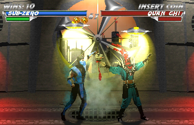
Sub-Zero Vs. Quan Chi
0
08/30/2003 09:48 PM (UTC)by
Avatar
The_Red_Dragon
Avatar
About Me

-Peace out, cubscout.

Member Since
04/26/2003 05:48 AM (UTC)
Avatar
MaRcElunbeatable
08/23/2003 12:09 AM (UTC)
0
awesome job, now I can't see crap since all this lights are on in my house so i'll come back later and give you my honest feedback.
Avatar
~Crow~
08/23/2003 12:23 AM (UTC)
0
Well, I must say this is very nice work. I love the BG, Its usually the real focus of your submissions. The fanblade style of arena overlooking the city is a pretty cool concept. Fanblades are nicely set into place, and are very well done as well. The lights are a nice touch, I suppose these are hanging down from the ceiling? I really can't see any sort of cable or rod connecting them there though. But the lighting effects are excellent looking, you starting with a bright enough color and it fades nicely as in streams away from the light source itself. The sewer grate is very nice as well, I really like this. The steam effects are great. Lifebars are pretty good, but whats with the win tokens? Anyway, the aren't actually neccesary, since this is MK4 and the lifebars go up after the fatality. But it really isn't all so important, I like this setup for the most part.

The fatality itself is pretty well done, but I think Sub-Zero should be just a bit closer to Quan Chi. He seems a bit to far back to me to be performing this fatality. The sprite edits are pretty nice, I really like Quan Chi. His costume looks just about perfect, but his head doesn't remind me of Quan Chi for some reason. Also, the skin color appears to be off, not really matching Quan's actual skin color. He still has the same complexion as Sub-Zero, Quan has that sort of darkish-gray colored skin. Sub-Zero looks pretty good though, I can tell you added the black stripe to his eye, very nice touch on that. Shadows appear to be well done, and given your description about them, I think I can see what you're saying.

I would have liked to see a bit more blood though, maybe some running down Quan Chi's body. Also, the blood looks to be in too big of a 'clump' as its falling down toward the arena floor, from Quan Chi's decapitated head I mean. It should be a bit thinner, but its not so bad 'spewing' out of his neck. Anyway, overall, this is a very nice fake, great job.
Avatar
The_Red_Dragon
Avatar
About Me

-Peace out, cubscout.

08/23/2003 12:40 AM (UTC)
0
Well, just a few quick notes. The concept behind this is a 2-D Mortal Kombat 4, so the background is a 2-D version of the Prison of Souls from MK4. In the game the spotlights, if you recall, float around and follow the combatants, so no, there’s no bar holding them. Quan’s skin color is actually white/gray, but the spotlights change the tone and give it a more fleshy look. Again keeping with the MK4 feel, I placed Sub-Zero at around sweep distance because in the game, I believe he stepped backwards after ripping the head off. I could be wrong, though. It’s been a while since I’ve played it. Well, I suppose that’s it. Thanks for the feedback as usual. grin
Avatar
~Crow~
08/23/2003 01:06 AM (UTC)
0
Ah, I see. Sorry about the lights, I was focusing on realism, and forgot about the MK4 BG for a moment.
Very, very nice.
The edits are practically perfect, Quan Chi is excellent.
The stage is great, though I would have liked it better if it was just meant to be the prison fan from MK4, as opposed to having those buildings behind the fan.
And you got those annoying light thingies in too, lol. Nice touch.
I also love the extra detail here, the red light from the sides of the stage, and the smoke from the vent, shows all that thought has been put to good use.
The lifebars are all perfect, all there etc. although the wins text for Subby, I think the "0" needs to be moved down just a touch, but, heh, who cares tongue.
I agree with you about the shadows, they don't need to be fully shown because of the way the light is shining on them.

Excellent work smile.
Avatar
MaRcElunbeatable
08/23/2003 05:15 PM (UTC)
0
Timsmk where have u been? I havent seen you online for days, w/ out u the Original Gangstas are vunerable and it also came to my attention u were talking to a MK5.ORG Juggalo? grin

Anyways like I said yerterday that is awesome. This has to be the best fake I seen you make. You actually did some actual editing and the way everything is made from scratch makes me happy smilethe lifebars are perfect, but the timer should be up more, I don't really like those texts, FatSatan has a page full of MK4 text I can give you the link ASAP. The sprites are very nice editing, the SubZero has a nice color while QuanChi does too. But if you notice his doesn't have that YingYang thing around his neck like in the game. Also like Crow pointed out is a bit hard to see his face. The black parts on his left and right side of his pants are a bit dark maybe put it a little bit lighter. But good effort tho. The stage is awesome, and that steim coming out from that "thing" (forgot the name) is a great addition.

Overall I will give it a 8/10 for good effort since you took your time, and did some editing, and didn't copy and paste.

Nice job
Avatar
Zentile
08/23/2003 06:57 PM (UTC)
0
Now this is true blue fucking awsomeness. I love it so much. The Quan Chi and the Sub-Zero sprites actually look like they were taken straight from a 2D MK4, or something. Excellent work. The BG is very nice also.
4.5
Avatar
mortal_kombat_fan2003
Avatar
About Me

Got to http//www.neopets.com/

08/23/2003 07:57 PM (UTC)
0
awesome! wgat did you use to edit the sprites and where did you get them sprites?
Avatar
MaRcElunbeatable
08/23/2003 09:02 PM (UTC)
0

Heres the Mk4 Texts, just simply get the paint bucket and color the black into white:

Kredit: FatSatan

Avatar
The_Red_Dragon
Avatar
About Me

-Peace out, cubscout.

08/23/2003 10:54 PM (UTC)
0
Hey Marcel, thanks for the text. While I did use MK4 text, I used the text that is available for download at totalmortalkombat.com, therefore, it was the large “so and so’ wins” text, not life bar text. To answer motal_kombat_fan2003, I used MS paint to edit the sprites mostly, with some additional tools from Corel Photo-Paint and the basic sprites came from the good ol' warehouse. Thanks again to everyone for commenting.

P.S. The Yin Yang hangs about half-way down around his stomach and is present, I’m kind of a stickler for details. glasses
Avatar
MaRcElunbeatable
08/23/2003 11:12 PM (UTC)
0
heh no problem, FatSatan has a lot of things, heres the old site he made a long time ago:http://www.fragile-minds.com/fatsatan/.

MaRcElunbeatable Wrote:
Timsmk where have u been? I havent seen you online for days, w/ out u the Original Gangstas are vunerable and it also came to my attention u were talking to a MK5.ORG Juggalo?

Nice job


I was on holiday in Spain, I like, so put a note in my sig tongue.

And, erm, was I? Lol, do tell.
Avatar
mortal_kombat_fan2003
Avatar
About Me

Got to http//www.neopets.com/

08/24/2003 01:15 AM (UTC)
0
where did youi stay in spain??
Avatar
VenoMark
08/30/2003 09:18 PM (UTC)
0
The head rip isn't an original idea, but the overall quality of the image is so good, I won't take any points away from you for lack of originality.

The background looks to 3D compared to the fight scene taking place. Speaking of the fight scene, the characters protrayed in it look a tad cartoony. Sub-Zero isn't that much cartoony compared to Quan Chi, but the mask on his face tooks a tad goofy, oversized and whatnot. The lighting effects you added kill the overall score of the image, man. Why the hell'd you decide to do that, anyway? I understand that sunlight may be spilling in from behind the spinning fan, but it wouldn't create such a hideous glare, as you've portrayed here. The massive blood droplet spilling from Quan Chi's severed head doesn't fit; you should've gone with a more realistic approach and created your own blood effects, or at least gone with a smaller drop of blood. The dark sorcerer's head also looks quite cartoonish, and I hate cartoony sprites, even if they're the intended sprites, which doesn't appear to be the case here.

Sub-Zero looks a lot like his MKM character, which is what I think you were going for, so hats off to you there. The lifebars are very nice. You could've taken a smidgeon of health away from Sub-Zero, so it would give the fight a more realistic feel. I say that because I'm sure Sub-Zero wouldn't get a perfect victory against someone of such high calibur--Quan Chi. But that's not a huge flaw or anything, just a personal preference. The lack of original text isn't a big factor, either, but the text doesn't exactly fit with the overall image. I absolutely love the custom Quan Chi sprite. It looks so damn realistic. The blades protruding from his shoulder pads, the circular appearance given to the neck protrusion in between the shoulder pads...everything is beautifully detailed. However, the torso looks a bit flat. Add some shadows underneath the chest protector, and it won't look like an iron-on decal, or whatever.

Overall, you earned yourself a very respectable 8/10, from a guy who grades very harshly. Hats off to you, chief.
Avatar
The_Red_Dragon
Avatar
About Me

-Peace out, cubscout.

08/31/2003 12:21 AM (UTC)
0
Well, I appreciate the comments, Veno. I have been waiting, and hoping, for some feedback from some of the more skilled fake artists. Anyway, enough with the pleasantries, the “hideous glare” that you refer to I’d imagine are the floating spotlights. I won’t argue with your opinion on them, you were giving me an honest critique, so now I know I may want to take the lighting effects down a notch.

There are two reasons I did the blood the way I did it. First, the blood in MK4 was rather globby, so I’d feel there was much need to mess with it. I was, after all, aiming for a 2-D MK4 look. Second, I find blood boring. I don’t feel it makes an image, therefore, I don’t really try. I’m more concerned about the backgrounds and sprites.

Speaking of sprites. Sub-Zero hasn’t been changed much from the original sprite, which was Scorpion mid-combo with his axe. I don’t recall changing the mask much if at all. The most I may have done to it was eliminate some of the details that made it look skeletal. Other than that, I ditched the black dividers, changed the color, nipped and tucked a few places and called it good. As for Quan Chi, the head has always been my least favorite part of him. I think the head is actually too big for the body. The irony is that I started with Kano’s upper torso (head included), but it just doesn’t look right. And thanks for the idea about the shadows on the torso. I think that would definitely improve upon him.

Update: I did a slight overhaul to this image by taking some of the suggestions which had been mentioned to me. If anyone would like to see it, let me know, I'll email it to you. I just feel wrong submitting it again. It would be as though I were looking for attention, which isn't the case.
Pages: 1
Download on the App StoreGet it on Google Play
© 1998-2024 Shadow Knight Media, LLC. All rights reserved. Read our Privacy Policy.
Mortal Kombat, the dragon logo and all character names are trademarks and copyright of Warner Bros. Entertainment Inc.