The curse of raiden-my comic series (three parts added updated 11/18/05)
Fan Kreations
Pages: 1
The curse of raiden-my comic series (three parts added updated 11/18/05)
0
posted01/06/2006 02:49 PM (UTC)byMember Since
08/28/2005 06:38 PM (UTC)
0
how did you know? anyway i know i need work on the font i'm trying to find a good one but just can't seem to find a good decent one
There's a great collection of free fonts at Blambot. Both ]{0MBAT and I got our main dialogue fonts from there. I use Letter-O-Matic and he uses Webletterer BB. I could tell it was Gimp from the starburst effect in your last comic. I've used the same effect in my own work.
I meant that in the first comic, some of the dialogue seemed to read out of order or at least forced the eye to go in odd directions. Jax is answering Johnny, but the way I read it, Jax answers before the question is asked. And in the last panel, Jax says two things, but the order of the dialogue isn't clear (I mean, you know it's going in that direction based on the conversation but it's awkward).
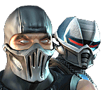
This is an example of a way you could make that clearer.

0
One thing I use for my comics is a great font Anime Ace, and all fonts you get on Blambot are better than Digital Strip. 
But I digress.
All bragging aside, the font looks rather rough, you should tick the "Anti-Alias" button so that the font looks smoother. I like the effect that you had on the last panel.
Anyway, if you need any help from muah, feel free to PM me, or talk to me on the #mortalkombat chat line.
But I digress.
All bragging aside, the font looks rather rough, you should tick the "Anti-Alias" button so that the font looks smoother. I like the effect that you had on the last panel.
Anyway, if you need any help from muah, feel free to PM me, or talk to me on the #mortalkombat chat line.
0
thanks for the tips you two
0
0
What do you mean i'm confused

About Me
For the most in-depth, in-detail, Mortal Kombat lore analysis vids, there's only one source:
0
If you look at the first panel, you have it backwards. Johnny Cage's should come first, and Jax's second; you have it the other way around.
0
so i should switch the characters around or just switch what they are saying


About Me
For the most in-depth, in-detail, Mortal Kombat lore analysis vids, there's only one source:
0
mortalfool Wrote:
so i should switch the characters around or just switch what they are saying
so i should switch the characters around or just switch what they are saying
Just switch the way the word balloons appear, so that it reads from left to right.


0
Oh my gosh, that actually made me laugh! Especially when Raiden just comes for no reason. Good talent. 10/10
0
Thanks for the comment okay }{ombat now i get what your saying i'll start working on it
0
Pretty cool comics mortalfool. Some of it is just kind of confusing to read though. Also, it appears that you have added that red burst effect after you put all of the panes into one because that effect is showing in the upper panes. For a first attempt at making comics I'd give you a 8/10. Good Job. Some of it was pretty funny. Well, actually, I really like the way that Raiden just appears. It may have been funnier if he had said, "Hey guys, I just appeared for no reason." I don't know why but a "hey guys" was always funnier than a "hi". Anyway, great start.
0
0
Pages: 1
© 1998-2025 Shadow Knight Media, LLC. All rights reserved. Mortal Kombat, the dragon logo and all character names are trademarks and copyright of Warner Bros. Entertainment Inc.


