
Triple Ice Spike Fatality
Fan Kreations
Pages: 1
Display Mature Content:
| Artist's Remarks: | |
|
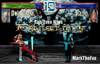
yay finally found a program that agrees with this POS Comp of mine. well the Fatality isnt very original but i was able to Darken the screen a lil bit, make my own Life Bars, my own Name Text, my own timer and even my own lil Fatality Text. Now if only i could make a signature i like. well lemme know what you guys think.
|
| Full Scale | 395x253 | Category | Fakes | User Views | |
| User Likes | User Ratings | 5 | Score |
 3.0 3.0
|
0


Pages: 1


© 1998-2026 Shadow Knight Media, LLC. All rights reserved. Mortal Kombat, the dragon logo and all character names are trademarks and copyright of Warner Bros. Entertainment Inc.