
Ultimate Showdown
Fan Kreations
Pages: 1
Display Mature Content:
| Artist's Remarks: | |
|
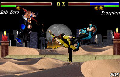
Alright, this is a serious Fake, and YES I DID F'N EDIT! True there is also Copy/Paste, but you really think there is a Sprite that does what Scorpion is doing? Oh well, please rate, as I had a fun time making this Piece. :-)
|
| Full Scale | 395x254 | Category | Fakes | User Views | |
| User Likes | User Ratings | 4 | Score |
 2.5 2.5
|


Pages: 1


© 1998-2026 Shadow Knight Media, LLC. All rights reserved. Mortal Kombat, the dragon logo and all character names are trademarks and copyright of Warner Bros. Entertainment Inc.