UlcaTron Wrote:
I like the idea, but major flaws are easily visible.
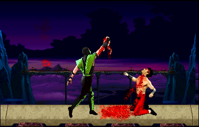
Blood :
Well, it looks poorly done. It looks like a bunch of spaghetti meat and kool-aid on the floor. You should probably try re-doing that.
Stage :
It doesn't seem 'dark' enough for the stage itself. It doesn't match the arena basically.
Sprites :
No editing, copy+pasted.
Concept :
Rather good, but pretty common for my taste.
You could have probably changed up the arena a bit more, fixed up the sprites, and re-do the blood. Better luck next time. Lol. =] Also, please don't take offense, I'm only trying to help ya out.
2.5/5
Kinda exactly what He ^ said. ^^ :D
Say, i made a sig for you 2 months ago!