Wastelands
Fan Kreations
Pages: 1
Wastelands
Artist's Remarks: | |
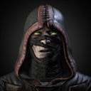
Well my friend and I worked on this together a while ago, I got around to touching it up in Photoshop. It's a deeper look into the wastelands.
|
Full Scale | 635x435 | Category | Drawings (Digitally coloured) | User Views | |
User Likes | User Ratings | 10 | Score | 3.5 |
0
RaisnCain •07/20/2007 07:08 PM (UTC) •
0
redman Wrote:
This looks freaking fantastic. 5/5 good job.
Well . . . thanks man. I didn't expect a perfect five, but sweet. This is another early part of my works, right when I started my classes and stuff.
UlcaTron Wrote:
I worry for you.
I worry for you.
lol. ^_^
It is pretty plain and simple. Though I kind of like the eerie feeling of it. However, if you want to improve it here is a suggestion...
In the front of the black hill to the castle you should bring out some of the detail in a dark grey tone. Like the hillside with maybe some caves or something. I dunno just a thought.
RaisnCain •07/20/2007 08:02 PM (UTC) •
0
Ekule Wrote:
It is pretty plain and simple. Though I kind of like the eerie feeling of it. However, if you want to improve it here is a suggestion...
In the front of the black hill to the castle you should bring out some of the detail in a dark grey tone. Like the hillside with maybe some caves or something. I dunno just a thought.
Thank you for the constructive criticism as well as some compliments. I might revamp it, idk. Thanks for the suggestion.
KillerJade •07/24/2007 04:44 PM (UTC) •
0
Looks nice and clean, but it ́s pretty simple, I gave it 3 / 5 :D
nastynate •07/24/2007 09:32 PM (UTC) •
0
um ok. I mean its a good ... whatever it is but it doesnt look like the Wasteland 3/5
Pages: 1
© 1998-2024 Shadow Knight Media, LLC. All rights reserved. Read our Privacy Policy.
Mortal Kombat, the dragon logo and all character names are trademarks and copyright of Warner Bros. Entertainment Inc.