
Could They Have Made The MK Dragon Logo Any Better?
General Discussion
Pages: 1


 Ghostdragon - Fan Submission Director

 Wow, I shrunk...

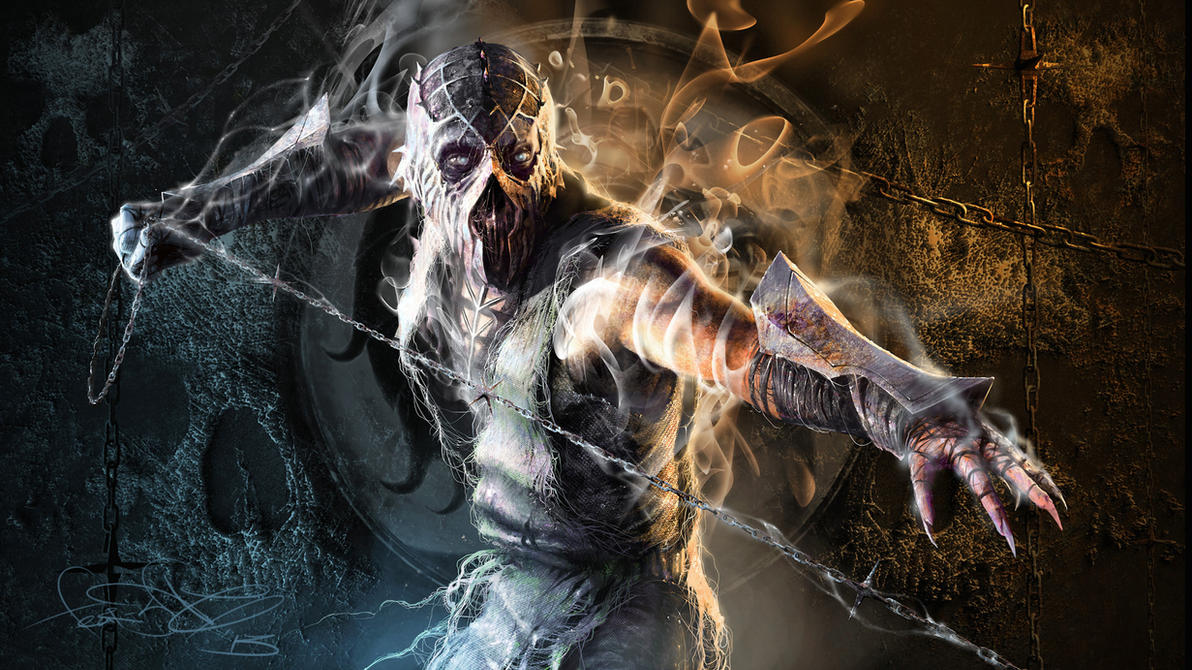 art by fear-sAs
Pages: 1


© 1998-2025 Shadow Knight Media, LLC. All rights reserved. Mortal Kombat, the dragon logo and all character names are trademarks and copyright of Warner Bros. Entertainment Inc.