

About Me

0
OngBak Wrote:
Avy: Already rated.
Sig: I dont like this one, the contrast is too high and the fire is too bright. 6.5/10
I want the Kira sig back! lol.
lol.
Avy: Already rated.
Sig: I dont like this one, the contrast is too high and the fire is too bright. 6.5/10
I want the Kira sig back!
Well you can't always get what you want!
The background is lovely and the render fits nicely but the text needs work. 9/10

0
Keith Wrote:
Well you can't always get what you want!
OngBak Wrote:
Avy: Already rated.
Sig: I dont like this one, the contrast is too high and the fire is too bright. 6.5/10
I want the Kira sig back! lol.
Avy: Already rated.
Sig: I dont like this one, the contrast is too high and the fire is too bright. 6.5/10
I want the Kira sig back!
Well you can't always get what you want!
Stop being like my mother! *cry* lol.
PS to the guy below: Rate Keiths sig.


0
Nice, 10/10 for Keith and 10/10 for Ong
Rate this one
Rate this one
0
ZOMG amazing!
10/10
10/10
0
Nice job. Work on the text though. 9/10.
About Me
0
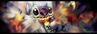
Nice and simplistic, but I don't like the guy in the sig, hes a little scary...
8/10
8/10
0
Avy: Already rated.
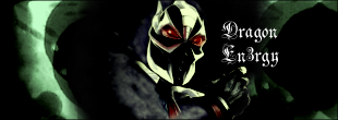
Sig: Everything is beautiful except the damn color and the contrast, you seriously need to learn how to use color balance, gradiant and everything because your sig are way too constrasted and this time the color are awful, pink with a sort of weird brown/black. 6/10, it would be an 8 with better color and contrast.
Sig: Everything is beautiful except the damn color and the contrast, you seriously need to learn how to use color balance, gradiant and everything because your sig are way too constrasted and this time the color are awful, pink with a sort of weird brown/black. 6/10, it would be an 8 with better color and contrast.
About Me
0
OngBak Wrote:
Avy: Already rated.
Sig: Everything is beautiful except the damn color and the contrast, you seriously need to learn how to use color balance, gradiant and everything because your sig are way too constrasted and this time the color are awful, pink with a sort of weird brown/black. 6/10, it would be an 8 with better color and contrast.
I'm doing that on purpose, I love heavily contrasted sigs, I don't like it when they're too bland.
Below user: Rate OngBak's
About Me
0
10
10
10
10
10
10
10
10
10
10
10
10
10
10
10
10
10
10
10
oh right...10/10...
10
10
10
10
10
10
10
10
10
10
10
10
10
10
10
10
10
10
oh right...10/10...
0
Keith your sig sucks...no jk XD 10/10
0
Then close your eyes, walk to your mirror, and then open you eyes. Congrats you just meet a sig master
10/10 for your sig
EDIT: ^^^That was for OngBak.
7/10 for Moon, you've done better
10/10 for your sig
EDIT: ^^^That was for OngBak.
7/10 for Moon, you've done better
0
OngBak Wrote:
Avy: 9/10
Sig: 10/10!!! OMG I wanna know who is the user who made that!
Avy: 9/10
Sig: 10/10!!! OMG I wanna know who is the user who made that!
Yeah I wonder also I guess we'll never know!
As for DragonEn3rgy...Sigs are improving I also really likes the one you submitted ofr the SOTW last week Good Job! 10/10
About Me
0
nice. 9.5/10
About Me
0
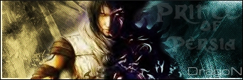
I have yet to play that game but I can't wait until I do! 7/10
About Me
0
7/10...and no, i like the one u hav now. u should make one to match that.
About Me
0
oh. i didnt see it. anyway, im gonna rate ur avy 8.5/10 funny


About Me
0
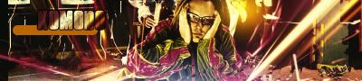
Cool, the grainy effect works well on that picture, it looks quite nice. 8/10


© 1998-2025 Shadow Knight Media, LLC. All rights reserved. Mortal Kombat, the dragon logo and all character names are trademarks and copyright of Warner Bros. Entertainment Inc.