


0
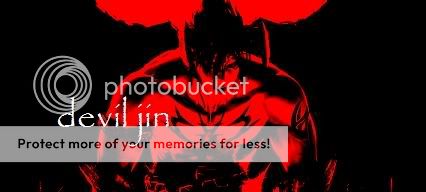
hum... I'm not liking this one Ong, theres too much on Havik IMO.
8/10
8/10
About Me
0
OngBak Wrote:
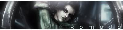
Avy: Bad quality 3/10.
Sig: The render are badly cut and the fire background is just basic, everyone can do it. 4/10.
Wheres the magic? Its his energy ball. The background is a skull cave. Its very ghost to me lol.
Avy: Bad quality 3/10.
Sig: The render are badly cut and the fire background is just basic, everyone can do it. 4/10.
skorpionrulz Wrote:
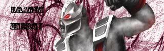
looks a little too magical for havik. try using something a l ittle more grim. 8/10
looks a little too magical for havik. try using something a l ittle more grim. 8/10
Wheres the magic? Its his energy ball. The background is a skull cave. Its very ghost to me lol.
it still looks like magic to me...anyway, the renders look badly cut because they were a lot bigger, and the background and stuff is basic because i only have paint and paint dosent allow you to crate your own backgrounds. as for dragonenergy's sig, love it 10/10

About Me

0
Okay Av & Sig
7/10 for both
7/10 for both

About Me

0
I really love it. I love the render! 9/10
About Me
Determination
0
much better
10/10
10/10

About Me

0
Amazing! 10/10 for both
Please rate this sig:

Please rate this sig:

About Me


0
8/10 for both
0
Not bad. I feeling the text. 6/10.

0
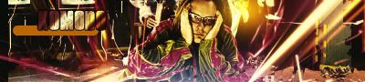
HAHAHAHA love the wario and love the sig
10/10 both
10/10 both
About Me
0
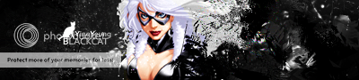
the avvy is a little blurry so 4/10
but the sig is beautiful 10/10
but the sig is beautiful 10/10
0
Its to bright for a sig that deals with Havik. 6/10.
0
its ok....6.5/10
About Me
0
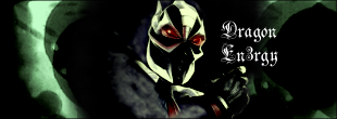
I really love it. Its dark and menacing and suits Baraka perfectly. 9/10
About Me
0
Oh god I gotta rid of it now! I don't pro! 
Yours is excellent. Its chaotic but still perfectly placed. It suits Havik perfectly. 10/10
Yours is excellent. Its chaotic but still perfectly placed. It suits Havik perfectly. 10/10
About Me
0
good. a little bright for my tastes, but oh well. 9.5/10
0
better than ur resident evil one...6.5
About Me
0
I don't like big sigs. 5/10
The avy is funny though 8/10
The avy is funny though 8/10


© 1998-2025 Shadow Knight Media, LLC. All rights reserved. Mortal Kombat, the dragon logo and all character names are trademarks and copyright of Warner Bros. Entertainment Inc.