
0
Its ok. 6/10.
0
Avatar- is that the nike symbol in the blood or just glare? I cant tell
Sig- I dont like the crack effect a lot... and a bit more saturation would be nice... but the render and lighting effects are so DAMN GOOD! 9/10
Sig- I dont like the crack effect a lot... and a bit more saturation would be nice... but the render and lighting effects are so DAMN GOOD! 9/10

About Me

0
Nice sig and avy, 10/10 for both.

About Me


0
kam- sig(hot) 9/10
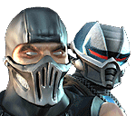
avatar i stilldont no wat it is 3/10
avatar i stilldont no wat it is 3/10


About Me

0
Its decent. Maybe a different avy from ur sig would be better tho. 7/10
0
Its alright. Blend the renders in better. 6/10.
0
Awesome dude. 9/10

About Me

0
Edit: Beat me to it 8/10 for sig - a few more colours would be better - 6/10 for avy
About Me
0
sig:already rated
avy: too small to see 4/10
avy: too small to see 4/10
About Me
0
Avatar- 6/10
Sig- 5/10 too big. - Someone that hasn't rated it before please
Sig- 5/10 too big. - Someone that hasn't rated it before please
0
Too crowded and the sig is just bad. 4/10.
About Me
0
i like it. the feel is very...ancient. mythological, if you will. 10/10
0
Text doesnt fit the sig. Its to out of place. Other then that, meh. 4.5/10.
About Me
0
sektor101 Wrote:
Text doesnt fit the sig. Its to out of place. Other then that, meh. 4.5/10.
Text doesnt fit the sig. Its to out of place. Other then that, meh. 4.5/10.
sig-9/10
About Me
0
WHOAH both 7/10 but only cos i had to put on sunglassses they were so bright


© 1998-2025 Shadow Knight Media, LLC. All rights reserved. Mortal Kombat, the dragon logo and all character names are trademarks and copyright of Warner Bros. Entertainment Inc.