
The Key to Creating The Perfect Album Cover (pics inside)
General Discussion
Pages: 1
The Key to Creating The Perfect Album Cover (pics inside)
I know most people don't even need a name or a title when they see these:


Of course, those two albums are among the best selling albums of all time. Still, the images are highly recognizable, and often adulated. I don't think I could ever create an album cover of that magnitude, but I wouldn't mind having one that can be at least awesome to the eyes.
Eventually, I will release my collections of original compositions to the general public, and when I do, I want the album covers to be catchy, fun to look at, and - if the gods allow it - unforgettable.
Below are the current covers of my fourth, fifth, and sixth albums respectively. Please, tell me what you think, and feel free to discuss any album cover you wish. Thanks for reading.
Angel of Dust
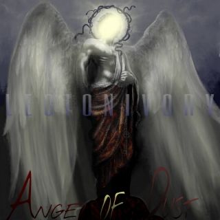
NOTICE: The above cover is derived from an existing black and white painting of the Biblical angel Lucifer.
Clock

Botanical Graveyard

0
I like the angel of dust one
not feeling the other two
not feeling the other two
About Me
STATE FED LIES CHARM EMPTY EYES. Anon.
0
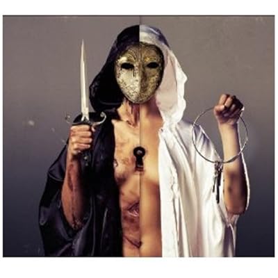
this is one of the most powerful album images i've seen of late, think of it as inspiration. It's called 'There Is A Hell, Believe Me I've Seen It. There Is A Heaven, Lets Keep It A Secret' by Bring Me the Horizon
p.s. Love the new sig i hope i had a positive influence on you.

About Me

MK Online Featured User 31/3/2010 12/4/2011
-----------------------Gifts-----------------------
Shinnok-fan64 - s3Kt0r
0
UNdiscovered Wrote:
I like the angel of dust one
not feeling the other two
I like the angel of dust one
not feeling the other two
agree


Album covers are meant to speak to the music, the artists, or something significant that connects to one of them. It takes and edge to match the cover art with the artistic value of the music. The album covers you created might take a better significance if we knew the music that went inspired the art. That way a connection is made. The better the music, the more of a connection is made with that cover.


A good album cover just needs to work well with the music. I know that's a weird thing to say, but look at this.

You know this will be a peaceful, if not somewhat overly expressive album. Hipsters will probably love it. It looks instagram-y and "quirky".

This is an eclectic, busy, somewhat crazy cover, and that's what the music is. Complicated, hectic, nuts.

Colorful, upbeat, and somewhat messy, just like the music, which is up-tempo garage pop rock.
it needs to be something that can instantly reflect your work. I mean. you wouldn't expect to pick up a blink-182 album and see a picture of dead animals or the grim reaper, or something. Sure, you'd get used to it over time, but it doesn't really reflect the music.
You know this will be a peaceful, if not somewhat overly expressive album. Hipsters will probably love it. It looks instagram-y and "quirky".
This is an eclectic, busy, somewhat crazy cover, and that's what the music is. Complicated, hectic, nuts.
Colorful, upbeat, and somewhat messy, just like the music, which is up-tempo garage pop rock.
it needs to be something that can instantly reflect your work. I mean. you wouldn't expect to pick up a blink-182 album and see a picture of dead animals or the grim reaper, or something. Sure, you'd get used to it over time, but it doesn't really reflect the music.
Vash_15 Wrote:
it needs to be something that can instantly reflect your work. I mean. you wouldn't expect to pick up a blink-182 album and see a picture of dead animals or the grim reaper, or something. Sure, you'd get used to it over time, but it doesn't really reflect the music.
it needs to be something that can instantly reflect your work. I mean. you wouldn't expect to pick up a blink-182 album and see a picture of dead animals or the grim reaper, or something. Sure, you'd get used to it over time, but it doesn't really reflect the music.
I hear you, man.
The album covers for Angel of Dust and Botanical Graveyard fit the music quite well, for Angel of Dust is mostly Alternative-based and stems from anguish, and Botanical Graveyard is dark, but upbeat as well.
Clock's cover, however, is one I wanted to contrast from the major style of the compositions. I also didn't want to show an actual clock, but the essence of one.
Of course, you all will have to decide for yourselves...

About Me
"Her touch intoxicating, she holds my heart within her hands. Unmerciful, she has become my everything"--The Agony Scene  [Gifts] [My Sigs] [Facebook] [Twitter] [YouTube] [My Site] [Request a Sig]

0
Some of my personal favorite album covers always contain a focal image that just "pops" and draws immediate attention of the viewers' eyes to the center focal image. Albums like:


All of these albums have an image in the background/foreground that distracts you from the text and averts your eyes to the image. I think they result in an overall original looking and feeling cover that is sure to grab people's attention and is sure to stick in the viewer's mind. I have a shirt with the cover art from the "Requiem" album I placed above, and people love the artwork, everywhere I go I get told how cool it looks. That's how I think album art should be, it should be so eye catching that even people who don't know the band will appreciate the originality and creativity behind the cover.
All of these albums have an image in the background/foreground that distracts you from the text and averts your eyes to the image. I think they result in an overall original looking and feeling cover that is sure to grab people's attention and is sure to stick in the viewer's mind. I have a shirt with the cover art from the "Requiem" album I placed above, and people love the artwork, everywhere I go I get told how cool it looks. That's how I think album art should be, it should be so eye catching that even people who don't know the band will appreciate the originality and creativity behind the cover.
Pages: 1


© 1998-2025 Shadow Knight Media, LLC. All rights reserved. Mortal Kombat, the dragon logo and all character names are trademarks and copyright of Warner Bros. Entertainment Inc.