
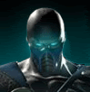
Battle-Worn Sub-Zero
Fan Kreations
Pages: 1
| Artist's Remarks: | |
|
My second attempt at fan-art, and my first to use any color. I decided to use spot-color for dramatic effect. I hope it turned out.
|
| Full Scale | 633x820 | Category | Drawings (Digitally coloured) | User Views | |
| User Likes | User Ratings | 7 | Score |
 4.0 4.0
|


Pages: 1


© 1998-2026 Shadow Knight Media, LLC. All rights reserved. Mortal Kombat, the dragon logo and all character names are trademarks and copyright of Warner Bros. Entertainment Inc.