
CHROMEWORKS: honor bound to compositionary try
Fan Kreations
Pages: 1
CHROMEWORKS: honor bound to compositionary try


About Me

0
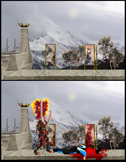
Dont take some random photo from as earch engine and use it as the background to your stage. Seriously, thats gay. And technically you're stealing it and everyone loves to jump on each others ass about stealing others "work."
Hotaru looks okay but way too smudgey and his head is blurred looking. The fire looks cartoony. The trees look like shit. Sub-Zero's body looks ackward. The blood is okay. Those silly signs in your stage look out of place. Why would the be on the edge like that? And the treets too... It looks great until you take a close look and see all the random shit thrown into your stage.
2/5

About Me

0
The Hotaru sprite looks ok. Sub-Zero looks odd... 3/5
Those silly signs in your stage look out of place. Why would the be on the edge like that?
-Bcen.Gan, tibetan tradition of decorating crenellations with religious parchments.
And the treets too...
-same.
It looks great until you take a close look and see all the random shit thrown into your stage.
-everything was preplanned according to several hundreds year old traditions.
I do not give a rats ass about quality. As long as I am restricted to paint, there is no such thing. I mainly work at the backgrounds.

hmmmmm....
2.3/5 and thats being generous. I give you the score for the the sub par Hotaru sprite edit and the blood. The rest doesnt even look like it took work, infact looks like to me it was simply cut and paste for the bg. Ive seen better, I love your art, but your fakes, not so. Try downloading Gimpshop, or if you have Limewire or any other Sharing P2P, download and crack Photoshop or something....
-ekule
0
For paint, that's a pretty damn good fake. But as a fake in general, i'll give it a 3/5. The trees seem choppy, Sub-Zero's position is...off, and that's about it.
However though, it's good for a paint fake. Download something like Photoshop and your fakes will get better.
However though, it's good for a paint fake. Download something like Photoshop and your fakes will get better.

About Me
0
Chrome Wrote:
I do not give a rats ass about quality. As long as I am restricted to paint, there is no such thing. I mainly work at the backgrounds.
I do not give a rats ass about quality. As long as I am restricted to paint, there is no such thing. I mainly work at the backgrounds.
Saying you only have Paint is a poor excuse for bad quality sprites and using photographs taken from the net. You can make a perfectly good background and perfectly good edits, in Paint, that look 100x better then any of the Photoshop shit with sparkle effects people post on here.
The background itself is of poor quality due to the semi-editted mk stuff being superimposed against a photograph and the 'Hotaru' edit on the second one is terrible. But it isn't totally horrendous and everything matches colorwise. So, I'll go with 2/5 on this one, dude.


well, Lets see if i can rate you on somthing beside the quality, since thats not waht you want. So if we're NOT TALKING QUALITY the background is great or what it is meant to be. I would give it a 5/5 not judging quality.
and the Hotaru sprite is not bad it's pretty d*mn good. (that is Artics right?)
so like said 5/5
and the Hotaru sprite is not bad it's pretty d*mn good. (that is Artics right?)
so like said 5/5


About Me
0
I think it's great 5/5. Another master piece i sincerely really like it, nice job chrome and in my general vision on life art is only a vessel the message behind it is of real value however you have a pretty interesting vessel here to back the message.

About Me

0
4/5, everything is good ( even the background), but Hotaru looks weird


0
It seems to be a good concept, the nice mountain stage. Maybe if you edited the Bacground a bit it would be better becuase it looks like its straight out of Google.
The SUb Zero sprite does not seem so good, but i know you use paint and Hotaru is pretty good.
Overall, taking you circumstances into consideration i would give 3.5/5
The SUb Zero sprite does not seem so good, but i know you use paint and Hotaru is pretty good.
Overall, taking you circumstances into consideration i would give 3.5/5
Pages: 1


© 1998-2025 Shadow Knight Media, LLC. All rights reserved. Mortal Kombat, the dragon logo and all character names are trademarks and copyright of Warner Bros. Entertainment Inc.