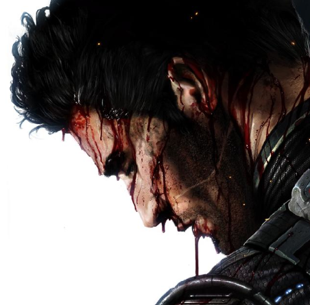
Dragon Master Sub-Zero
Fan Kreations
Pages: 1
Dragon Master Sub-Zero
| Artist's Remarks: | |
|
My first fan-art submission... ever. I hope you enjoy. Feedback appreciated, of course.
|
| Full Scale | 592x812 | Category | Drawings (Digitally coloured) | User Views | |
| User Likes | User Ratings | 11 | Score |
|
0
Cool drawing. I really like the details and shading you used on Sub. His arm muscles look a little too big for him in proportion to the rest of his body. The dragon behind him is awesome. The scales are very well drawn. I like the way it is wrapping around Sub. The lettering around the pic is a nice touch. Good job. 4/5
I can see this is your first attempt... and all I can say is I wish my first attempts look that good! What you lack in detail you make up for in unparalleled style! Suh-weet! The kanji are amazing. And... I know what they say. Nice touch. I can't wait to see more. I say 4 1/2/5. Some color would have helped, I think, but still, Sub looks completely bad-ass.

0
Nice drawing. I think the best part about this drawing is the dragon. The scales and the detail around the eyes and face is awesome. Dont get me wrong, Sub-Zero is still good. The costume design and shading is great, I think it would've looked better if you colored it though. However, his arms and muscles look bigger than the rest of his body. Other than that great drawing, 3.5/5.


About Me
WyattHarris.com Dig it
0
I like the overall composition. It all works together very well. The anatomy for Sub is a little odd in spots. His chest is too big around the top. The definition in the arms needs work.
The perspective is a little off as well. You shouldn't be able to see the side of the far sleeve. The right one is facing the front and the other is facing away. It should be more of a rear view.
The dragon's mouth is a little crooked but that might be intentional.
I really like your shading style. The way you used those angled brush (pencil) strokes across the entire image really looks good.
Overall I'd say it's pretty good.
Wyatt


About Me
I Have Become as the Wastelands of Unending Nothingness. Now Shall the Night Things Fill Me with their Whisperings, and the Shadows Reveal their Wisdom.
0
Nice job! The detail is pretty good, as is the overall style. The dragon looks cool, although the head seems a little uneven. Also, I don't know if that's supposed to be fire behind the dragon, or a crest on its back; if it's fire, that doesn't seem to fit a Sub-Zero pic very well. As for Sub himself, he looks a little top-heavy, and his waist looks a little too thin. His costume looks really good though.
By the way, what does the Asian writing mean?
By the way, what does the Asian writing mean?

0
Your first ever? Thats really good. I love the dragon coming up. Is that like for his fighting stance?
Pages: 1
© 1998-2026 Shadow Knight Media, LLC. All rights reserved. Mortal Kombat, the dragon logo and all character names are trademarks and copyright of Warner Bros. Entertainment Inc.


