
Electrocution Redone
Fan Kreations
Pages: 1
Display Mature Content:
| Artist's Remarks: | |
|
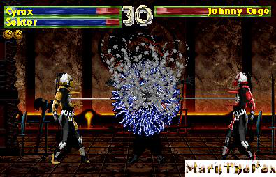
ok this is what is different from my first: Electrocution is spelled right, i added shadows, a new electricity effect, the screen is darkened, Johnny Cage is now a charcoal gray, New Life Bars, new Timer, and even the new MarktheFox logo...its a little big though lol. hope you guys like this one better than my first
|
| Full Scale | 395x254 | Category | Fakes | User Views | |
| User Likes | User Ratings | 2 | Score |
 2.5 2.5
|
0


Pages: 1


© 1998-2026 Shadow Knight Media, LLC. All rights reserved. Mortal Kombat, the dragon logo and all character names are trademarks and copyright of Warner Bros. Entertainment Inc.