
FakePicUserBattle: Dark Illusion vs BlackSaibot!
FakePicUserBattle: Dark Illusion vs BlackSaibot!
| Artist's Remarks: | |
|
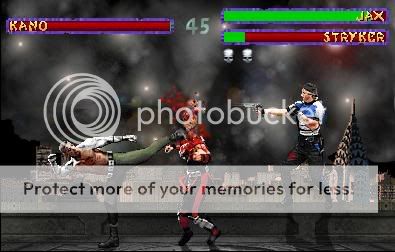
To see the HIGHER better quality go here:http://img47.photobucket.com/albums/v143/marcel2/Other/BetaQualityFake.gif Blacksaibot was the first one to teach me a lot fake pics so I decided to make a fake pic of both of us fighting. Dark Illusion a ninja. Blacksaibot a deadly sickle ninja: http://img47.photobucket.com/albums/v143/marcel2/Other/saibot01.png I wasn't focusing on effects nor did anybody help me out. I was focusing more on blood, cloth rips and things MK:DA should have added. Enjoy.
|
| Full Scale | 400x256 | Category | Drawings (Digitally coloured) | User Views | |
| User Likes | User Ratings | 11 | Score |
 3.0 3.0
|
0

0
Idea is cool. The rest, meh. I even went to that other link that you said go to for a better quality pic. I still have no idea what the hell is going on. I have no direction in to what this fake is doing. The pic needs to be lightened up cuz it is extremely too dark to see anything. No matter how hard i squint i cant see dark illusion for nothin. All I see is the weapons. Work harder on lighting the picture a little more and it will be alot better.

About Me

0
Man, this is one dark picture, I like the rain effect and the custom faces up next to the health bar but as far as the characters are concerned I cant make out what they are doing or really what the look like. You say you concentrated on the blood and cloth tears but those dont mean much if a) they arent in context with the battle being shown and b) cant really be seen anyways. perhaps next time use some innovation when creating a fake, if you want two dark characters fighting in a dark forest during a storm then perhaps add a few lanterns around the arena to justify the light that you need to show off the characters better.

0
If you have your lights being glared at your monitor, it might be hard to see. Other than that I could see the image perfect.
Thanks for the feedback. .
.
Thanks for the feedback.


0
Too dark, cant see whats going on.
Everyone knows that to make a good fake you must show clearly whats going on, thats the whole point of it.
Everyone knows that to make a good fake you must show clearly whats going on, thats the whole point of it.
0
As everybody else has said, the picture really is too dark to see the amount of detail you've put into this.
I lightened it in Paint Shop Pro and even then it was hard to see Dark Illusion because he blends in with the background far too well.
However, from what I could make out, the fake is very nice.
Here's my old system :
:
Negatives:
- + Marcel, Marcel, Marcel. You know I invert the colours to check for shadows I don't see any.
- Oh yeah, it's too dark.
Good points:
+ Nice edit to the background, the floor fits in well with the original Living Forest background, it doesn't look like you've just slapped on another floor.
+ The sprite edits do have a lot of detail, although it's a shame that they can't be seen too well. They are also a little blurry however, even on the high quality.
+ Nice job using the MK:D lifebars too. If I were being picky (which I am), I'd say the "fight stage indicators" are missing, but I think they're stupid anyway, so I'll ignore that .
+ Blood work. Pretty good, not too excessive, although the Sai maybe overdone a little. But the stuff on the tree looks great.
+ Rain effect. Yep, looks good.
Yeah, I guess.
I'm gonna give it a 7/10.
Shadows = 8/10
Less blurry edits perhaps = 9/10
And being able to see it = 10/10.
Still though, nice fake. Good job, but it takes a bit of lightening to be able to see anything at all.
I lightened it in Paint Shop Pro and even then it was hard to see Dark Illusion because he blends in with the background far too well.
However, from what I could make out, the fake is very nice.
Here's my old system
Negatives:
- + Marcel, Marcel, Marcel. You know I invert the colours to check for shadows
- Oh yeah, it's too dark
Good points:
+ Nice edit to the background, the floor fits in well with the original Living Forest background, it doesn't look like you've just slapped on another floor.
+ The sprite edits do have a lot of detail, although it's a shame that they can't be seen too well. They are also a little blurry however, even on the high quality.
+ Nice job using the MK:D lifebars too. If I were being picky (which I am
+ Blood work. Pretty good, not too excessive, although the Sai maybe overdone a little. But the stuff on the tree looks great.
+ Rain effect. Yep, looks good.
Yeah, I guess.
I'm gonna give it a 7/10.
Shadows = 8/10
Less blurry edits perhaps = 9/10
And being able to see it = 10/10
Still though, nice fake. Good job, but it takes a bit of lightening to be able to see anything at all
0
Thank you. .

0
im so sick of seeing this fake at all the boards and pretending I like it. fuzzy sprites, ugly tone to it, poor effects (dont mess with rain till your that good). IMO...
0
| gororules Wrote: im so sick of seeing this fake at all the boards and pretending I like it. |
Tsk..Tsk..Tsk...
First of all, Gororules I am not forcing you to like this image. Let alone there is the fact that I am 10 times better than you, when it comes to showing actual editing. Look at everybodys reply, I am happy that people had the decency to be completely blunt with me. If you do not have anything worthwhile to say, I suggest you keep your mouth shut in advance.
| gororules Wrote: fuzzy sprites, ugly tone to it, poor effects (dont mess with rain till your that good). IMO... |
I would have idolized you if I had known you are an awesome great fake pic maker, but then again I just realize you are not. Definitely, I am not good either but I put effort to my work and also when I am criticizing your art, I am not being shallow like you are babbling about. Poor effects? There are no effects, I was focusing on custom sprites for the first time. Fuzzy sprites? Gee, looks to me you are a bit late since people obviously already pointed out the obvious.
0
hahah your so pathetic, name the time place and type of fake, id own your crappy edits ANYDAY
hell, this fake alone ownes your ass http://img30.photobucket.com/albums/v90/Gororules/Ten.jpg
hell, this fake alone ownes your ass http://img30.photobucket.com/albums/v90/Gororules/Ten.jpg
0
| gororules Wrote: hahah your so pathetic, name the time place and type of fake, id own your crappy edits ANYDAY hell, this fake alone ownes your ass http://img30.photobucket.com/albums/v90/Gororules/Ten.jpg |
Lmfao?
Okay, since you obviously have an immense ego I will do a comparison:

See the huge difference?
How can you say your fake is a lot better if all you did was:
Format the image to a jpeg.
The blood is sloppy and then right blurry.
2 Sprites doing a Fatality on one person? You have way to much going on.
Purple MKII lifebars? Gee, very original
Shadows facing the wrong way. How can Stryker be on a higher ground then Jax?
Original Bg? Mediocre, but damn right boring and overdone.
Spites edits? All you did was pallet swap Jax's pants to greenish. But the Stryker blood is a nice touch. To bad the quality sucks.
Let's look at mine:
Original bg? Yes with rain.
Original CUSTOM sprites? Yes.
Shadows? No.
Original lifebars? Yes. (MK:D in mine).
Custom editing focus? Yes.
Quality? Good but the sprites are blurry.
Owned.
0
NO I have no ego, just talent
Format the image to a jpeg so I could host it at the time i had no better host
The blood is sloppy? Try he was kicked AND shot! and its not "blury" I added a bullet time wave thru the back of his head
"2 Sprites doing a Fatality on one person? You have way to much going on." its called a two on one move dumbass, been done alot before in great fakes
at least I trty makin my own life bars instead of copy paste.
Shadows facing the RIGHT way, who are you to tell me the light source? the sky is the lighting loser.
"How can Stryker be on a higher ground then Jax?" have you never heard of a railing?
better backround then one with some rain added, good one! loser...
and yea my sprite edits were ment to be what they are, its not a total sprite edit fake slapnutts.
Let's look at YOURS:
Original bg? Yes with rain. (did you even make the rain?)
Original CUSTOM sprites? Yes. (if you call makin one dark and anothing crappy then you got me there!)
Shadows? No.
Original lifebars? Yes. (MK:D in mine). wasnt it someoen else who cut those? yea I know who it was loser
Custom editing focus? Yes.
Quality? Good but the sprites are blurry. not to mention not covered in rain
Owned? you wish
0
| gororules Wrote: NO I have no ego, just talent Format the image to a jpeg so I could host it at the time i had no better host The blood is sloppy? Try he was kicked AND shot! and its not "blury" I added a bullet time wave thru the back of his head |
Formatting the image as a jpeg drops the image color hues to extreme blurriness. I suggest formatting the image as a jpeg if you are going to submitted here, but keep the PNG quality too.
| gororules Wrote: "2 Sprites doing a Fatality on one person? You have way to much going on." its called a two on one move dumbass, been done alot before in great fakes |
Exactly. Your idea is overuse and boring. You hardly ever see this kind of art being posted. In fact, the last decent fake pic user battle was between VenoMark vs. Minus_Zero.
| gororules Wrote: at least I trty makin my own life bars instead of copy paste. |
Wrong. I got the lifebars from Midget Kong and I had to edit them because he left some flaws and I definitely will not show how lazy I am by just pasting as some people rely on. I made the left/right side gray, I made the blood transparent and I took something out from the timer.
| gororules Wrote: Shadows facing the RIGHT way, who are you to tell me the light source? the sky is the lighting loser. |
| gororules Wrote: "How can Stryker be on a higher ground then Jax?" have you never heard of a railing? better backround then one with some rain added, good one! loser... and yea my sprite edits were ment to be what they are, its not a total sprite edit fake slapnutts. |
I made a mistake criticizing you for the shadows. I believe, TimsmK is perhaps the only user with the capacity of explaining shadow source. Not only is insulting me making you look like a moronic joke on the Internet, but you are also an inept child when it comes to saying a good comeback with out the use of childish phrases.
0
I would love to continue but Flaming is not recomended on mk5.org, I would like to say sorry to everyone (not you loser) if you think you got more to cry about, take it to mko
you are the william hung of fakes, just cause people laugh doesnt mean your good
you are the william hung of fakes, just cause people laugh doesnt mean your good

About Me
Anything war can do, peace can do better.
0
I love the idea of users, really good idea. The sprites look good, but the background could be more original imo. Nice job.
About Me
-Peace out, cubscout.
0
Nobody asked for my 2 cents, but Im going to give it. Illusions fake has a lot of good qualities. First, the sprite edits look pretty convincing. They look a little blurry when compared to the crisp background. It maybe would have helped to have used a sharpening filter, but still, good job all around. The damage on the fighters is a nice touch. The lack of shadows doesnt bother me, either because the background has no real light source. So you can get away it by saying the background was too dark to create defined shadows. There must be light for there to be dark... And the life bars look ok. It looks like the red is transparent? Good job. Yay for transparency. Speaking of rain, theres none over the fighters... When I do rain, I like to do it in two layers. The first background layer is a fine dusting, then after I paste the fighter sprites, Ill add a denser shower to add depth to the effect. Plus, some reflective puddles would have been fun.
On to Gororules. Oh good, Jaxs has a new pair of pants. Ill be honest, Im not crazy about this. Right off the bat, the idea is over-used and I just dont get it. The notion of a two-against-one battle doesnt make much sense. Kanos head appears to be hovering above the corpse, but Striker just put a bullet into it, right? I think some chunks would have been more appropriate, plus the blood is too blurry around the edges, it looks like spots more than anything. Same thing with the blood on Strikers pants. When fluid soaks into clothe, its color changes, but here, its still nice and red. It should have been a deeper color (such as a maroon) so it didnt just look like a spot sitting on top. Finally, I just dont get the background. Are this supposed to be UFOs flying over Mexico City or something...? Im a firm believer in the power of lense flares, but I dont think that many at one time are needed. Less is often time more.
On to Gororules. Oh good, Jaxs has a new pair of pants. Ill be honest, Im not crazy about this. Right off the bat, the idea is over-used and I just dont get it. The notion of a two-against-one battle doesnt make much sense. Kanos head appears to be hovering above the corpse, but Striker just put a bullet into it, right? I think some chunks would have been more appropriate, plus the blood is too blurry around the edges, it looks like spots more than anything. Same thing with the blood on Strikers pants. When fluid soaks into clothe, its color changes, but here, its still nice and red. It should have been a deeper color (such as a maroon) so it didnt just look like a spot sitting on top. Finally, I just dont get the background. Are this supposed to be UFOs flying over Mexico City or something...? Im a firm believer in the power of lense flares, but I dont think that many at one time are needed. Less is often time more.
0
this is why I dont post my images on mk5.org, shitty reveiws. FYI the head would be floating cause jax just kicked it, You my friend have not even begain to comprehend how over your head my fake is, these is so much detail in my fakes that you would not beleive, as in fragments of bone blood flesh and many many layers, I make my fakes to improve detail editing and acualy doing somthing worthwhille, so people can enjoy a shitty sprite slapped onto a a backround they didnt make all you want. But when your lookin for someone to make the next mk game your gonna get another mk advanced.

About Me

0
I would have probably have chosen one of your better fakes Goro,never the less it's an alright fake.but there should be some shadows and more originality in the sprite edits.Goro's fake ain't perfect either but he did get the lightsource right IMO and I do beleive him to be a good Fake maker mostly because he's done some really cool stuff in paint wich is a very difficult program to work with IMO.I'd like to see a battle but with fakes.not words(although it is quite amusing).and I know what you mean goro but you have to except bad critism even if that person has a limited imagination or just simply can't always put 2 and 2 together.I've always thought that even if the fake oesn't always show exactly what happened that the artist could explain why this or that has happened.many a time though I figured things out and didn't need to ask why something is happening.
0
| gororules Wrote: I would love to continue but Flaming is not recomended on mk5.org, I would like to say sorry to everyone (not you loser) if you think you got more to cry about, take it to mko you are the william hung of fakes, just cause people laugh doesnt mean your good |
William hung? How cliché. Not only was that joke moronic but it definitely was not witty at all. Try harder.
| gororules Wrote: this is why I dont post my images on mk5.org, shitty reveiws. |
I doubt you even have the right to even criticize his reply. He knows more than you do, Goro. Moreover, responses is to take as consideration not something you are going to get pissed off about.
/Edit: Thanks for the feeback BAV and TRD.
0
all i hear is blah blah blah im a dirty tramp *does the robot* hey I got more dragon points then your ass anways ahaha even with shitty mk5.whorg reveiws. im sorry but its only the truth, this place would be better without suckups and assjammers. now give me my skull rating and we can all move on.
0
| gororules Wrote: all i hear is blah blah blah im a dirty tramp *does the robot* hey I got more dragon points then your ass anways ahaha even with shitty mk5.whorg reveiws. im sorry but its only the truth, this place would be better without suckups and assjammers. now give me my skull rating and we can all move on. |
Because of your bickering, you took my thread out of proportion. Nobody was insulting you, yet you open your mouth and that is why people who have talent verbally assailed you. More dragon points than me? How is that even relevant to anything?
0
I give you a rating of above average meh. I won't go into how you can improve or the faults or the good things because they are mentioned pretty much above.


© 1998-2026 Shadow Knight Media, LLC. All rights reserved. Mortal Kombat, the dragon logo and all character names are trademarks and copyright of Warner Bros. Entertainment Inc.