Fight
0
02/04/2006 11:55 PM (UTC)by
Avatar
LatinoNinja
Avatar
Member Since
07/26/2003 10:20 PM (UTC)
Well, what's with the greyscale?

Anyhow, this is pretty basic really, and it's mostly props.

I'm not liking the grey "board" that flies up the center from the well.
The fonts used in the lifebars are pretty dodgy, you can barely read them as they are pretty thin, and they are also not suited. Try the MKDA font, (at the warehouse).

I don't like that it's all grey either.
It's a nice open space though, I do like the way you organized the space.
The rest is pretty much so, so.
Keep going, and try to edit and make new props.
Avatar
Zentile
08/04/2003 03:12 PM (UTC)
0
Well, what's with the greyscale?

Anyhow, this is pretty basic really, and it's mostly props.

I'm not liking the grey "board" that flies up the center from the well.
The fonts used in the lifebars are pretty dodgy, you can barely read them as they are pretty thin, and they are also not suited. Try the MKDA font, (at the warehouse).

I don't like that it's all grey either.
It's a nice open space though, I do like the way you organized the space.
The rest is pretty much so, so.
Keep going, and try to edit and make new props.
But it's nice for your first artwork.
Avatar
~Crow~
08/05/2003 01:05 AM (UTC)
0
Uhh... something seems strange about your response Zentile, like I've seen it before wink.

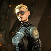
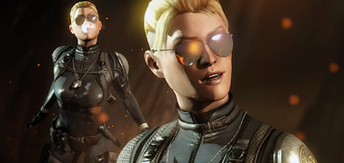
Anyway, I'm not sure I like this much. Its quite obvious you just used the poses for these two characters at the warehouse, because I can still see the 'box' around them. The screen is a little too big as well, the lifebars look odd because they seem small to the image. Its very hard to read as well, and the texts aren't lined up at all.

I'm not really understanding the BG very much at all, I see the upside down candles, but I really don't know what to make of them. There is alot of black here as well, way too much of it. And that big gray rectangle in the center is very odd looking, you need to use more colors and make it less 'square' looking to improve it. The floor doesn't make much sense either really, as you need something on the other side to make it look more like an actual arena for fighting. And what are those two lines that are running across the pillars in the background?

Anyway, its pretty simple, and originality is on the low side. You need to do some more editing with this, and also the jpg will take a toll on the image if you save it in paint. Keep trying at it though.
Avatar
BoardTng
Avatar
About Me

BoardTng----Truly a Mystery-----

08/05/2003 04:06 AM (UTC)
0
He seems new the forum. So I think he did good for his first one being 3d in some parts of it. GJ on it. Keep it up.
Avatar
noobsaibotsshadow
Avatar
About Me

i wish i had something cool to say

08/05/2003 06:40 PM (UTC)
0
at least you tried, i mean, come on. he had an idea and used it and it is his first time. you gotta give him some credit.

eC=>
Avatar
supertim1
08/07/2003 12:53 AM (UTC)
0
i donno why people respond so harshly sometimes especially to newcomers i mean if they were doing something they were new at i bet they would like someone to tell them kindly what they were doing wrong not say oh its mediocre and verry verry shitty.
try getting some fat lazy arse computer geek to rebuild an automobile engine.
Avatar
~Crow~
08/07/2003 12:58 AM (UTC)
0
You know, I suggest all of you people actually try READING the comments made, explain to me where you see someone saying "this is shit and you suck" you don't see that do you? If you don't give constructive critism, then it is impossible for whoever it is to improve.
Avatar
Torchia
08/28/2003 11:06 PM (UTC)
0
Hmm..Pretty good for your first fake..I noticed you tried to cheat though. Dimming the backround cause you couldnt take out the black backround around the fighters...Cheater! tongue.

Nice though..Next time try to put more effort into it, and you might be able to be the new TimsMK! wink
Avatar
balkcsiaboot
08/28/2003 11:55 PM (UTC)
0
It's shit like this that deserves a zero. Everything that was bad to say about this God awful fake picture has been said already, but in a totally underseved nice way. No need for me to repeat anyone.
Avatar
MaRcElunbeatable
08/29/2003 11:37 PM (UTC)
0
Nice avatar bs
Avatar
UltimateRyu
02/02/2006 05:13 AM (UTC)
0
5/5
Avatar
justycist
02/02/2006 07:15 AM (UTC)
0
UltimateRyu Wrote:
5/5


wtf?


Anyways, err 1/5. Just copy and paste.
Avatar
SubMan799
02/03/2006 03:20 AM (UTC)
0
It seems like you only copied, pasted, and changed the colors. It's also a bit to dark. Nice idea though. 2/5
Avatar
queve
02/04/2006 11:55 PM (UTC)
0
Keep trying and you will improve. Im sure you can do better.
Pages: 1
Download on the App StoreGet it on Google Play
© 1998-2024 Shadow Knight Media, LLC. All rights reserved. Read our Privacy Policy.
Mortal Kombat, the dragon logo and all character names are trademarks and copyright of Warner Bros. Entertainment Inc.