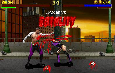
Jax VS Sindell REMAKE!
Fan Kreations
Pages: 1
Jax VS Sindell REMAKE!
Display Mature Content:


| Artist's Remarks: | |
|
Alright...I noticed I needed more blood...so...shma..
|
| Full Scale | 394x252 | Category | Fakes | User Views | |
| User Likes | User Ratings | 7 | Score |
|
Yeah well... it's a problem that some of the staff members have been thinking about fixing. Its just not as simple as it may seem, but with time, we'll have a better system. The basic idea is showing what each user has given as a rating, thus revealing to the public who is doing this. Another idea is to only be allowed to vote once you have commented, as that's another problem.
Anyway, like Zentile said, you really didn't follow too much of the advice we all gave you. You just threw some blood on, thats the only addition I see. I'll give you what I gave you last time, plus 1/2 dragon for the blood. That gives you a 3 1/2 from me.
Anyway, like Zentile said, you really didn't follow too much of the advice we all gave you. You just threw some blood on, thats the only addition I see. I'll give you what I gave you last time, plus 1/2 dragon for the blood. That gives you a 3 1/2 from me.
0
Crow is correct, I wouldn't really call this a remake.
You hardly remade it really.
The only thing you changed was some blood that looked like it was "slapped on". And perhaps edited the blood on the ground a little.
What about other things, like the lifebars, the fonts, darkening the background and shadows.
They were all explained in the previous thread.
The addition of blood to this picture, doesn't really make it look any better, infact, I liked the blood before. If you did notice I said, you could add just a little more blood, without making it look ridiculous, this is bordering on ridiculous .
.
If you remake it again, take your time, and just go through each of the points we all made in the other thread. Good luck .
.
You hardly remade it really.
The only thing you changed was some blood that looked like it was "slapped on". And perhaps edited the blood on the ground a little.
What about other things, like the lifebars, the fonts, darkening the background and shadows.
They were all explained in the previous thread.
The addition of blood to this picture, doesn't really make it look any better, infact, I liked the blood before. If you did notice I said, you could add just a little more blood, without making it look ridiculous, this is bordering on ridiculous
If you remake it again, take your time, and just go through each of the points we all made in the other thread. Good luck
0
blood=good.  Whoever said MK should be realistic?
0
I think the fonts you used were horrible, and the way you set up the health bars and dragon icons are ugly. Why in the world is Jax's running meter red? It should have replenished by now. The blood is alright but I think the fatality isn't that spectacular. Her "head pieces" don't look that good. I also think the word FATALITY and JAX WINS should appear after the fatality is performed and Jax is in his winning pose, like it's been in EVERY SINGLE MORTAL KOMBAT there was.
| Zentile Wrote: Smells like bs, to me, but meh, could be wrong. |
Lol...No bullshit, i seriously was joking around this time..someone IRL told me to add ALOT more blood and i kind of over did it...Trust me...I can admit when I make mistake...Like look at my old fakes...Now THOSE are mistakes...
I can't recall seeing the old version, so I'll just critique it, based on only seeing this version.
The fact that you took some health away from Jax is a plus. A lot of people around here, including some of the veterans, like to give the victor a full health-bar status. I find that a sign of laziness. Other than that, though, everything else negates that little tidbit.
You could've maybe edited the characters a tad. I understand editing characters isn't easy, but people need to start concentrating on original character ideas, or old characters with new appearances. The blood is terrible, and that's putting it lightly. Yes, it is nice that you tried for some realism by making the blood soak a portion of Jax's midsection, but his entire skintone shouldn't be completely red. Blood is thick, but it tends to run, and when it runs, it becomes thinner in areas, allowing some show of transparency; with that said, the blood should be a brownish-red, and thin strands of blood with thicker beads at the ends of each strand should be dripping from his blood-soaked midsection. The two massive hunks of hairy flesh strewn on the ground are horribly placed. They should be closer to the body.... And, speaking of which, why the hell is Sindel in that pose? Did she try screaming, and Jax just crushed her head for making such a pathetic attempt at giving him a headache? Get her out of that pose, and give her something a tad more suitable, like on its knees facing us or something. The text doesn't fit, at all; you should've just stuck with the MK3 style and use the MK3 text, not some text that doesn't even contrast with the image.
Overall, I'd probably give this a 0/5. Out of ten, perhaps a half a point, but only because of that one little positive I pointed out in the start of the critique. Out of five, it isn't at all deserving of that, considering the great number of flaws your image possesses.
I don't expect much praise from people about my extremely constructive criticism, but if you do happen to use my help, please give me credit. I spent the time typing all of that to help you; the least you could do is show some sign of appreciation and credit me for it. People like TheDarkDuelist/ShinShinobi/-Onimusha- very rarely give me credit, and only do so when I inform them of that. I deserve something of the sort for revolutionizing the fake picture industry. You know? Heh, probably not, but do take my advice and credit me where credit is needed.
0
Nice post VenoMark. Post starter take all this feedback and gather it into 1, and when you redo it for the snd time its going to look better and you will like the results.
Pages: 1
© 1998-2025 Shadow Knight Media, LLC. All rights reserved. Mortal Kombat, the dragon logo and all character names are trademarks and copyright of Warner Bros. Entertainment Inc.


