
Mavado versus Baraka...
Fan Kreations
Pages: 1
Mavado versus Baraka...
0
posted09/30/2003 02:46 PM (UTC)by
Member Since
02/10/2003 02:59 AM (UTC)
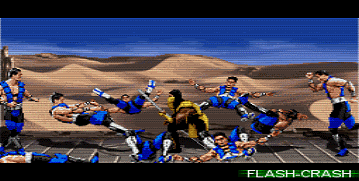
Here is the TOP SECRET FAKE i was talking about,Im going to be honest with yall i didnt realize that i forgot to darken untill i went to upload the pic and i dont feel like doing the pic over again it's like one of those "one time only"kind of moments when i was making the fake.I've been working on this pic since mid-June.
Desciption:Mavado slice's off Baraka's head and pull's out his organ's.
all done in paint:


This pic is funny, because at first, I was like ''whoa nice job'', but then as I slowly started looking at the fake, I began noticing it's terrible flaws. It's time for me to go TismMK on this thing.
Good things:
- the blood and organs on Baraka.
- The sprite edit on mavado's head and chest.
Bad things:
- Those shoes. I honestly dont know what you meant to do, but they look frighteningly terrible.
- The blood on the floor looks like an absolute joke. I look at the cool mavado edit, then I look at that blood. It almost looks like you did it on purpose to mess around with our heads.
- The cape is almost as bad as the blood. Only one colored? Come on, Dokter, what is that crap.
- The names on the lifebars just dont look right. I dunno.
Overall, it gets a 2/5. The blood and the cape look like absolute jokes.
0
Right well, don't use the forgot to darken the background or add shadows excuse, because in all honesty, it isn't hard to start over. It takes all of two minutes, if that.
Think about it, you have the sprites saved in a separate file to the background, so all you have to do is add the shadow to the sprites, darken the background, and then paste the sprite on the background.
I also recommend working on EVERYTHING that's in the fake and not in the background in a separate file, so if there is a problem, all you do is change it, and then paste it on the background, simple.
So:
- Background has not been dimmed. I explained above why it shouldn't take so long.
- Shadows, once again, see above.
- Lifebars. Nicely put together, but they are mixed. In that the MK3 wins texts with MK4 lifebars. While, imo, MK2 Baraka with an MK2 style Mavado should result in MK2 lifebars, or MKDA lifebars as Mavado is from MKDA.
- Speaking of which, why is Baraka's run meter full up?
- Timer, you can hardly see it. Did you make it? Because it looks a bit boring, and one-coloured with outline.
- Look at the way Baraka's lifebar is filled, then look at the way Mavado's lifebar is filled. Mavado's decrease in health in the bar is one colour.
- The blood, is very flat in colour. And that pool by his right hooksword (our left), is a perfect circle/elipse! Like that would happen!
- The cape, it needs shading, it's flat colour again.
- Those shoes, lol. I think you can tell the problem with them . Zebra shoes are not very MK.
- I think you could've edited the face a bit/more to look more like Mavado.
- The bridge. It's from the game I know, but is it badly removed from the game? I mean, it's colour quality doesn't seem too good.
Good things:
+ The Mavado edit is decent.
+ Blood/Organ work to Baraka is pretty good, though I'm not sure if some organs would be where you put them.
+ Best fake you've done.
You seem to have forgotten some pretty important things for making it look like the game, i.e. shadows and the dark background.
Remember to include everything, and use the advice of making everything in a separate file (unless you can use software that uses layers).
Think about it, you have the sprites saved in a separate file to the background, so all you have to do is add the shadow to the sprites, darken the background, and then paste the sprite on the background.
I also recommend working on EVERYTHING that's in the fake and not in the background in a separate file, so if there is a problem, all you do is change it, and then paste it on the background, simple.
So:
- Background has not been dimmed. I explained above why it shouldn't take so long.
- Shadows, once again, see above.
- Lifebars. Nicely put together, but they are mixed. In that the MK3 wins texts with MK4 lifebars. While, imo, MK2 Baraka with an MK2 style Mavado should result in MK2 lifebars, or MKDA lifebars as Mavado is from MKDA.
- Speaking of which, why is Baraka's run meter full up?
- Timer, you can hardly see it. Did you make it? Because it looks a bit boring, and one-coloured with outline.
- Look at the way Baraka's lifebar is filled, then look at the way Mavado's lifebar is filled. Mavado's decrease in health in the bar is one colour.
- The blood, is very flat in colour. And that pool by his right hooksword (our left), is a perfect circle/elipse! Like that would happen!
- The cape, it needs shading, it's flat colour again.
- Those shoes, lol. I think you can tell the problem with them
- I think you could've edited the face a bit/more to look more like Mavado.
- The bridge. It's from the game I know, but is it badly removed from the game? I mean, it's colour quality doesn't seem too good.
Good things:
+ The Mavado edit is decent.
+ Blood/Organ work to Baraka is pretty good, though I'm not sure if some organs would be where you put them.
+ Best fake you've done.
You seem to have forgotten some pretty important things for making it look like the game, i.e. shadows and the dark background.
Remember to include everything, and use the advice of making everything in a separate file (unless you can use software that uses layers).

About Me
WyattHarris.com Dig it
0
| TimsMK Wrote: Right well, don't use the forgot to darken the background or add shadows excuse, because in all honesty, it isn't hard to start over. It takes all of two minutes, if that. |
I think the point was that he's not gonna, not that he couldn't.
Well, this is pretty nice DRF.. you show some excellent editing skills in a few areas. I know since you worked on this since June, you must have been wanting to go ahead a post it, get it over with. I say that because, some parts of this are great, but you left off some small details, and some of the edits look like much effort wasn't involved. I still don't know what happened to the floor here, the quality isn't good at all, but this is a PNG so I wouldn't think the quality should diminish. I suppose you got this from the warehouse, and saved it in Paint as something other than a BMP.
Anyhow, as for the BG, other than the bad quality on the bridge it's good. I would have rathered you use the MKDA lifebars, or at least the MK2 version. But I believe the MKDA lifebars are fitting when you are making a sprite from that game. Though, your lifebars aren't horrible, they were pieced together rather well I guess. The timer is a bit bland though, just one solid color, isn't very interesting. But at least you have everything there, so good job there. You know what you missed, so I guess it really doesn't count as a mistake.
Mavado looks pretty decent, in fact, excellent in a couple of places. I love the chest edit, thats really excellent work. Yeah, the face could use some amount of work I guess, doesn't quite look like Mavado. The hair seems to be nailed pretty well though, its his nose and facial expre-ssion that look rather odd. The pants are decent I guess, a bit too basic, if the cape was done better it would have helped. The cape is one example at what I was talking about, I believe seeing that chest edit you could have done better. One solid color anywhere on a fake is never good, shading and in Paint's case pixel work is always neccesary to achieve the best results. I'm not sure where you were going with the striped shoes, Mavado doesn't wear boots like that. And again, once basic color makes it look flat. The one shade of gray you used over his stomach isn't as noticable, and it actually not so bad, but more color tones should be used.
The blood work isn't good for the large part. Its all one shade of red, and a couple of the formations the blood has gathered into are quite odd. The elipse, and also the pool under the right hooksword look odd. The one under the right looks too angled off, and the left, well of course blood isn't going to gather that perfectly. The blood is that same red on the left hooksword, not very good really, you just used the outline of the hooksword and colored it dark red. Really, only the blood on the right hooksword is decent. The blood around Baraka isn't good either, and the way its flowing from the head makes it look sort of bulky. The organs are alright though, maybe slighty misplaced but they are still pretty nice I supposed. Baraka's position was very well chosen though, Mavado's isn't bad really but the way his head is turned from Baraka isn't good. I'd rather he be facing the victim.
But, you show a great deal of skill in a few areas, I think you should have continued to work with this one for a bit longer. It has great potential, defiantely your best overall.

About Me
0
Dude... I don't know how long have you been makin fatality fakes but its not that bad for a beginner.
just try to make it closer to the game coz that's the whole point.
A fake 100 dollar bill should look like a 100 dollar bill not a mix of $100, and a 10 Euro banknote.
so should a fake UMK3/MKT fake fatality...
just try to make it closer to the game coz that's the whole point.
A fake 100 dollar bill should look like a 100 dollar bill not a mix of $100, and a 10 Euro banknote.
so should a fake UMK3/MKT fake fatality...

0
Oh my fucking god! your fucking back! were have u been?
| flash-crash Wrote: Dude... I don't know how long have you been makin fatality fakes but its not that bad for a beginner. just try to make it closer to the game coz that's the whole point. A fake 100 dollar bill should look like a 100 dollar bill not a mix of $100, and a 10 Euro banknote. so should a fake UMK3/MKT fake fatality... |
About Me
0
Wow Crow u must be good in school in if u can write a 4 paragraph review on this picture its like u did an essay, but thats a good thing. As for the picture it looks kinda weird. I hate it when ppl use solid colors it makes it look very bad, thats the main problem with it. The Mavado sprite looks weird his torsi doesnt go goos with his legs at all. But the Baraka sprite looks pretty cool. And i like the backround i tried to take the railin and stuff off that backround before but its to hard. Overall i give u a 2/5
About Me
0
Well yeah am back. been to other boards (non-mk) but then I decided I missed my good ol' MK kommunity pals and signed back in.
0
Come back like always you know... make some new animations, fakes and have a good O rematch against Timsmk 
| flash-crash Wrote: Well yeah am back. been to other boards (non-mk) but then I decided I missed my good ol' MK kommunity pals and signed back in. |
0
| MaRcElunbeatable Wrote: Come back like always you know... make some new animations, fakes and have a good O rematch against Timsmk |
Say wha?
Lol, good to see ya back Flash
About Me
0
thank you tim.

About Me
0
Looking good DRFatality, hope to see more.
About Me
It's time to run away with the sideshow.
Full speed, right ahead.
Don't stop, you can sleep when you're dead."
0
its good, the only thing i dont like are those zebron shoes, you could have probaly just completely do them in silver since thats the color of his shoes, other than that, nice work
Pages: 1


© 1998-2025 Shadow Knight Media, LLC. All rights reserved. Mortal Kombat, the dragon logo and all character names are trademarks and copyright of Warner Bros. Entertainment Inc.