
MK vs DC: Character Select Screens
Fan Kreations
Pages: 1
MK vs DC: Character Select Screens

About Me
 WoW player Name:grubgrub realm:dragonmaw HORDE
0
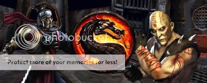
i like the deception version its more snappy (sorry couldn't think of a word)


0
Too plain and horrible quality.
I don't think it's plain. I think it's really good despite having only not that much to work with (talking about the avatars of course). But I will agree that it is a bit blurry, not too much.
But all in all, it's very good. Could we expect to see more when we see more characters popping up? I hope so.
... Or at least edit these pictures with new characters.
But all in all, it's very good. Could we expect to see more when we see more characters popping up? I hope so.
... Or at least edit these pictures with new characters.
0
I don't like either actually. Very blurry and plain. It literally hurts my eyes to look at them, especially the second one - and the font sucks.
What's so plain? It's hard to believe you don't see why the backgrounds are so BLAH.
What's so plain? It's hard to believe you don't see why the backgrounds are so BLAH.


Way too plain (not to be confused with plane), and it really has nothing to do with the theme of the game... especially with that retarded second one. It's like... huh? What kind of choice of color was that? Ridiculous.
I hope the game's actual select screen has nothing to do with either of those.
I hope the game's actual select screen has nothing to do with either of those.
Icebaby Wrote:
I don't think it's plain. I think it's really good despite having only not that much to work with (talking about the avatars of course). But I will agree that it is a bit blurry, not too much.
But all in all, it's very good. Could we expect to see more when we see more characters popping up? I hope so.
... Or at least edit these pictures with new characters.
I'll be editing my sig.
It'll take time, though. As much as people say the pics suck, they still aren't easy to do.

About Me
0
I think the first one is really good, the second one needs a little more work. Maybe you can add a background to it. 
0
hmm...i've come up with an idea of a select screen. i'm not going to show it though due to the fact that i'm plagiarizing if i do without original user consent, but i have an idea.
Pages: 1


© 1998-2025 Shadow Knight Media, LLC. All rights reserved. Mortal Kombat, the dragon logo and all character names are trademarks and copyright of Warner Bros. Entertainment Inc.