
Mortar's lung rip in some new bg
Fan Kreations
Pages: 1
Display Mature Content:
| Artist's Remarks: | |
|
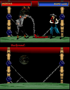
OK, first of all, dont rub it in my face that it's the same fatality, same sprites, same everything as the previous mortar's lung rip. That's because, I first did a sprite edit on Scorpion and mixed him in with Kung Lao to make this other ninja guy. But, the pc crashed, and no more sprite. Than I made another one, with sub-zero this time, but the pc crashed again. Tired and pissed, I decided to just show the damn bg instead of putting a new fake into it. Enjoy.
|
| Full Scale | 399x510 | Category | Fakes | User Views | |
| User Likes | User Ratings | 11 | Score |
 3.0 3.0
|


Pages: 1


© 1998-2026 Shadow Knight Media, LLC. All rights reserved. Mortal Kombat, the dragon logo and all character names are trademarks and copyright of Warner Bros. Entertainment Inc.