
MY first MKA sigs.
Fan Kreations
Pages: 1
MY first MKA sigs.
0
posted10/06/2006 02:34 AM (UTC)byMember Since
02/12/2006 08:37 PM (UTC)
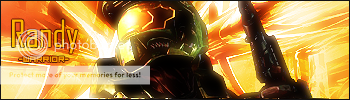
I got the idea to make these by seeing MINONS sigs, but there not as good as his. I made two so far: http://img95.imageshack.us/img95/8602/mkanoobck6.png AND http://img161.imageshack.us/img161/2585/mkareptiletz8.png

 MK Khronology: 58.49% complete...
0
Opps. Thank you!


0
Good sigs mate. I like the Reptile one a lot more as the ffect behind the text blends in a lot better than the Noob Saibot one. Maybe you should have changed the background to fit Noob better, as i think the fire colour does not really blend with the signiture and seems to look out of place.
The effect behind the text in the Noob sig is too intrudin and sharp. Its covers too much of the signiture IMO. Its hard to see the White Pixel font infront of the effect too. Maybe you should added a border to this text of used drop shdow. On the other text it looks like you have used Bevel and Emboss, i think this isn't good, forgive me if you have not used it.
The Reptile signiture, i like a lot. You have kept a Green theme in the signiture and into the effect. This time the effect is more light and not as extreme so it is easy for it to blend into the signiture. The "Reptile" text looks good and a better colour has been chosen. Maybe on the "Zatterean Assasin" and the pixel font, a border could have been added to the text to make it more noticeable or maybe a shadow could have been used.
Overall these are good for your first MKA Sigs
Noob- 6/10
Reptile 8.5/10


skinsley Wrote:
Love it, what fonts do you use ? and how do you get that interesting effect behind the words?
Love it, what fonts do you use ? and how do you get that interesting effect behind the words?
He used the Resident Evil font for Reptile, I'm not sure about Noob's... kinda hard to tell.
Also the Zaterran Assassin and the Demon of Shadows look like the Mortal Kombat 5 font.
0
I love em. Try putting more width on it and putting more characters or more pics or renders of the same character
Noob8/10
Reptile7.6/10
Noob8/10
Reptile7.6/10
0
Thanks for the advice and complements! I knew the Reptile would be the better, I made it first and decided to play around with a noob one. I dont know why, but I liked the noob one, the black burst thing reminds me of a ninja star. The fonts I used were Resident Evil, Mortal Kombat 5, and Blade 2.
They're both amazing nice effects and fonts, bravo.
Reptile: Your better of the two. The effect behind the words blends perfectly. 9.5/10
Noob: Still good, but not as good as the Reptile one. The effect isn't as good as Reptile's. 8.7/10
Reptile: Your better of the two. The effect behind the words blends perfectly. 9.5/10
Noob: Still good, but not as good as the Reptile one. The effect isn't as good as Reptile's. 8.7/10
Pages: 1


© 1998-2025 Shadow Knight Media, LLC. All rights reserved. Mortal Kombat, the dragon logo and all character names are trademarks and copyright of Warner Bros. Entertainment Inc.