
My new sig
Fan Kreations
Pages: 1
My new sig


 I hope you like it. Rate it please
About Me
0
The sig has no focal point. Focus on that.

About Me

0
dont like it, too many renders, i dont like the little scorp render just standing there, it needs some more too it, blending maybe, some nice text, border, put more into it.

About Me
<img src ="http://www.comixodez.com/Sets/mkosig2.png"
www.ComiXodeZ.com
0
The Li Mei is out of place and there isn't a focal point.
0
Don't like it.Theres nothing special going on just some renders there.
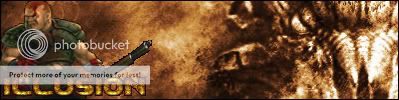
P.S illusion loving ure sig bro,pure badass sig
P.S illusion loving ure sig bro,pure badass sig


About Me
<img src ="http://www.comixodez.com/Sets/mkosig2.png"
www.ComiXodeZ.com
0
We can't see her face. You should at least be able to see part (like Cham's) face in order to be a decent sig (and that's only if you want to focus on one person). You can only see her body, she's there for no purpose. "And without reason there is no purpose."
About Me
0
Thanks for the sig compliment, Sektor101.
I dont know what you guys are talking about but i can see her face. here is another picture if you cant see it. http://img.photobucket.com/albums/v410/wwe123/Mortal%20Kombat/Zerosig2.jpg
zeroman Wrote:
I dont know what you guys are talking about but i can see her face.
here is another picture if you cant see it.
http://img.photobucket.com/albums/v410/wwe123/Mortal%20Kombat/Zerosig2.jpg
I dont know what you guys are talking about but i can see her face.
here is another picture if you cant see it.
http://img.photobucket.com/albums/v410/wwe123/Mortal%20Kombat/Zerosig2.jpg
Dude your sig is way to big for this site..make it smaller plz.
Pages: 1


© 1998-2025 Shadow Knight Media, LLC. All rights reserved. Mortal Kombat, the dragon logo and all character names are trademarks and copyright of Warner Bros. Entertainment Inc.