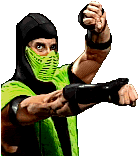
Raydens MK2 fatality,Hand drawn.
Fan Kreations
Pages: 1
Raydens MK2 fatality,Hand drawn.
0
posted09/07/2006 12:13 AM (UTC)by

About Me
I made this! Yay!

Guess who's back!
Member Since
08/29/2006 12:09 AM (UTC)
Edit:fixed Sub-Zero's z Edit:I added to the background and made it more like MK:SM This is Rayden's MK2 fatality performed on subzero, here is the link. http://img512.imageshack.us/my.php?image=09012006112209pmwc0.png
About Me
0
Hmm... this drawing isn't that bad.
Some things you can work on:
- Raiden's lifebar needs to be fixed. It looks uneven and smaller than Subby's lifebar.
- Win marks are uneven.
- The Z in Sub-Zero needs to be fixed.
- The background looks quite boring. Try adding more things to it. The Shadow Priest looks good. So does Raiden and Sub-Zero.
- The fatality text is somewhat too low.
Overall: 3/5


About Me
I made this! Yay!

Guess who's back!
0
Thanks man, i just dont like how the shadow preist came out i could've drawn him better.
About Me
0
Okay, the background looks better now. 3.5/5


About Me
I made this! Yay!

Guess who's back!
0
Thank you.


About Me
0
nice 3.5/5


About Me
I made this! Yay!

Guess who's back!
0
thank you.


About Me
I made this! Yay!

Guess who's back!
0
thank you.
I like the effort. It looks like you tried your best with what you know.
The details on Sub and Rayden are fine, but the backgrounds are a bit out of place.
The priest is slightly tilted on the 1st and 3rd slots.
You should have added some shading too, especially to the simple backgrounds.
Also, I like the way you made it into an animated comic format so we can get a better idea of what happens.
3.5/5


About Me
I made this! Yay!

Guess who's back!
0
Thanks
0
Nice, drawing is still not easy to do.I used to draw, now I sculpt.
Anyway I like it 9/10
Anyway I like it 9/10


About Me
I made this! Yay!

Guess who's back!
0
Thanks man!!
Pages: 1
© 1998-2025 Shadow Knight Media, LLC. All rights reserved. Mortal Kombat, the dragon logo and all character names are trademarks and copyright of Warner Bros. Entertainment Inc.


