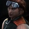
0
submitted 10/02/2006 05:10 AM (UTC)by
Brodeur Member Since
05/29/2003 03:59 AM (UTC)
Yup, it's better.Keep it up.
you're definitely improving, the proportions are much better but still need a little work. Your detail is getting much much better but I still suggest fooling around with shading. Perhaps you should practise drawing different parts of the body to get a better sense of form. Start on heads first, arms, hands, all the way. I give you 3/5 for this one.
Um....thats totally a 2 cause I have no clue what I just saw. Ok improvment.
1) No horns on Scorpion he isn't a demon or a devil he is a spector
2) A skull on his belt is waaay cooler than his own face.
3) Why is that thing on his knee breathing smoke??
4) Fire on his mask doesn't look right at all.
5) Snake coming from his back? I don't get it.
Your drawing looks nice but don't add your own things. Try to make a copy of Scorpion from the pic. but don't add anything weird. 2/5 yes I know its a customized Scorpion but the customized stuff added on doesn't match him. Customize him for #3 and add things that match him.
Zombie •07/30/2004 06:19 AM (UTC) •0
not bad. keep working on it
I don't like the face but the body looks great.....um.....that didn't come out well did it?
© 1998-2025 Shadow Knight Media, LLC. All rights reserved. Mortal Kombat, the dragon logo and all character names are trademarks and copyright of Warner Bros. Entertainment Inc.