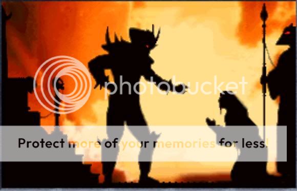
Scorpion vs Cage
Fan Kreations
Pages: 1
Scorpion vs Cage
Artist's Remarks: | |
okay this one is NOT a mk "game battle" its more cinematek and dont tell me i need lifebars and all that crap so enjoy and dont tell me how to do my work i mean tell me what's wrong but not how u like it to be ok!
|
Full Scale | 395x254 | Category | Drawings (Digitally coloured) | User Views | |
User Likes | User Ratings | 7 | Score |
|
This is very good. All the blood effects look very nice. I like the stance that you put Baraka in instead of his winning stance, it gives it a different look. The ways that Johnny is ripped in different places looks good as well. The background looks awesome. I like the blood effects that you put under the FATALITY word. They look cool. It gets a 4/5.

0
Wow, nice.
As it's meant to be a more cinematic thing, then I personally would have left out the fatality and occupied the space with something else, like maybe making the moon a little larger to fill that gap.
Speaking of, I would've really liked if you had a moonlight effect.
Also, perhaps a smoother transition to the moon going behind the cloud (i.e. fading).
However, nice sprite for Baraka and great blood work.
But yeah, as I said before I think it might be better without the fatality (or perhaps a better text, I mean everybody has already seen the MK2 one a zillion times).
Still though, nice
.
As it's meant to be a more cinematic thing, then I personally would have left out the fatality and occupied the space with something else, like maybe making the moon a little larger to fill that gap.
Speaking of, I would've really liked if you had a moonlight effect.
Also, perhaps a smoother transition to the moon going behind the cloud (i.e. fading).
However, nice sprite for Baraka and great blood work.
But yeah, as I said before I think it might be better without the fatality (or perhaps a better text, I mean everybody has already seen the MK2 one a zillion times).
Still though, nice

0
Awesome job.
I seen some fakes in the past base on this particular idea, but never this good. I don't know what you did to Baraka's face, but it has a nice touch. Great job on the Blood, i'm really impress in your editing.
I don't like the moon. Unoriginal and sort of boring, sorry. Start adding the watermark on the LEFT or RIGHT side of your fakes. No lifebars. Why in the world, is the FATALITY text so high?
Use ImageReady, to cut out the frame where the text is dripping.
Start getting in the habit of coming out with ORIGINAL ideas, but your fakes aren't bad. You just need to "move on",
.
I seen some fakes in the past base on this particular idea, but never this good. I don't know what you did to Baraka's face, but it has a nice touch. Great job on the Blood, i'm really impress in your editing.
I don't like the moon. Unoriginal and sort of boring, sorry. Start adding the watermark on the LEFT or RIGHT side of your fakes. No lifebars. Why in the world, is the FATALITY text so high?

Use ImageReady, to cut out the frame where the text is dripping.
Start getting in the habit of coming out with ORIGINAL ideas, but your fakes aren't bad. You just need to "move on",


About Me
0
very nice work.
0
pimpin Wrote:
you dumb shit
Don't bump threadsyou dumb shit


About Me
0
It's pretty good. The blood and the fatality text looks fine. 3.5/5
Pages: 1
© 1998-2025 Shadow Knight Media, LLC. All rights reserved. Mortal Kombat, the dragon logo and all character names are trademarks and copyright of Warner Bros. Entertainment Inc.