
Shinnok in mkt
Fan Kreations
Pages: 1
Shinnok in mkt
0
posted08/07/2007 04:00 PM (UTC)by


0
i don't like it for the following reasons:
1)you have should used his MK Sub Zero mythologies spites instead of mk4 ones;
2)the lifebars need more work
3)the hand should be white or at least very light blue
4)the hand should lift up smoke,and his head shuld pop pff a bit later
for the rest i think that is good
1)you have should used his MK Sub Zero mythologies spites instead of mk4 ones;
2)the lifebars need more work
3)the hand should be white or at least very light blue
4)the hand should lift up smoke,and his head shuld pop pff a bit later
for the rest i think that is good
0
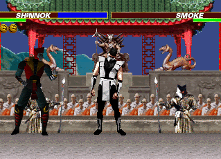
To be honest, I think it's a bit sloppy.
A couple more sprites/screen caps for Shinnok would've helped a lot here because he's not very animated.
The effects on the hand are a bit odd too - don't like the blue line and the hand looks of very low quality (but maybe that's the GIF compression using most of the colours on Shinnok - if so, perhaps try exporting as another format?).
The head popping off doesn't appear to follow a good motion either, just up, across and straight down with no blood arriving anywhere until it's hit the floor.
This was one of my more favoured fatalities in MK4 because it was just goofy, funny and superbly sinister.
But I don't get the same personality from this, or in fact I found it hard to find any here.
If there were more frames you could take advantage of some good timing (i.e. longer time squeezing the hand, having him shaking until it finally pops up, for example) to inject some spirit into it?
2/5 from me.


No time
Lifebars were a little off screen
The head seems like its floating at the end
Shinnok doesn't move (not a big flaw, cuz I know that would be hard to make him move but i've seen custom characters like Rieko in animated fighting stances)
It was sloppy
The portal think was just 1 plain color.
The lifebars are really messed up. The health is backwards.
I didn't like it. It was cool trying to make his fatality, but it just wasn't that good. Good luck next time you make a fatality.
2/5
0
Sharpeye Wrote:
great job on that dude.The shinnok sprites were pretty cool.And it was a good idea to make him do his MK4 fatality.Keep up the good work!
great job on that dude.The shinnok sprites were pretty cool.And it was a good idea to make him do his MK4 fatality.Keep up the good work!
ha, its better than your animations
there's just a few things that i don't really like in here
your characters are not movig, like smoke should be dizzy before getting squeezed by the big hand.
your shinnok sprites should be from mythologies not mk4
but all and all it's a decent animation.
meh, 3.5 / 5


0
I see several problems.
-Shinnok is FAR too dark.
-The 3D MK4 styles really clashes with the 2D sprites.
-If the hand is meant to squeeze smoke to the point where his head pops off it doesn't do a very good job. It looks like it just grabs a hold of him and his head falls off.
I think it's a cool idea but just a poor execution.

About Me

0
If you can't see what's wrong with this animation without us telling you, then you're screwed. 1/5.


Pages: 1


© 1998-2025 Shadow Knight Media, LLC. All rights reserved. Mortal Kombat, the dragon logo and all character names are trademarks and copyright of Warner Bros. Entertainment Inc.