
Sub-zero vs Striker
Fan Kreations
Pages: 1
Display Mature Content:
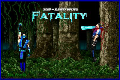
| Artist's Remarks: | |
|
Here it is. I thought that I would try that old Iceicle thing...only I figured that it would look better in the mouth. As you can see, I made the forest messier....so that it's more foresty, and not so MK stagey. The reson for the fatality text being how it is is because I like to match that text with the character. Again, no life bars because I like to keep it simple.
|
| Full Scale | 402x269 | Category | Fakes | User Views | |
| User Likes | User Ratings | 19 | Score |
 4.0 4.0
|


 |
|

Pages: 1


© 1998-2026 Shadow Knight Media, LLC. All rights reserved. Mortal Kombat, the dragon logo and all character names are trademarks and copyright of Warner Bros. Entertainment Inc.