
The Specters Stare....*in colour*
Fan Kreations
Pages: 1
The Specters Stare....*in colour*
0
posted12/03/2006 06:17 PM (UTC)by
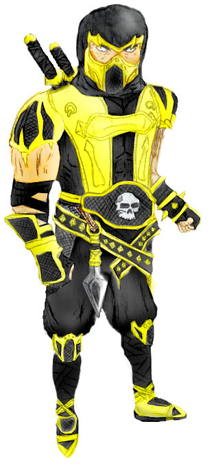
Drawn by me, coloured by Arctic.
:)

About Me

0
It's decent, but the proportions are way off. 2/5.

About Me

0
The proportions are way off. The head is too big, the arms are awkward and the feet needs work, too. The coloring is okay. 2.5/5
Don;t knock the proprtions too bad. They are wrong but I c what he was going for. Scorpion looking up at you and the damera pointing at a downward angle. Your mistake is common. People focul on trying to get the front of the pic in b4 they realize the true blue view of the camera angle.
Remeber he is looking up at you so you don't want toshow too much of his body It could slide like you were looking down a hill. A for effort. And good job colouring arctic.
Remeber he is looking up at you so you don't want toshow too much of his body It could slide like you were looking down a hill. A for effort. And good job colouring arctic.
About Me

0
Kombosus Wrote:
Don;t knock the proprtions too bad. They are wrong but I c what he was going for. Scorpion looking up at you and the damera pointing at a downward angle. Your mistake is common. People focul on trying to get the front of the pic in b4 they realize the true blue view of the camera angle.
Remeber he is looking up at you so you don't want toshow too much of his body It could slide like you were looking down a hill. A for effort. And good job colouring arctic.
Yeah, this was my first time trying the angle.
And NM read what he said, and re-rate.
And Hikari... how did my score go down from when it wasn't in colour?
About Me

0
It's pretty good.But like said,the proportions are way off.Scorpion's head looks too big compared to his small arms and legs,body,etc.The coloring is pretty good,although his armor in Deception was more of a darker orange-y color.
2.8/5
2.8/5
About Me
0
Tommy, did you read the apove post?

that's it not in colour...
duh.
that's it not in colour...
duh.
About Me
0
dagonzombie Wrote:
Yeah, this was my first time trying the angle.
And NM read what he said, and re-rate.
And Hikari... how did my score go down from when it wasn't in colour?
Kombosus Wrote:
Don;t knock the proprtions too bad. They are wrong but I c what he was going for. Scorpion looking up at you and the damera pointing at a downward angle. Your mistake is common. People focul on trying to get the front of the pic in b4 they realize the true blue view of the camera angle.
Remeber he is looking up at you so you don't want toshow too much of his body It could slide like you were looking down a hill. A for effort. And good job colouring arctic.
Don;t knock the proprtions too bad. They are wrong but I c what he was going for. Scorpion looking up at you and the damera pointing at a downward angle. Your mistake is common. People focul on trying to get the front of the pic in b4 they realize the true blue view of the camera angle.
Remeber he is looking up at you so you don't want toshow too much of his body It could slide like you were looking down a hill. A for effort. And good job colouring arctic.
Yeah, this was my first time trying the angle.
And NM read what he said, and re-rate.
And Hikari... how did my score go down from when it wasn't in colour?
I'm not going to rerate it. I know it's from a downward angle. The proportions are still off.
The eyes are way too far apart, as well.
About Me
0
eyes? far apart? no. but okay.
0
guys calm down, not everyone on here is professionals. We al got to start somewhere, i think its great! better then what i can draw.
About Me
0
EdboonFan Wrote:
guys calm down, not everyone on here is professionals. We al got to start somewhere, i think its great! better then what i can draw.
guys calm down, not everyone on here is professionals. We al got to start somewhere, i think its great! better then what i can draw.
I didn't say everyone here is a professional. I'm critiquing the art, which is what you're supposed to do.
Yes, the eyes are far apart. His head is way too fat, and his mask is all crooked and squished.
About Me
0
Kombosus Wrote:
Yes but you are being very cruel.
Yes but you are being very cruel.
Cruel?
"It's decent, but the proportions are way off. 2/5."
"I'm not going to rerate it. I know it's from a downward angle. The proportions are still off.
"The eyes are way too far apart, as well."
"Yes, the eyes are far apart. His head is way too fat, and his mask is all crooked and squished."
Hardly.
About Me
0
Ninja_Mime Wrote:
Cruel?
"It's decent, but the proportions are way off. 2/5."
"I'm not going to rerate it. I know it's from a downward angle. The proportions are still off.
"The eyes are way too far apart, as well."
"Yes, the eyes are far apart. His head is way too fat, and his mask is all crooked and squished."
Hardly.
Kombosus Wrote:
Yes but you are being very cruel.
Yes but you are being very cruel.
Cruel?
"It's decent, but the proportions are way off. 2/5."
"I'm not going to rerate it. I know it's from a downward angle. The proportions are still off.
"The eyes are way too far apart, as well."
"Yes, the eyes are far apart. His head is way too fat, and his mask is all crooked and squished."
Hardly.
The eyes arent too far apart... by much... and the mask crooked? I made his head wide to be Scorpion's (scorpion's head is skinnier.
dude w/e


About Me
0
Zentile Wrote:
Jesus Christ buddy, get a fucking grip on yourself. I enjoy the picture, but there ARE things wrong with it. Why dont you just admit it? People critisize you for a REASON, man, what is it with these kids? They go crazy at criticism.
Jesus Christ buddy, get a fucking grip on yourself. I enjoy the picture, but there ARE things wrong with it. Why dont you just admit it? People critisize you for a REASON, man, what is it with these kids? They go crazy at criticism.
Dude, i agreed with him. I'm just asking him to be more specific. I admit its not perfect, nothing is, my picture does have some proportion problems.
Thanks any ways
ZOmbie
About Me
0
dagonzombie Wrote:
Dude, i agreed with him. I'm just asking him to be more specific.
Zentile Wrote:
Jesus Christ buddy, get a fucking grip on yourself. I enjoy the picture, but there ARE things wrong with it. Why dont you just admit it? People critisize you for a REASON, man, what is it with these kids? They go crazy at criticism.
Jesus Christ buddy, get a fucking grip on yourself. I enjoy the picture, but there ARE things wrong with it. Why dont you just admit it? People critisize you for a REASON, man, what is it with these kids? They go crazy at criticism.
Dude, i agreed with him. I'm just asking him to be more specific.
I gave you pretty straight forward criticism. How can you not understand "The eyes are too far apart"?

About Me

0
just look at what people say and go fix it
if most people say the same thing it must be true
if most people say the same thing it must be true
Pages: 1


© 1998-2025 Shadow Knight Media, LLC. All rights reserved. Mortal Kombat, the dragon logo and all character names are trademarks and copyright of Warner Bros. Entertainment Inc.