
the white ninja
Fan Kreations
Pages: 1
the white ninja


Nice! It's really good. There's only one thing I don't like and that's the head. But I'm not sure why. I think it looks a little too big, but as I said I'm not sure. Other than that it looks really good. He reminds me of a Star Wars Stormtrooper. Great Job! 4/5

0
Wow, m_k_x!
You really surprise me with your 3D renders. They are all good. This one is great... but not all that fantastic. You've done better. What I don't like about this render, is how the Ninja's arms are placed. Plus they look too small, and you should of blending it with the rest of his upper arms. Although, it's still awesome. Good work. By the way, you should really come to the board more often... I hardly see you around.
My rating : 3.5/5

0
eh NoobSaibot about your sig... your actually right 
Well I sort of don't like the idea of "White Ninja" it will look better if you made this render as Noob Saibot since his black, but good effort.
Btw I seen your avatar in MkChampions are you "Kain05"?
Well I sort of don't like the idea of "White Ninja" it will look better if you made this render as Noob Saibot since his black, but good effort.
Btw I seen your avatar in MkChampions are you "Kain05"?


| MaRcElunbeatable Wrote: eh NoobSaibot about your sig... your actually right Well I sort of don't like the idea of "White Ninja" it will look better if you made this render as Noob Saibot since his black, but good effort. Btw I seen your avatar in MkChampions are you "Kain05"? |
I dont think he said he's going to make a black one, Marcel.
Anyway, it looks great and all, but lets talk- anatomy.
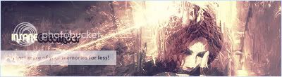
The head is huge compared to the arms and hands. But that's about it for bad stuff, I think it looks pretty nice.
Hmm.. well this one is alright I suppose, but I believe it could have been blended together a bit better as forthmentioned.
The head is actually quite nice, I like the sort of 'slash' mark of white, its a pretty nice design idea. I'm not so sure about that shadow though, it seems rather misplaced to me. The shadows being cast below his head is well placed though. His head doesn't seem that well set on his shoulders though, looks as if his neck is raised too high. The 'spikes' are a nice edition though. I don't really care for this characters name, "rien" as its a bit too close to "rain" for me.
You call this 'the white ninja' but really I would have liked to see more white, and more intricate designs that this. Its just a bit bland I think, someone siad it looked a bit like a stormtropper and I can see that. Also, the way that white 'rectangle' is positioned seems a bit off. It makes his shoulders seems sort of blocky. The forearms really are alot different in texture than his upper arms are, which is what I meant by blending it a bit better. The effect between his hands is okay I guess.
Anyhow, I still like this, your renders are enjoyable to look at. Hope to see more from you soon.
0
Damn SaiBot your sig fucking 0wnszz
Zentile that was just my opinion, since he kinda looks like Noob Saibot.
I can't seen to go to Mk Champions, but sure as fuck there is some1 w/ the same avatar as yours.
Zentile that was just my opinion, since he kinda looks like Noob Saibot.
I can't seen to go to Mk Champions, but sure as fuck there is some1 w/ the same avatar as yours.

About Me
WyattHarris.com Dig it
0
That is a big head, it does give me a good idea for Noob though.
Wyatt
Wyatt
0
What the fuck? It's ok.
Pages: 1


© 1998-2025 Shadow Knight Media, LLC. All rights reserved. Mortal Kombat, the dragon logo and all character names are trademarks and copyright of Warner Bros. Entertainment Inc.