
Do you LIKE or HATE the New Character Select Screen STYLE?
Do you LIKE or HATE the New Character Select Screen STYLE?
I'm happy with the new character select screen of Deception. I love the character 2D drawings, it looks pretty awesome even though I was hoping to see something new and different. (Guess we will have to wait for Mk7)

But I was wondering if anyone remembers this unused character select screen from MKDA??? I really like this one, im not sure if its better then the new one but I really like the detail a lot more! What do you think?
I hope we see something like this in Mk7. Different from all the past screens!
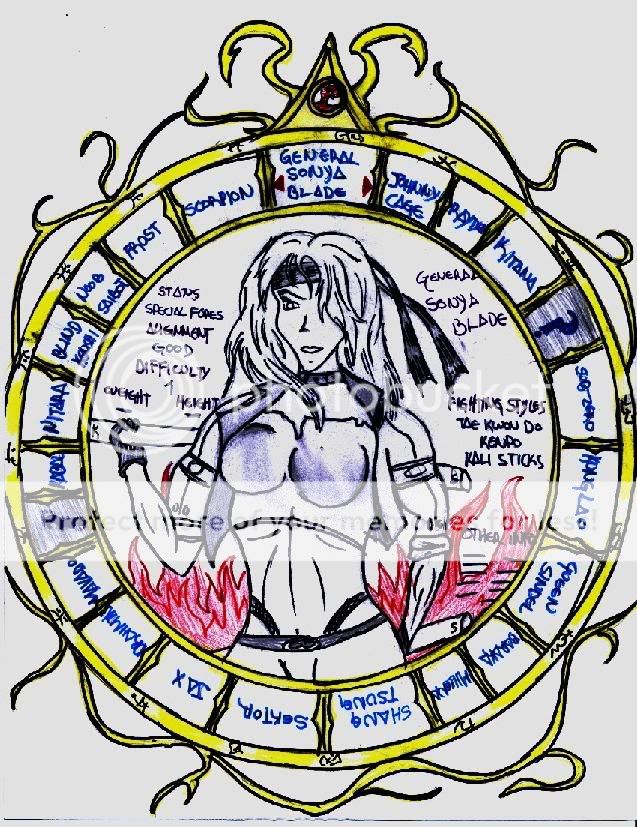
But I was wondering if anyone remembers this unused character select screen from MKDA??? I really like this one, im not sure if its better then the new one but I really like the detail a lot more! What do you think?
I hope we see something like this in Mk7. Different from all the past screens!


I love the new select screen, it looks really dark with the moving clouds and thunder above. I really hope they keep it this way but it has changed before in MKDA. I did not like the early MKDA select screen so much it looks too plain but this one is way better.

0
Daemos is right, I really dont think that one at E3 was final, it looked really plain compared to MKDA's one.
Expect a revamped new for release.
Expect a revamped new for release.
About Me
To Live in silence is to live in fear
0
I really like the one at E3, we dont need some elaborate graphical select screen. If they are going for a more darker look/feel for the game, I think the select screen adds to it. It reminds me of the old d ays of mkII and III.

About Me
Sex is Evil, Evil is Sin, Sin is forgiven, so Sex is in.
I kill people for a living. Get over it.
0
I think they'll keep the same look as the one at the E3 Show but they will add 6 more charater icon 3 on each side bringing the total to 30!!!!

0
I liked the E3 one it looked dark and menacing a bit on the simple side but who said we nooeded all the bells and whistles.

About Me
0
I really like the MK:Deception select screen. It's dark and that is what this MK is looking DARK. It is missing the animated characters that I was hoping for. It also seemed to simple but I think the background will be like the official sites background. With the lightning and thunder.

I was hoping they would go old school and make the select screen look like it was made out of stone. Having a stone tablet with the icon's of all the characters and show the character from the torso up in their default stance (the character you have your cursor over anyways) instead of just being still and lifeless, and when you select them they go into a toned down victory stance just like the ones in mk 1-3. I sort of like the new one, but I think the select screens in the new Mortal Kombats are just like every other fighting games IMO.


0
I love the new select screen. I prefer it to the unused one! I haven't seen the vids yet so I don't know if there's any animation. So I hope they have or do include some for the characters when you pick them.
0
WOW!
I had never seen that mkda early character screen! I like that one so much more!!!
I actually hope the new one changes, but not like the one of mkda...
I had never seen that mkda early character screen! I like that one so much more!!!
I actually hope the new one changes, but not like the one of mkda...

About Me
<img src=http://i1205.photobucket.com/albums/bb424/astro407/Baraka407---Baraka-Sig---GIF1.gif?t=1302751589
0
I definitely like the early unused MK:DA select screen. If they had maybe filled in the blue areas under the pillars, it would've been perfect. Perhaps starting out with stone behind them, and then the stone shatters once you go to select the arena to fight in, filling them with the background they were going to fight in (a sweeping camera view when the background is highlighted), but that's just my opinion.
As for the current select screen (is there anyone someone could post a pic of that? I don't seem to be able to), I have to say it looks REALLY early. I'd bet money that won't be the final select screen. It looks like they just did that in a short amount of time to get something presentable for E3. I'm not saying tha it looks bad, it doesn't, but it doesn't look like it's animated, and the background with the clouds and what not seems very plain. heck, I'd probably prefer the unused MK:DA select screen to the current MK:D select screen. Still, like I said, I seriously doubt that what we currently see is the final version. I'll be shocked if it is.
As for the current select screen (is there anyone someone could post a pic of that? I don't seem to be able to), I have to say it looks REALLY early. I'd bet money that won't be the final select screen. It looks like they just did that in a short amount of time to get something presentable for E3. I'm not saying tha it looks bad, it doesn't, but it doesn't look like it's animated, and the background with the clouds and what not seems very plain. heck, I'd probably prefer the unused MK:DA select screen to the current MK:D select screen. Still, like I said, I seriously doubt that what we currently see is the final version. I'll be shocked if it is.

0
The unused mkda character screen is so cool!!!
I love the new one but after seeing this one i kind I hope they do somehing like this. but i definitely want to see something like that picture you draw.
I love the new one but after seeing this one i kind I hope they do somehing like this. but i definitely want to see something like that picture you draw.
| spike81 Wrote: I love the new select screen, it looks really dark with the moving clouds and thunder above. I really hope they keep it this way but it has changed before in MKDA. I did not like the early MKDA select screen so much it looks too plain but this one is way better. |
I actually love the character model styles they used in that screen.
I like it a lot more then the one we had in the final game.
0
I like it, but DA's looked pretty awesome to IMO.
I just hope they show all of the characters stats and such when you go to pick them. Thats one thing i loved about DA's character selection screen.
I just hope they show all of the characters stats and such when you go to pick them. Thats one thing i loved about DA's character selection screen.

About Me
0
I think this one is pretty nice, although I was impressed with MKDA's as well. I don't know, I guess what it really comes down to is I'm going to like it no matter what.
Although one thing I do grade strongly for is whether a larger view of the character appears once his/her icon is highlighted. That is important to me.
Although one thing I do grade strongly for is whether a larger view of the character appears once his/her icon is highlighted. That is important to me.
About Me

0
i love the new select screen, i hope they dont change it like they did with Mk:Da

About Me

0
I think its kool. It deffinately has the dark MK feel to it.
0
Agreed 100%
| MetadragonX Wrote: I think its kool. It deffinately has the dark MK feel to it. |


I highly doubt that will be the final select screen, they've done this at E3 before. They throw one together just for the show. It's just a temporary thing I assure you. However, I love that style. I hated when they changed the one for Deadly Alliance. Maybe it will be similar to the horizontal layout they have with the current one.


© 1998-2025 Shadow Knight Media, LLC. All rights reserved. Mortal Kombat, the dragon logo and all character names are trademarks and copyright of Warner Bros. Entertainment Inc.