
New Box Cover
New Box Cover


About Me
0
Very nice, I like it a lot. Good job on the find. 

About Me
Herro.
0
Another Counterpart Idea!
If those are the counterparts of those three, then I am happy.
Scorpion and Batman
Wonder Woman and Raiden
Sub Zero and Superman
Now we won't have arguments on whether Catwoman or Wonder Woman gets Kitana or Sonya.
If those are the counterparts of those three, then I am happy.
Scorpion and Batman
Wonder Woman and Raiden
Sub Zero and Superman
Now we won't have arguments on whether Catwoman or Wonder Woman gets Kitana or Sonya.


About Me
<img src="http://i91.photobucket.com/albums/k282/braindude/BadMansearlylife4.png?t=1215548862"
0
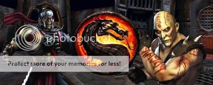
That's some awesome looking cover art, but Subs was a better match for Batman, and it should be Raiden against Superman, not Scorpion.
0
Damn that is some nice cover art.

About Me

0
Not bad at all... I wonder if the Kollector's edition will have the same cover or not.
I'd like to see a few different variations, though.
I'd like to see a few different variations, though.
About Me

0
That looks pretty damn awesome! love it. It's perfect, definitely sums up what the game is about.


About Me
Cage always wins, and in MK u will be Caged!

0
Dang all the charcters on it look GOOD!
About Me
What do you like? Hit the Toasty thumbs up on articles and forum posts for a quick response!
0
Mmm! An unattractive, uninspiring painted cover straight from the nineties!
How could MK fans not like it?
The Worlds Collide face off version might be familiar to fans, but it's also a far more enticing and appropriate design. Lumpy, style-deficient painted renderings looks more like something a magazine would knock-up, or receive as promo art.
How could MK fans not like it?
The Worlds Collide face off version might be familiar to fans, but it's also a far more enticing and appropriate design. Lumpy, style-deficient painted renderings looks more like something a magazine would knock-up, or receive as promo art.
0
Way cool!!!
Mick-Lucifer Wrote:
Mmm! An unattractive, uninspiring painted cover straight from the nineties!
How could MK fans not like it?
The Worlds Collide face off version might be familiar to fans, but it's also a far more enticing and appropriate design. Lumpy, style-deficient painted renderings looks more like something a magazine would knock-up, or receive as promo art.
They did :P they've looked almost EXACTLY like that
About Me
0
Mick-Lucifer Wrote:
Mmm! An unattractive, uninspiring painted cover straight from the nineties!
How could MK fans not like it?
The Worlds Collide face off version might be familiar to fans, but it's also a far more enticing and appropriate design. Lumpy, style-deficient painted renderings looks more like something a magazine would knock-up, or receive as promo art.
Mmm! An unattractive, uninspiring painted cover straight from the nineties!
How could MK fans not like it?
The Worlds Collide face off version might be familiar to fans, but it's also a far more enticing and appropriate design. Lumpy, style-deficient painted renderings looks more like something a magazine would knock-up, or receive as promo art.
What I see is a badass cover that's gonna be very noticeable when people see it on the shelves at Gamestop.
Would you prefer the original cover art, the silhouette of Batman and Sub-Zero? Cause that was kind of boring.
About Me

0
love it but always thought it was batman vs sub, wonder woman vs kitana, and scorpion vs superman hmmmmm

About Me
What do you like? Hit the Toasty thumbs up on articles and forum posts for a quick response!
0
BiohazardEXTREME Wrote:
What I see is a badass cover that's gonna be very noticeable when people see it on the shelves at Gamestop.
Would you prefer the original cover art, the silhouette of Batman and Sub-Zero? Cause that was kind of boring.
Mick-Lucifer Wrote:
The Worlds Collide face off version might be familiar to fans, but it's also a far more enticing and appropriate design. Lumpy, style-deficient painted renderings looks more like something a magazine would knock-up, or receive as promo art.
The Worlds Collide face off version might be familiar to fans, but it's also a far more enticing and appropriate design. Lumpy, style-deficient painted renderings looks more like something a magazine would knock-up, or receive as promo art.
What I see is a badass cover that's gonna be very noticeable when people see it on the shelves at Gamestop.
Would you prefer the original cover art, the silhouette of Batman and Sub-Zero? Cause that was kind of boring.
Silhouettes are black... Not clearly visible images like the Sub-Zero/Batman mock-up [mentioned] that is conventionally appealing, has better economic composition, and is much more instantly noticable than a motley cover with ugly designs and barely noticable characters loitering in the background. Neither eye catching, asthetically pleasing, or an efficient way to attract attention to a game on a shelf.
Boring? I find it very hard to believe people dismissive of the Worlds Collide cover aren't letting their own familiarity with the image get in the way of assessing what is a decent and representative cover.
Apparently this piece looks exactly like what it's been used as, up until now: supplemental artwork.
Vash_15 Wrote:
They did :P they've looked almost EXACTLY like that
Mick-Lucifer Wrote:
Lumpy, style-deficient painted renderings looks more like something a magazine would knock-up, or receive as promo art.
Lumpy, style-deficient painted renderings looks more like something a magazine would knock-up, or receive as promo art.
They did :P they've looked almost EXACTLY like that
It might fill space [well!] in an editorial and sponsor interest in the lead up to official game renders, but as a cover, it's disconnected and dated. I'm not sure I believe it is the final art given how poorly the space is used.
About Me
0
Well, I think the new cover looks much better than the mockup. The mock up was good for a teaser, it had its spark of dark mystery. But when people are gonna buy this game what they have to see is not "This is dark and mysterious", they have to see, "This game is about angry badass character beating the shit out of each other."


0
Not something spectacular but....
Token Wrote:
That's some awesome looking cover art, but Subs was a better match for Batman, and it should be Raiden against Superman, not Scorpion.
That's some awesome looking cover art, but Subs was a better match for Batman, and it should be Raiden against Superman, not Scorpion.
It doesn't have to be the couterparts. It could be they placed Scorpion and Batman in front because Batman has been bumped up by The Dark Knight movie and Scorpion... I don't know... Boon likes him!
About Me
Sex is Evil, Evil is Sin, Sin is forgiven, so Sex is in.
I kill people for a living. Get over it.
0
looks amazing!!! Great find


© 1998-2025 Shadow Knight Media, LLC. All rights reserved. Mortal Kombat, the dragon logo and all character names are trademarks and copyright of Warner Bros. Entertainment Inc.