
0
A bit big... but overall it is nice... 7/10
About Me
Determination
0
the sig is awesome man !!!!
awesome !!!
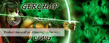
9.5/10 for d sigg
av is a bit ..... 5/10
awesome !!!
9.5/10 for d sigg
av is a bit ..... 5/10


0
Its ok. I like the text. 5/10.
About Me

0
8 for both

About Me

0
Simplistic and I really like the font in the upper right hand corner. 7/10

0
It's great to see you trying new styles! 10/10 without a doubt.

About Me
0
Great idea doing it in 2 seperate colours. The pink is cooler though. 
Both 10/10
Both 10/10
About Me
0
Whoa. You actually made the spear...bloody! 10/10
And the avy gets a 9
And the avy gets a 9
About Me
0
10/10 looks awesome
next person, i forgot to switch my avy too. dont rate it.
next person, i forgot to switch my avy too. dont rate it.
0
Simple, but good. 7/10.
About Me
0
TheKrypt Wrote:
6/10(You need to try to take out some of those white dots left over around the characters)
6/10(You need to try to take out some of those white dots left over around the characters)
\
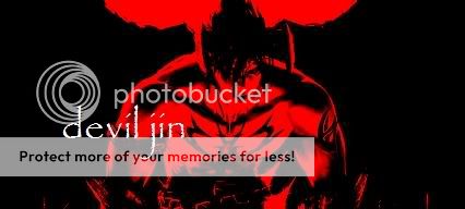
eh. im lazy. they were cut out like that, so i just left em. torchia did the one in the middle. as for the above sig, better than the last one, more bright 9/10
About Me
0
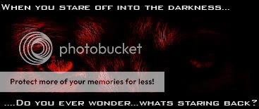
Why not use a white background instead?
Anyway, the layout is nice and the pics looks cool and the colours are cool and I love the logo. 7/10
Anyway, the layout is nice and the pics looks cool and the colours are cool and I love the logo. 7/10
About Me
0
just regular white? hmm....i could try it, but then people like ong-bak would trash it for being too basic, and that nayone could make it. as for the logo, its the one thing i cut out that looks any good.
skip me, go to keith
skip me, go to keith

0
just blur the edges...please..
About Me
0
Really cool! Love the colours and the overall look. Its nice that you didn't use a render. Makes it original. 10/10

About Me
0
Sig and avatar are both really cool, me likes. 9.5/10


© 1998-2025 Shadow Knight Media, LLC. All rights reserved. Mortal Kombat, the dragon logo and all character names are trademarks and copyright of Warner Bros. Entertainment Inc.