
About Me
Hahahaha...?
0
Ha, hopefully you aren't talking about me. :P
About Me
Hahahaha...?
0
OngBak Wrote:
Yes i am -_-
Yes i am -_-
I thought you were talking about the guy in the corner underneath the table...

About Me

0
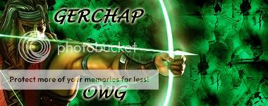
Avy: 7/10
Sig: Tool an Tommy. 9/10
Sig: Tool an Tommy. 9/10

0
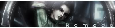
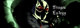
Sig: Very good, one of your best. Looks like BE style. 8.5/10
Well you and the guy underneath the table, i didnt saw the guy underneath the table when i said that lol.
Sponge-Zer0 Wrote:

I thought you were talking about the guy in the corner underneath the table...
OngBak Wrote:
Yes i am -_-
Yes i am -_-
I thought you were talking about the guy in the corner underneath the table...
Well you and the guy underneath the table, i didnt saw the guy underneath the table when i said that lol.

About Me


0
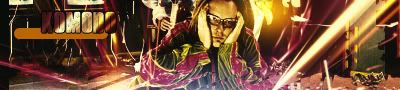
Very sharp 10/10
0
pretty nice.. 7/10

0
4/10 text is bad and Render is worse.


0
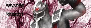
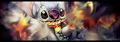
I love the style.....7/10 for calling me a square
8/10
8/10
About Me

0
The avy is great, 10/10
The sig I don't like too much. 7/10
The sig I don't like too much. 7/10
0
Oh, wow I must have missed that! 5/10
and good luck with the shadow ban.
and good luck with the shadow ban.
0
You have done way better Libz. 6/10.
0
cool sig 9/10
0
Theres always something in my sigs that is just not right lol
9/10
9/10
0
It's a bit stretched and the font is kind of chunky... 6/10


© 1998-2025 Shadow Knight Media, LLC. All rights reserved. Mortal Kombat, the dragon logo and all character names are trademarks and copyright of Warner Bros. Entertainment Inc.