Alt. MK3 Kontinue screen v.1.5
0
05/24/2003 09:34 PM (UTC)by
Avatar
Zentile
Avatar
About Me
Member Since
02/10/2003 04:39 PM (UTC)
Avatar
JoRdANMan
04/01/2003 10:37 PM (UTC)
0
its ok, i really like it
Avatar
MaxDam
Avatar
About Me

04/01/2003 10:38 PM (UTC)
0
LOL That is Pretty Sweet!
Good Job. My only complain is the shadow!
Avatar
balkcsiaboot
04/01/2003 11:09 PM (UTC)
0
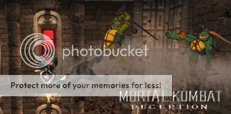
I like it. The only thing weird is the shadow. But atleast you took the time to add it for a some-what realistic umm... some-what realistic "stuff" or whatever.
Avatar
Zentile
04/02/2003 09:49 PM (UTC)
0
I hated the shadow aswell, but I was so lazy at the time...lol, well, thnks for the comments ppl, and BUMPEE DEE BUMP!
Avatar
NoobSaibot
04/02/2003 09:55 PM (UTC)
0
Shadow looks dump...but the rest is ok. Btw, nice Icon BS.

Avatar
balkcsiaboot
04/02/2003 10:05 PM (UTC)
0
Thanks. Third compliment of the day :)
Apart from the shadow, the only problem I can see is the walls, they don't connect with the floor properly.
But nice job!
Avatar
Jonin01
Avatar
About Me

=Jonin01=


My DeviantArt Site - Check out my Artwork here

04/03/2003 11:25 PM (UTC)
0
Looks cool.

But please don't bump your own thread. It's ignorant and if nobody wants to reply in it (hence why it dropped down the page), bumping it to the top serves no purpose but to annoy folks.
Avatar
~Alucard~
04/04/2003 01:06 PM (UTC)
0
I like it!
Avatar
MaRcElunbeatable
04/04/2003 09:21 PM (UTC)
0
you have good taste in profile pics blacksaibot. cool what happened to the test your might in mk2 that murdoink promice?
Avatar
karim
05/02/2003 02:12 PM (UTC)
0
its nice
Avatar
TLaG-
05/02/2003 02:41 PM (UTC)
0
Heh, simple, yet effective.

If ya wanted to go outside the realm of pixelation, could maybe add a slight motion blur to the sprite.
Could perhaps have lowered the text a bit so you could crop it on the top more and get rid of uninteresting background space.

I agree with Timsk on the wall bit. But the 'walls' actually look more like two collumns that are closer to the viewer than the sprite. Whether that was intended or not, the implied perspective looks pretty good.

Aside from the 'speckled' shadow, could also use more blood splatted onto the spikes, I think.
Avatar
Zentile
05/02/2003 03:43 PM (UTC)
0
Thnks. Well, I dont think it's possible to make the 'movement blurr' with Paint. And it's all I got.
Also, unfourtunetly, the kolumns were not intended, lol.
Avatar
BBaSS
05/02/2003 07:16 PM (UTC)
0
well done with the translation of a 3d work to 2d well Mk4 to Mk3.

Job well done, shadow a little weird but it doesn't mess up all of your work. really nice indeed
Avatar
Dante_Is_Back
Avatar
About Me

ShingoEX Wrote: Me in a thressome, with my left and right hand...

05/03/2003 03:40 PM (UTC)
0
For someone that has such harsh critism to others fakes, I would expect much, much better. Its alright, 4/10.
Avatar
SubScorpTile
05/03/2003 10:23 PM (UTC)
0
pretty good but like sum people said the shadow is off a bit its a solid fake overall 4/5 from me
Avatar
Xg_Leader
Avatar
About Me
http://www.xgthps4.tk/
I was banned from MK5.org for no reason, so I can't reply to anyone.
05/18/2003 04:59 PM (UTC)
0
Nice Job!
I really hate that ugly shadow though,
it's not only choppy and not transparent enough,
but it doesn't fit him.
is this supposed to look like the continue
screen from MK4?
it looks like it.
Keep up the good work!
Avatar
queve
05/24/2003 09:21 PM (UTC)
0
I gave it 5/5. Its awsome!
Avatar
Zentile
05/24/2003 09:34 PM (UTC)
0
Thnks Queve.
And XG Leader, I do agree that the shadow itself is terribly choppy, but it does fit Kano. I took the kano sprite, made it ''shadow-ish''(well...I tried, anyway) and shrunk it. So it does fit Kano.
Pages: 1
Download on the App StoreGet it on Google Play
© 1998-2024 Shadow Knight Media, LLC. All rights reserved. Read our Privacy Policy.
Mortal Kombat, the dragon logo and all character names are trademarks and copyright of Warner Bros. Entertainment Inc.