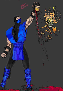
Colored Spinal Rip
0
02/25/2004 11:37 PM (UTC)by
Avatar
The_SuiT
Avatar
Member Since
05/30/2003 07:53 PM (UTC)
Avatar
BoardTng
Avatar
About Me

BoardTng----Truly a Mystery-----

08/31/2003 08:27 PM (UTC)
0
Wow!, Nicely colored. Makes this whole image stand out more. (now do this to the rest of yours) j/k. Anways Gj 5/5 dragons
Avatar
~Crow~
09/01/2003 12:45 AM (UTC)
0
I like this. I'll comment on your coloring on this submission of course, since I commented on the actual drawing earlier. You did a good job with Sub-Zero, he looks colored perfectly, well for the most part. Hanzo's head looks good, and the spinal column does as well. I also like how you put a reflection in the blood pool below, very nice touch. Scorpion is colored ok, but the flames don't seem 'bright' enough to me. I'd like to see more colors there, like a red/orange/yellow mix. But you did a good job at preserving the skulls details. This is very good to be your first actual coloring, nice job.
Avatar
Hyuga
09/01/2003 01:00 AM (UTC)
0
I noticed a few things that you should work on.

-The dark lines aren't anti-aliased. They look very jagged and unattractive. Here's an example :


-The dark shading on the pants and head is the opposite of what it should be. The lightest part should be on the inside, unless the light source is coming from behind him.

-The blue shading on the legs looks completely random. It almost looks like water is reflected on them.

-There are too many varied light sources. Look at the mask, for example. The light looks like it's coming frmo the right if his head. Then, look at his chest (the blue area). The light looks like it's coming pointed upward from left of his feet.
Avatar
bartholemewj
09/01/2003 03:56 AM (UTC)
0
its wondafill, 5/5, but i wouldve liked 2 see scorps body, with tons of blood. otherwise, excellent job man!!!
Avatar
NeoScorpion
09/01/2003 06:28 AM (UTC)
0
I don't like this... maybe cuz I can't figure it out... why is scorpion STILL THERE? I like ur earlier work much better.
Avatar
~Crow~
09/01/2003 06:38 AM (UTC)
0
Ok, NeoScorpion, here is the explaination.

Sub-Zero has just killed Hanzo(Scorpion's name when he was human.) The specter in the corner is the actual Scorpion, he's not really 'there', its more like a message he was been born in hell and is bent on revenge.
Avatar
dfgnsbsdgrt
09/01/2003 05:34 PM (UTC)
0
wicked. I really like this- the spinal column looks great, as do the eyes, heads and mostly everything else. The shinguards look a bit speckly, and think the black lines around the muscles on the arms look a bit odd now it`s all coloured in, but i still gave you 5 things.
Avatar
RaMeir
09/02/2003 02:16 PM (UTC)
0
The undefined light-source seems to be the best critique so far. Still, if this is your first it's a good effort. Whatever was used to shrink it down caused massive artifacts and aliasing though. Can't give it a fair judgement because of the jaggies.

Wyatt
Avatar
NovaStarr
Avatar
About Me

TemperaryUserName Wrote: ...the best solution is set an example.
Show some tolerance. Be a fucking leader.

1337...there is no 1337 none of us can be 1337 because we are all the same, we are all human. The sooner we realize that, the better off we'll be.

My MKO Profile Site

09/02/2003 07:56 PM (UTC)
0
Very nice work I like the shadow and I'll assume the light source is both from the specter Scorpion and perhaps something off of the page. Very nice job, especially for a first attempt.
Excellent!
I like this alot.
I didn't post in your other thread as soon as I saw this one, and now I've finally got around to it, I am pleased that I have tongue. SO I'll put everything here.

I love the way this is drawn, every detail is just superb, particularly the two costumes, I love how their styles are slightly different, differing Sub from Scorp.
Also loving the idea of having the spectre Scorpion there. Fits right in with the story, shows a lot of thought has been put into this.

Now that it's coloured as well, the flames and the blood come out extremely good as well! I'm no colouring expert (hell, I'm no drawer either tongue), but still, I like the colouring, it makes this piece even more attractive to look at.

Excellent work smile.
Avatar
ShoeUnited
Avatar
About Me

Puto, ergo non est deus
Non opus est, si pretium non habetis.

09/04/2003 10:55 AM (UTC)
0
I am sorry, but I actually like this as a b&w better.

-Shoe
Avatar
SexyCheerleader
02/17/2004 11:54 PM (UTC)
0
Hi.I really like your picture.It's cool.I really like the coloring.I think I like Sub-Zero now. wink
Avatar
eric_of_earth
02/18/2004 12:08 AM (UTC)
0
Really cool.
Avatar
|Cham|
Avatar
About Me

Setup85.com

02/18/2004 05:36 AM (UTC)
0
wow bad ass, great job.
Pretty cool but, wow, what a bump!
Avatar
Mobster_For_SATAN
02/25/2004 11:37 PM (UTC)
0
SH!T Thats very very very very good i love the way you did Scorpion
Pages: 1
Download on the App StoreGet it on Google Play
© 1998-2024 Shadow Knight Media, LLC. All rights reserved. Read our Privacy Policy.
Mortal Kombat, the dragon logo and all character names are trademarks and copyright of Warner Bros. Entertainment Inc.