Ermac Fake
0
02/22/2004 03:58 AM (UTC)by
Avatar
Born-Again-Vampire
Avatar
About Me

Anything war can do, peace can do better.
Member Since
12/12/2003 01:14 PM (UTC)
Avatar
Marine_Warrior
02/20/2004 05:27 PM (UTC)
0
The purple sky is kinda weird but other than that I like it. 3.5/5
Avatar
StonedSour
02/20/2004 05:34 PM (UTC)
0
Come on, don't waste our time. You've done so much better than this.

Good points:
- Er..I'm not sure what to say. The blood looks good, but that's been supplied by MKW..

Bad points:
- The background. A POLAR COORDINATES EFFECT FOR THE SKY?!? What were you thinking dude? Here's a tip, look for a realistic sky tutorial on Photoshop, that'll look a lot better than..that. Besides, it's pink! Seriously..
- Please, PLEASE try and use the right sized template for the background, as that looks horrible. You've mixed MK elements with real elements, and unless you can do it properly, it's a very bad idea.
- The Ermac sprite has a white edge around, and that is NOT a good idea. Make sure if you rip the image from a white background, that you don't get a white edge on it.
- The lifebars. They should NOT be that length, they should not take the whole screen up. The font looks horrible, there's no timer, no shadows, no win marks, NOTHING. This is bare minimum.

Comments :
Well BAV, you can do so much better than this. Use MKW to it's full potential, it has names, lifebars, timers etc! Use them!

1/5
Avatar
Murdoink
02/20/2004 05:59 PM (UTC)
0
I agree with StonedSour.
Anyways, I think there's a weird issue with the names of the lifebars on MKW, I shall check it to see what's happening with it.
Avatar
balkcsiaboot
02/20/2004 07:54 PM (UTC)
0
I frickin hate your fakes now. They were so-so before, now they just BLOW.
The background looks like shit - a photograph of trees and a lake or river, and then you put some dinky pink background WHATEVER THE HELL THAT IS SUPPOSED TO BE. The healthbars look like crud. Nice effects, but it's just not for MK. Ermac's sprite looks like trash. That is one horrible job on the color swap. I can even see the outlines around his sprite. The idea of turning Scorpion's Hand from Hell into green, and rotating it and slapping it next to his hands was the lamest idea of a fatality I've ever seen. I don't even see why raiden is bleed. It's not like the hand is clenching him, and the blood is just spraying out of no where and for nothing.

Don't see this as a personal attack, I just think your fake is CRAP. I hate your ideas for backgrounds, and I hate your unoriginal fatalities and the healthbar style you just cant let die out.
Avatar
Born-Again-Vampire
Avatar
About Me

Anything war can do, peace can do better.
02/20/2004 08:42 PM (UTC)
0
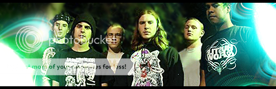
Thanks for your comments. I don't know what you mean about the background template. I got both character sprites from MKM and messed up on ermac. The sky, I love though. I had a feeling some might not like it but I think it is fun. You mentioned something of the size which I will look at but it looks good to me.
StonedSour Wrote:
Come on, don't waste our time. You've done so much better than this.

Good points:
- Er..I'm not sure what to say. The blood looks good, but that's been supplied by MKW..

Bad points:
- The background. A POLAR COORDINATES EFFECT FOR THE SKY?!? What were you thinking dude? Here's a tip, look for a realistic sky tutorial on Photoshop, that'll look a lot better than..that. Besides, it's pink! Seriously..
- Please, PLEASE try and use the right sized template for the background, as that looks horrible. You've mixed MK elements with real elements, and unless you can do it properly, it's a very bad idea.
- The Ermac sprite has a white edge around, and that is NOT a good idea. Make sure if you rip the image from a white background, that you don't get a white edge on it.
- The lifebars. They should NOT be that length, they should not take the whole screen up. The font looks horrible, there's no timer, no shadows, no win marks, NOTHING. This is bare minimum.

Comments :
Well BAV, you can do so much better than this. Use MKW to it's full potential, it has names, lifebars, timers etc! Use them!

1/5


Oh, BlackSaibot it is obviously a river, the Mississippi to be specific. And I am sorry to hear I have lost a fan but hey that's life.
Avatar
balkcsiaboot
02/20/2004 09:26 PM (UTC)
0
It could have just as easily been a lake.
And you've never had me as a "fan."

born-again-vampire Wrote:
Oh, BlackSaibot it is obviously a river, the Mississippi to be specific. And I am sorry to hear I have lost a fan but hey that's life.

Avatar
aliem
02/20/2004 09:47 PM (UTC)
0
Don't use real photos that aren't plain textures for fakes... makes it look even more fake.

I kinda like the concept of the hand, it should be a little more grabby and less... um... whatever it is now. Blood also looks strange since he doesn't look like he's being harmed.

Sorry but I gotta go with the others, in a less aggresive way though... 1.5/5
Avatar
Born-Again-Vampire
Avatar
About Me

Anything war can do, peace can do better.
02/20/2004 09:55 PM (UTC)
0
Oh believe me I used it (the word fan) very loosely.
And actualy from the perspective and visible distance it is clearly a river (3d largest in the world).
balkcsiaboot Wrote:
It could have just as easily been a lake.
And you've never had me as a "fan."

born-again-vampire Wrote:
Oh, BlackSaibot it is obviously a river, the Mississippi to be specific. And I am sorry to hear I have lost a fan but hey that's life.

Avatar
Nikodemus
02/20/2004 11:53 PM (UTC)
0
I like the concept of this fake but you just didn’t make it look very good. Also, didn’t like the backround. I'd like to see a remake cause its a neat idea.
Avatar
Born-Again-Vampire
Avatar
About Me

Anything war can do, peace can do better.
02/20/2004 11:59 PM (UTC)
0
Thanks. Maybe I will....
Nikodemus Wrote:
I like the concept of this fake but you just didn’t make it look very good. Also, didn’t like the backround. I'd like to see a remake cause its a neat idea.

Avatar
aliem
02/21/2004 05:27 AM (UTC)
0
I could make it fully animated I really like the concept... it's just it wasn't executed too well.
Avatar
Gl1tch
Avatar
About Me

02/21/2004 11:32 AM (UTC)
0
Actually, the photo itself is pretty damn good and matches with the MK floor. Though I think you should have made the purple in the sky darker and maybe the picture darker too. The fatality is a good Idea but green does not go with purple so you should have just used a different hand or something. next time, blend things together more...(darker)
Avatar
Scorpio_Death
02/22/2004 03:58 AM (UTC)
0
its ok...but the purple/pink stuff in the air looks like some sort of retarded sunset. anyway soso. 2.5 stars.
Pages: 1
Download on the App StoreGet it on Google Play
© 1998-2024 Shadow Knight Media, LLC. All rights reserved. Read our Privacy Policy.
Mortal Kombat, the dragon logo and all character names are trademarks and copyright of Warner Bros. Entertainment Inc.